

Why not something Monet / Impressionism for the logo, despite being requested for that's personal taste on art for some of the brand founders?
→ Aiming at the users instead of the owners. The design strategy I follow for branding prioritizes successful competition against established and successful references, as this is essential for brand success, even if it differs from the brand owners' personal artistic preferences. Additionally, comparing logos to complex artwork, such as a Monet painting, may not be relevant, considering that logos are typically simple, abstract shapes.
→ However, branding can indeed target impressionism. Not the logo, but the branding overall: for instance, artists might produce visuals that aim for impressionism, if relevant for marketing purposes.
→ And HOWEVER, because it does not harm the quality of the final delivery, I’ve considered potentially using one vibrant vivid color for accents in the brand. Not necessarily for the logo, which is kept simple on purpose, but for accents across branded materials.
→ Also, and as a “nevertheless”... It does not harm to express movement. And even though –again– I'm focused on users, not owners, I’m conveying some movement to the logo via making the symbol somehow organic. I gotta say my goal is that of expressing movement and humanness, rather than satisfying the taste for impressionist paintings. Coincidentally, and without compromising quality, this aligns with the personal desire previously hinted at. Notice though, I'm talking about movement, but still constrained to calmness, which is coincidentally a feature of impressionism painting.

Why organic?
We are approaching organic for humanism, and approaching modernity and tech through cleanliness and professionalism on the little logo craft details.
→ Although this is a tech brand, the target audience burdens a highly human weight: people (most emphasize people) seeking a job (a highly human desire) in the realm of healthcare (an area of extraordinarily human value).
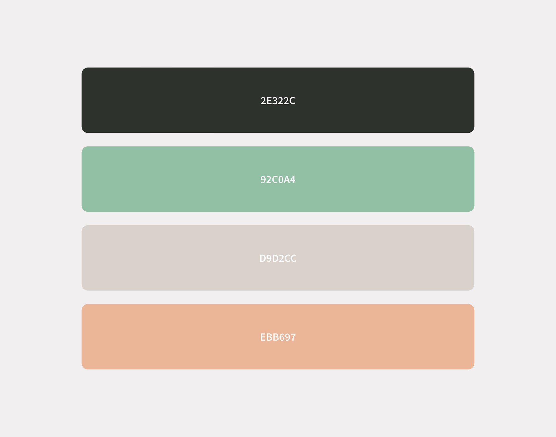
→ That’s also a reason why the proposed palette for branding materials (not necessarily the logo, but branded assets) is creamy.
Why creamy, and why Japandi
Japandi is a style trend for interior and architectural design. It conveys calmness, organic colors, and cleanness. That’s potentially the ideal sentiment to be conveyed.
→ Anthropic uses it.
→ Galileo uses it as well.

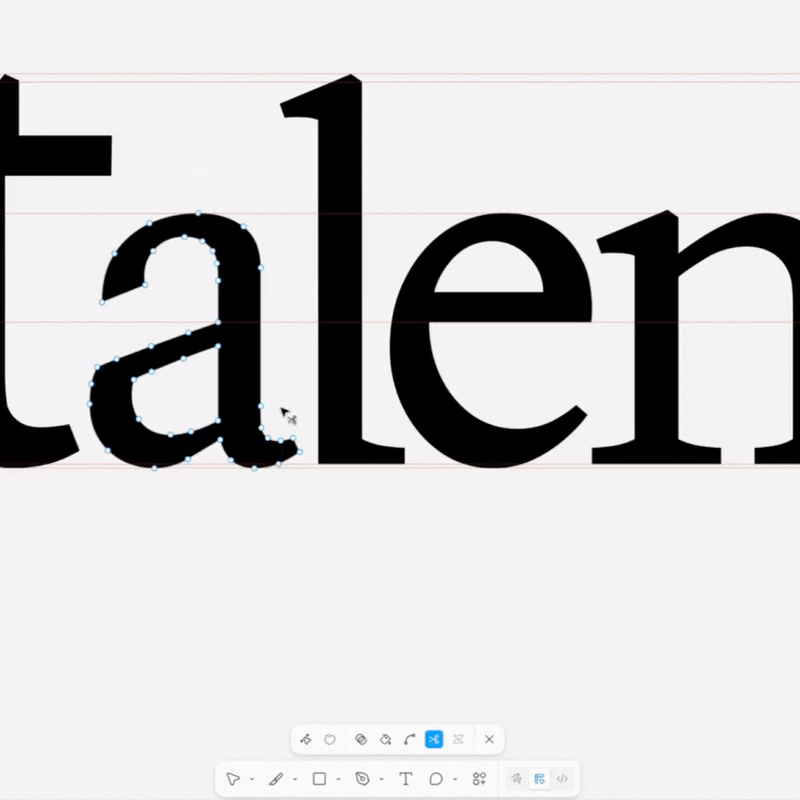
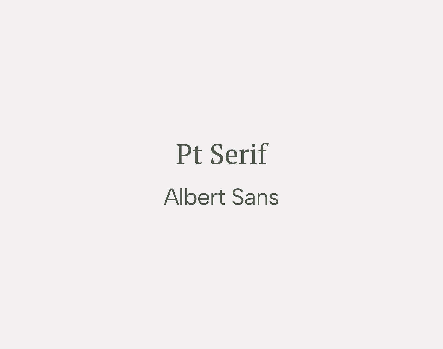
Why serifs
While the majority of ai brands are non serifs for their branding, there are exceptions. One of them has been an exception for countless decades: IBM. The other one, a more recent one, is a major player using serifs as well: Claude by Anthropic. Cohere is yet another example. With this being said, using serifs is a safe move backed by what big player references are doing.
Why not gradients
→ We are not using gradients. Uncommon (although exceptions are present) for overall logo works. Not seen in our references. And this goes contrary to the organic feeling I’m approaching.
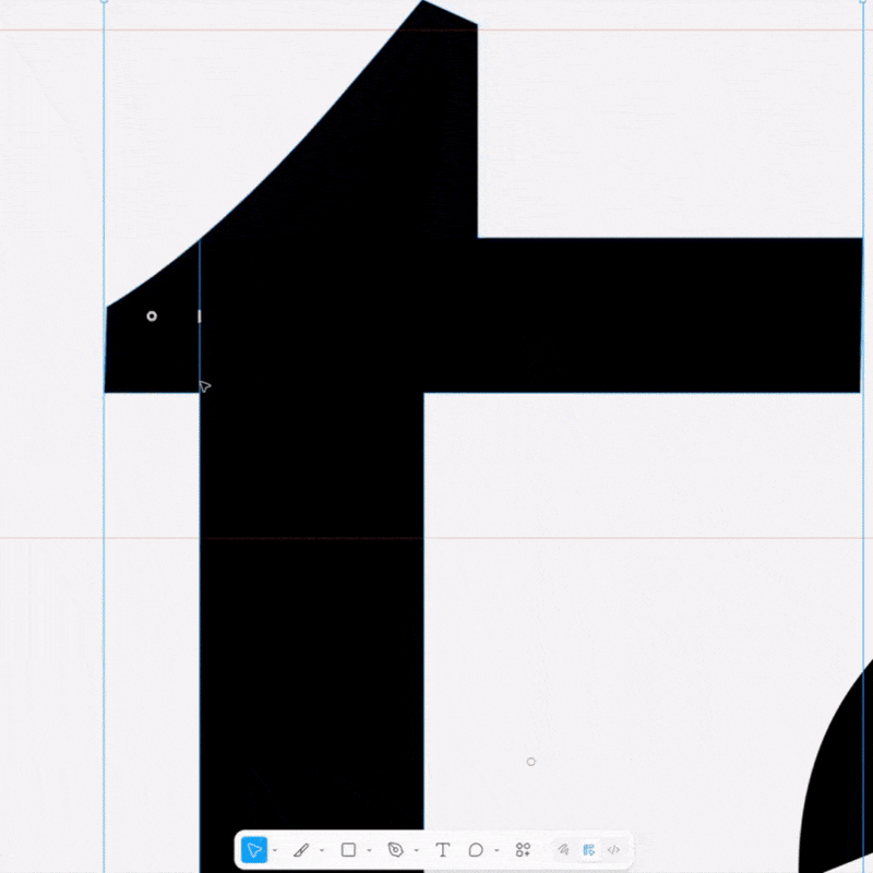
Why an abstract asterisk symbol
The majority of the references lack a symbol - relying on typeface alone, Paradox and Ribbon being exceptions. Then, Ribbon’s symbol relates to the brand's wording directly. Then we have the Galileo case, which integrates the symbol as an accent for the typeface, integrated into the logo. Anthropic does this as well, although they make the symbol a replacement for a character of their typeface.
With this in mind, I decided to play it safe and have a small accept symbol, as Galileo does. And this is the approach I choose to follow, for it also check the boxes of simplicity and cleanness, which are our ways of conveying tech (at this point, we are using serifs and will employ creamy colors, so simplicity and cleanness are our ways of staying attached to the tech industry: making sure the logo is so clean and professionally crafted that it does convey a sense for tech).
Then, a neural network is a highly abstract idea. Representing it in a simple way could either go in many directions. I chose the asterisk for its conveying the idea of a spark. Other explored ideas somehow got me into the “entangled” feeling, so I disregarded them.
Finally, albeit abstract, the asterisk could represent a fingers snap, relating to ”Pronto” or ready, fast, done.

Why is the asterisk not a perfect geometrical shape? Like, why so weird of an asterisk?
One, for conveying movement, an organic feeling, and therefore humanity.
Then, for uniqueness: there are so many asterisks over there. Creating a perfect one would not convey any uniqueness to this brand.
Finally, the symbol's creation was rooted in the concept of a neural network, beginning with hand-drawn lines and entanglements.

The color palette for branded assets beyond the logo.
Typeface: A combination of serifs for headings and humanist non serif for paragraphs and else.
Thanks!