

While the original UI ("before") was functional, it might lacks the visual hierarchy and aesthetics required to guide users intuitively and engage. The updated design ("after") and its abstracted marketing counterparts focus on clarity, warmth, and immediate comprehension.
Strategic intent: why we changed it
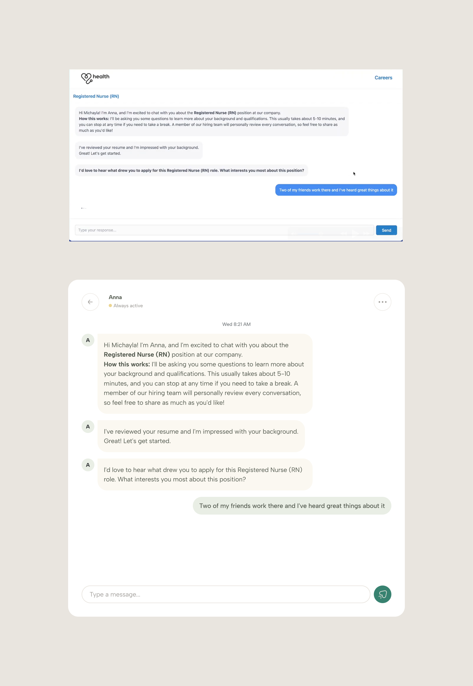
The primary goal was to shift the user perception from "administrative task" to "human conversation."
Building trust
In the healthcare and talent space, sterility can feel cold. We needed to inject warmth to make the platform feel like a partner rather than a tool.
Key interventions: what we changed
Visual hierarchy and containment
We introduced a card-based system (the beige and white containers). This groups related information logically—separating the "job details" from the "conversation"—allowing the user to process two distinct tasks simultaneously without confusion.
Aesthetics and tone
Before: Standard "tech blue" and stark white felt generic and unfinished. It might also convey the feel of a theme based app.
After: We implemented a refined palette of soft greens, warm beiges, and charcoal text. This creates a calming, professional environment that aligns with a premium service offering.
Component modernization
Before: Sharp corners and standard browser inputs.
After: We softened the UI with rounded corners on buttons, chat bubbles, and cards. This "friendly" geometry invites interaction and modernizes the brand feel.

The abstraction strategy: how we presented it
For the marketing assets and public-facing visuals (the final output), we applied a technique called "UI abstraction."
Signal over noise
We stripped away the "browser chrome" (URL bars, bookmarks, window edges) seen in the original screenshots. These elements add visual noise but zero value.
Feature focus
By isolating the UI components—specifically the chat interaction and the job card overlay—we force the viewer to focus entirely on the core value proposition: the ease of applying and the clarity of communication.
The outcome
The result is not just a prettier screen, but a communicative asset. The "after" visual communicates the ease and humanity of the platform instantly. By distilling the UI down to its essence, we save the viewer the time of interpreting the interface, allowing them to instantly understand the value proposition: simple, conversational, and human-centric.
