The general thought is that the current navigation is a bit boring or too simple, and we are tasked to improve it. The existing website's UI is generally high quality, but there are areas where we can improve the navigation. The approach for tackling this task has two phases: first, the "boring" approach of ensuring the bones of the navigation are solid. We will review important industry patterns and ensure compliance with the basics. Second, the branding logic: we will apply branding and specifically explore ways Mellow can break the "boring" pillars to convey movement and fun.
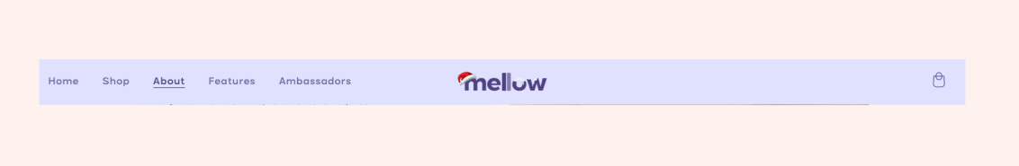
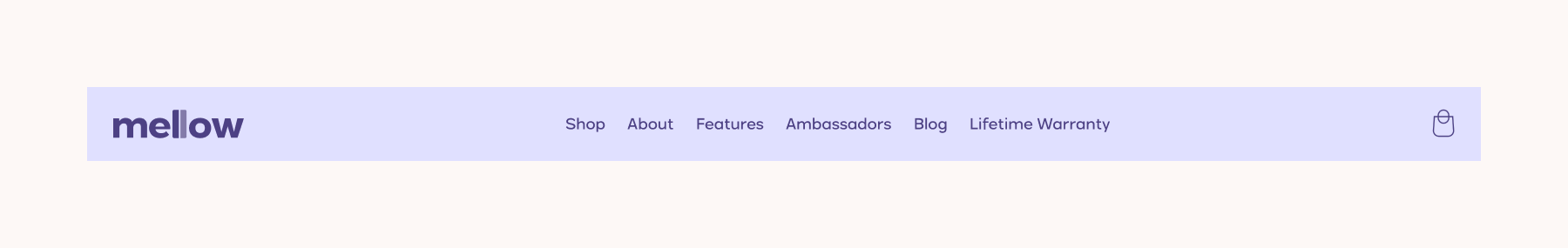
To evaluate the solidity of the fundamental design, consider the example of Buffy, which also employs a centered logo in its navigation bar. A key takeaway is the visual balance achieved between the elements on the right and left sides. In contrast, Mellow's current configuration lacks this balance, placing five links on the left and only a small icon on the right.
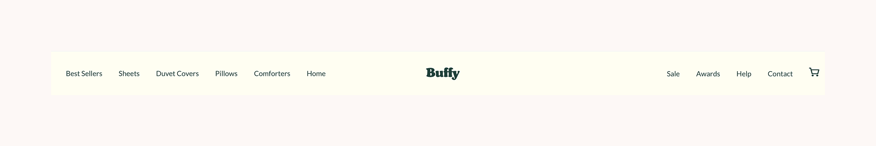
A crucial point regarding hierarchy and spacing is that in "Buffy," the space between links is equal to or less than the distance between a link group and the browser's edge.
In contrast, "Mellows" utilizes spacing to establish hierarchical grouping: the "Home" link is positioned closer to the browser border than to its neighboring links within the navigation group. However, there is an inconsistency in the application of margins/spacing: the margin between the "Home" link and the browser border is smaller than the margin between an icon and the browser border. This demonstrates that spacing usage is critical for defining hierarchy.
The site also offers two areas with content that could enhance the user's purchase experience: the blog and the compelling lifetime warranty information. Considering these additional links, along with a technically correct navbar UI that features a centered logo, the resulting design would be a significant improvement, as illustrated.
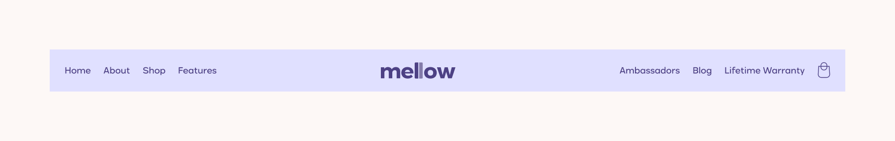
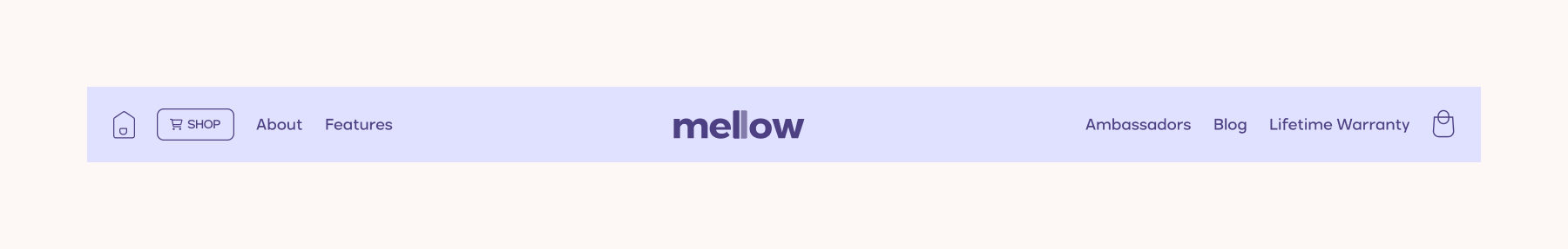
Or yet another variation would be having the logo left aligned:
Regardless of centered or left, up until this point we have done the "boring" approach of ensuring the bones of the navigation are technically correct and solid.
Breaking the "boring" pillars
How so?
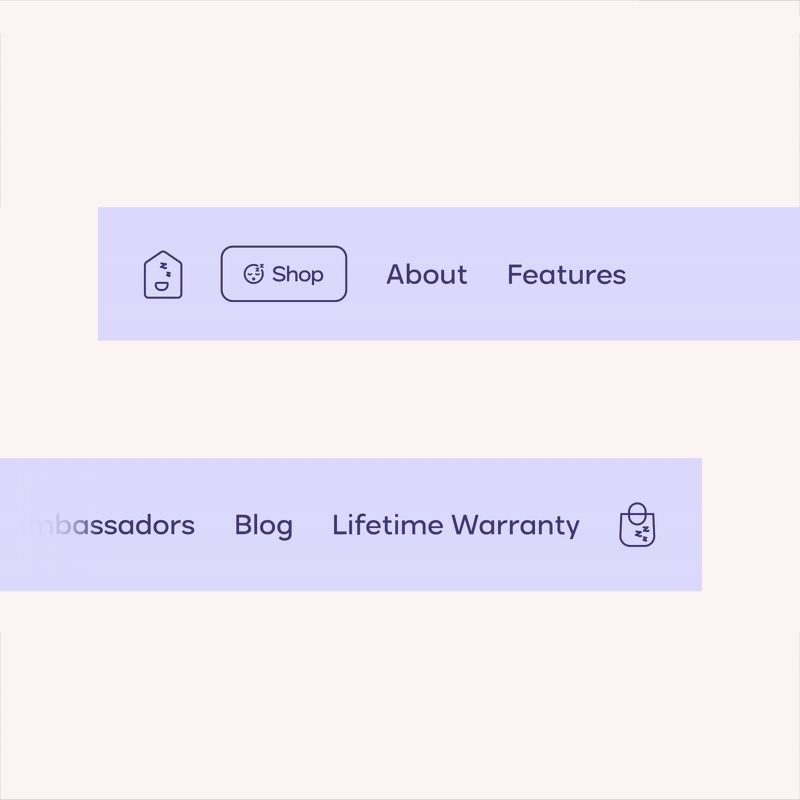
→ Usage of branding for accents. Specifically, the outlined style can be conveyed to elements such as buttons.
→ Distinguishing the main CTA as a button. That would be the Shopping link.
→ Using an icon for such a CTA.
→ Creating a fun icon for the home button (if using the logo centered navigation… otherwise this might not be necessary as users tend to relate a left centered logo with a link to the homepage).
Taking it a “fun” step further
Adding a branded signature to this proposal, with the use of “Zzz” that relates to sleep, branded iconography with such signatures, and on hover interactions for such branded icons.