A clean and modern product grid showcasing Ginjan's merchandise. The design uses ample white space and consistent "Learn More" and "Box" CTA buttons to create an uncluttered, premium shopping experience that is easy to navigate.

The primary e-commerce section for Ginjan's beverage and coffee products has a UI design that highlights the entire product family with vibrant imagery and clear pricing, utilizing consistent layouts for each item to ensure a cohesive and scannable shopping experience.

The product detail page for the Kakoulima Tumbler has a design that features a prominent product image, clear purchasing options, and a "You may also like" section that effectively cross-sells related products, driving further engagement and sales.

The product page UI for a 12-pack of Ginjan's drinks has a design that prioritizes conversions with clear one-time purchase and "Subscribe & Save" options, supported by benefit-driven icons and detailed nutritional information to build customer confidence.

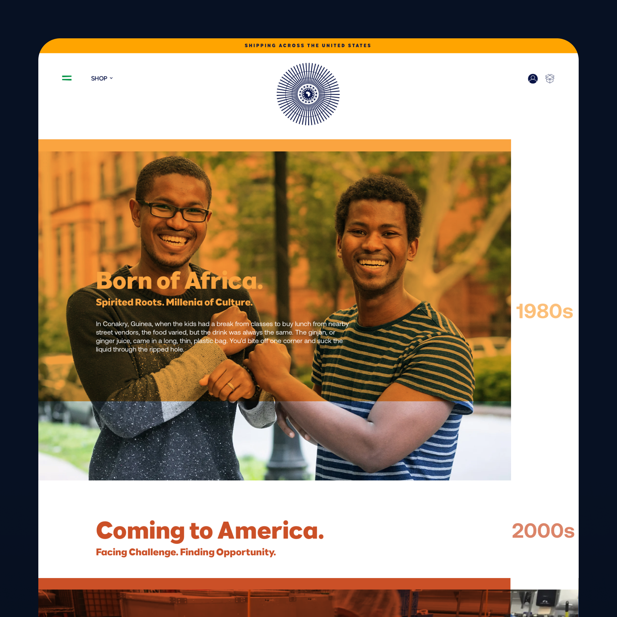
The created "About Us" page uses powerful imagery and typography to tell the brand's origin story: the design conveys an emotional connection by weaving a compelling narrative with a visually engaging, timeline-style layout.

We coded the design for a unique layout on the brand's story, combining a detailed narrative with a clean, minimalist timeline of company milestones. This design effectively communicates Ginjan's journey and achievements, building brand authenticity and trust.

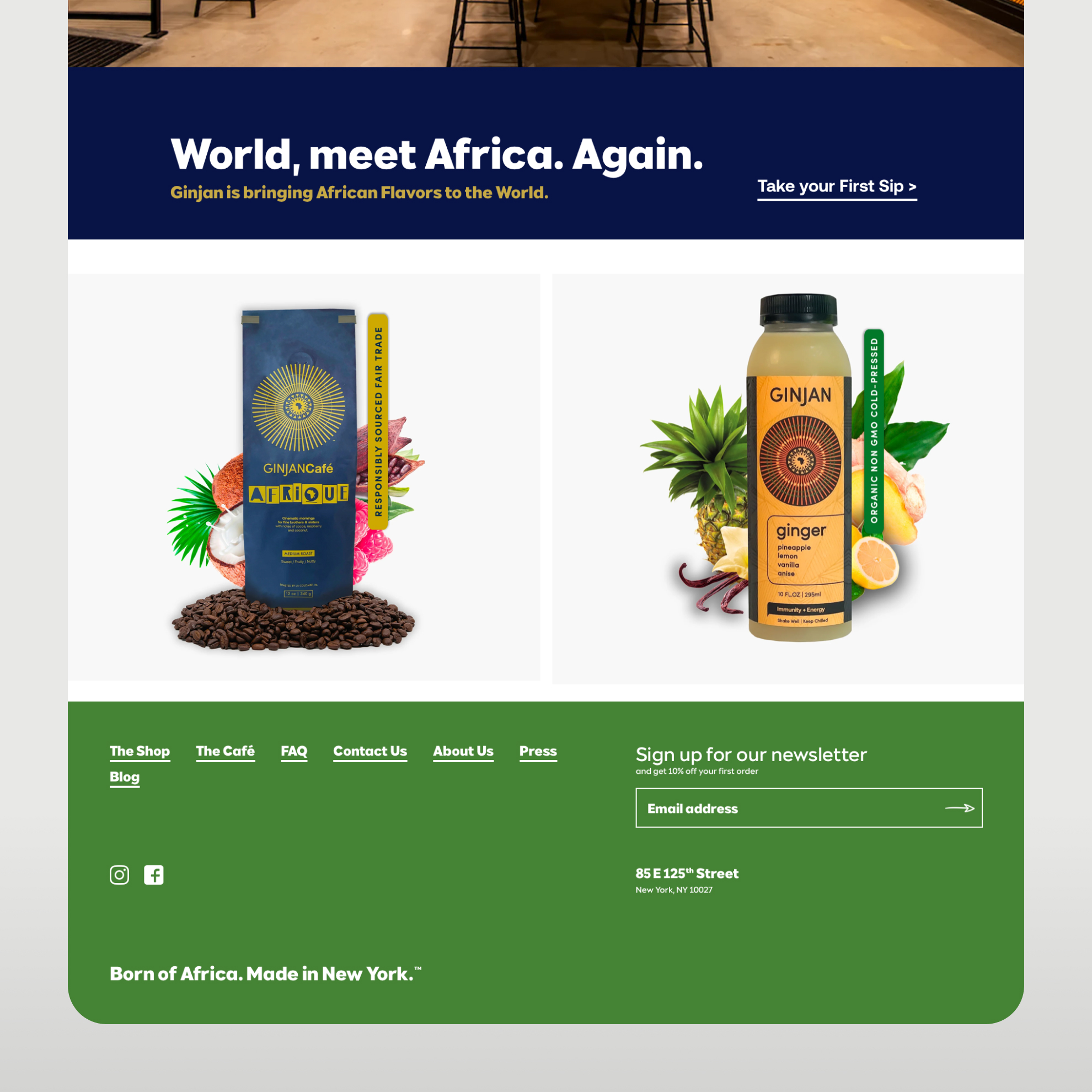
As a highlight on the small details: the lower half of the homepage is designed to drive action: The "World, meet Africa. Again." headline is paired with a clear "Take Your First Sip >" call-to-action, leading into a comprehensive, well-organized footer with newsletter signup and social links.

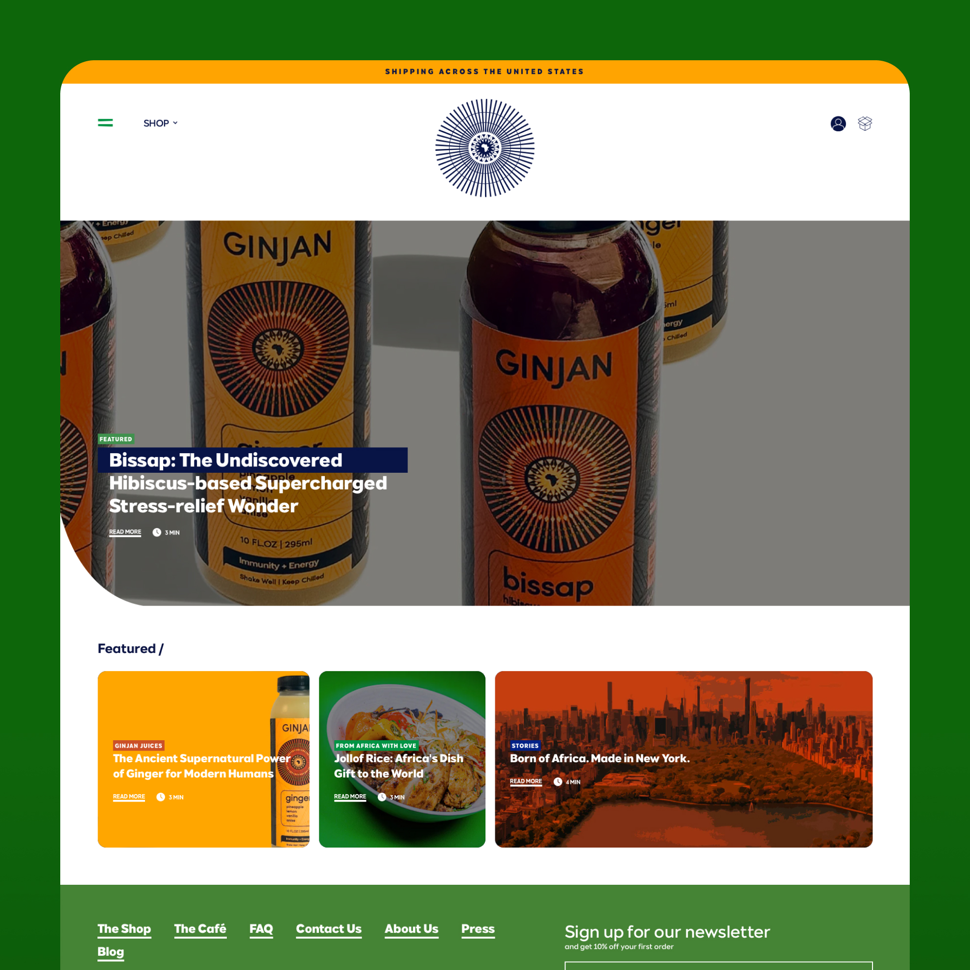
The design for Ginjan's blog and content hub uses a strong visual hierarchy with a large featured article and a grid of smaller cards below, creating an engaging and easy-to-browse experience for readers.

A content-rich section of the website showcase cocktail recipes and featured stories under a design that uses a visually appealing card-based layout and incorporates a bold, patterned newsletter signup form to capture leads effectively.

A clean and immersive article page design prioritizes readability with a strong hero image, clear typography, and social sharing icons, creating a seamless experience for users engaging with the brand's content.

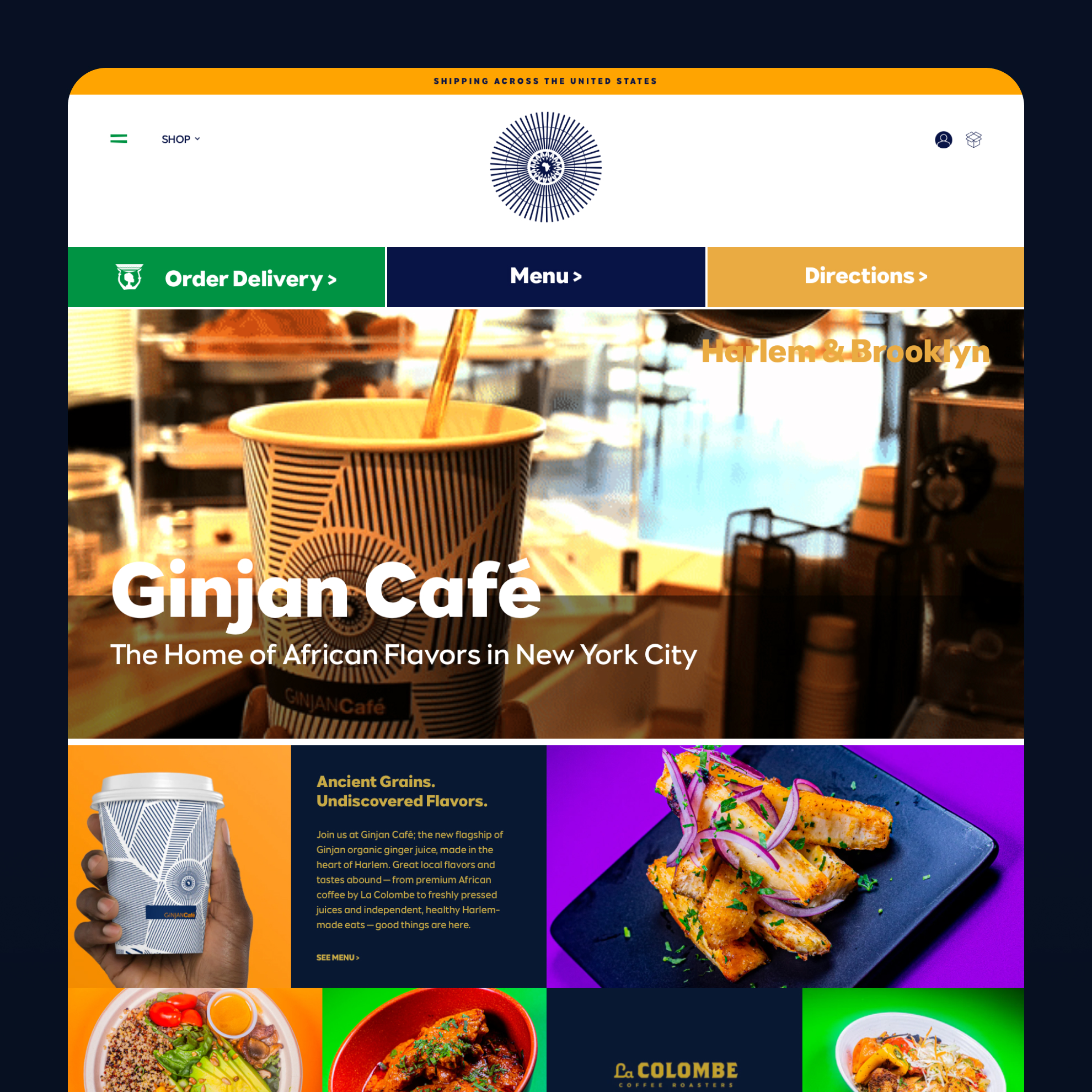
The landing page for the Ginjan Café is designed for local customers: The UI immediately presents the three most critical user actions—Order Delivery, View Menu, and Get Directions—in a prominent action bar. This user-centric approach, combined with vibrant food photography, aims to drive online orders and foot traffic.


