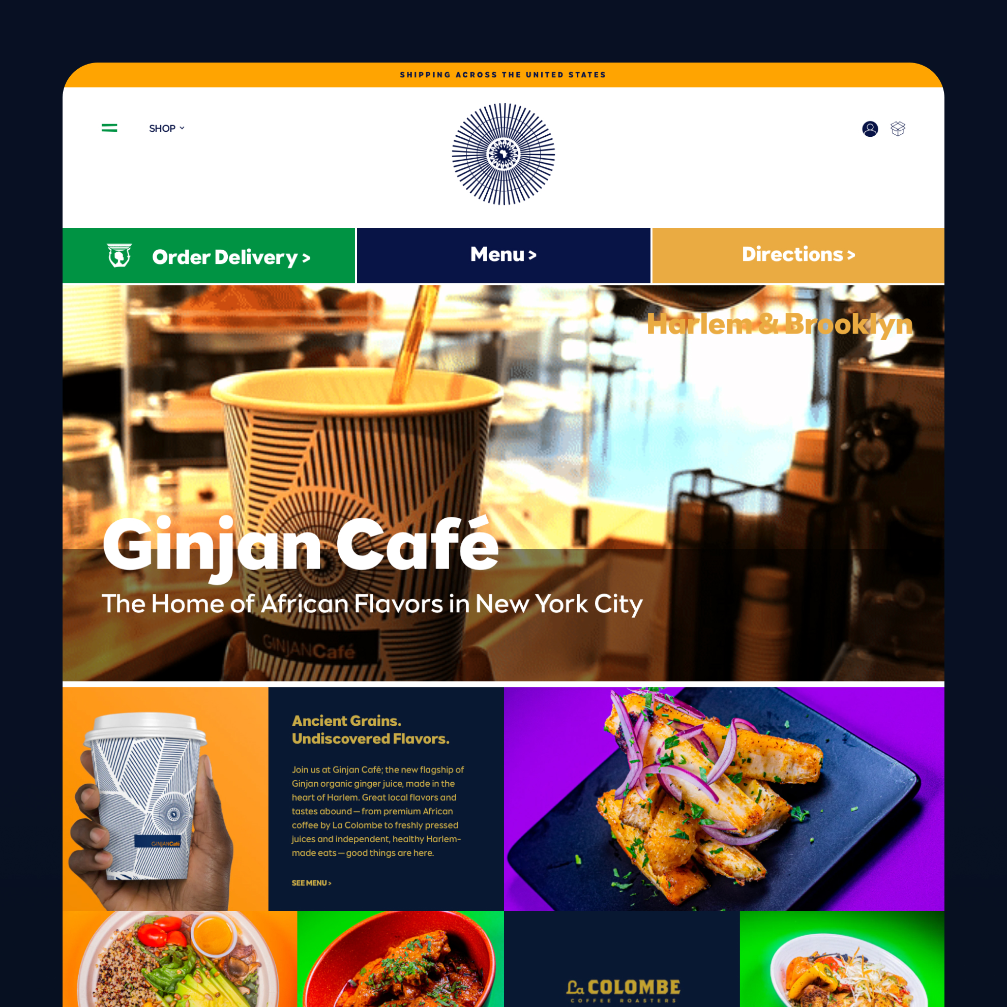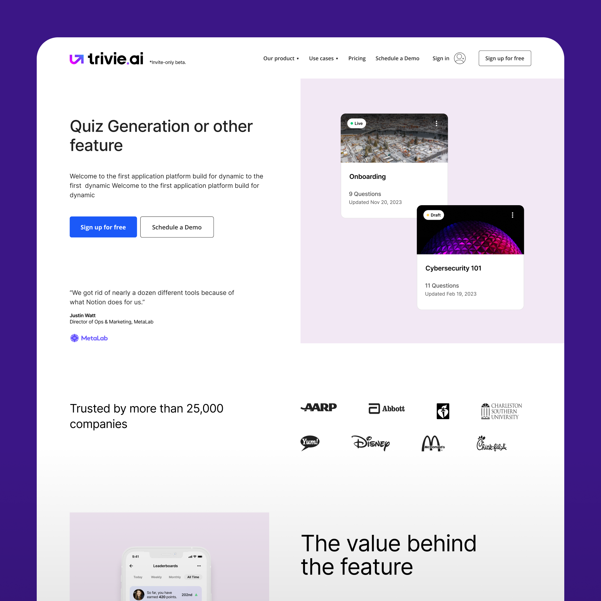
We aimed for a clean, inviting look that immediately communicates their mission: "Eco-Conscious Products for Everyday Life." A soft, earthy palette and clear navigation set the stage for the entire user experience.

Here's how we introduced the MOS brand family. This section was designed to give each sub-brand—imse, boob, and MonthlyCup—its own spotlight while maintaining a cohesive look. Simple, elegant cards make it easy for users to explore.
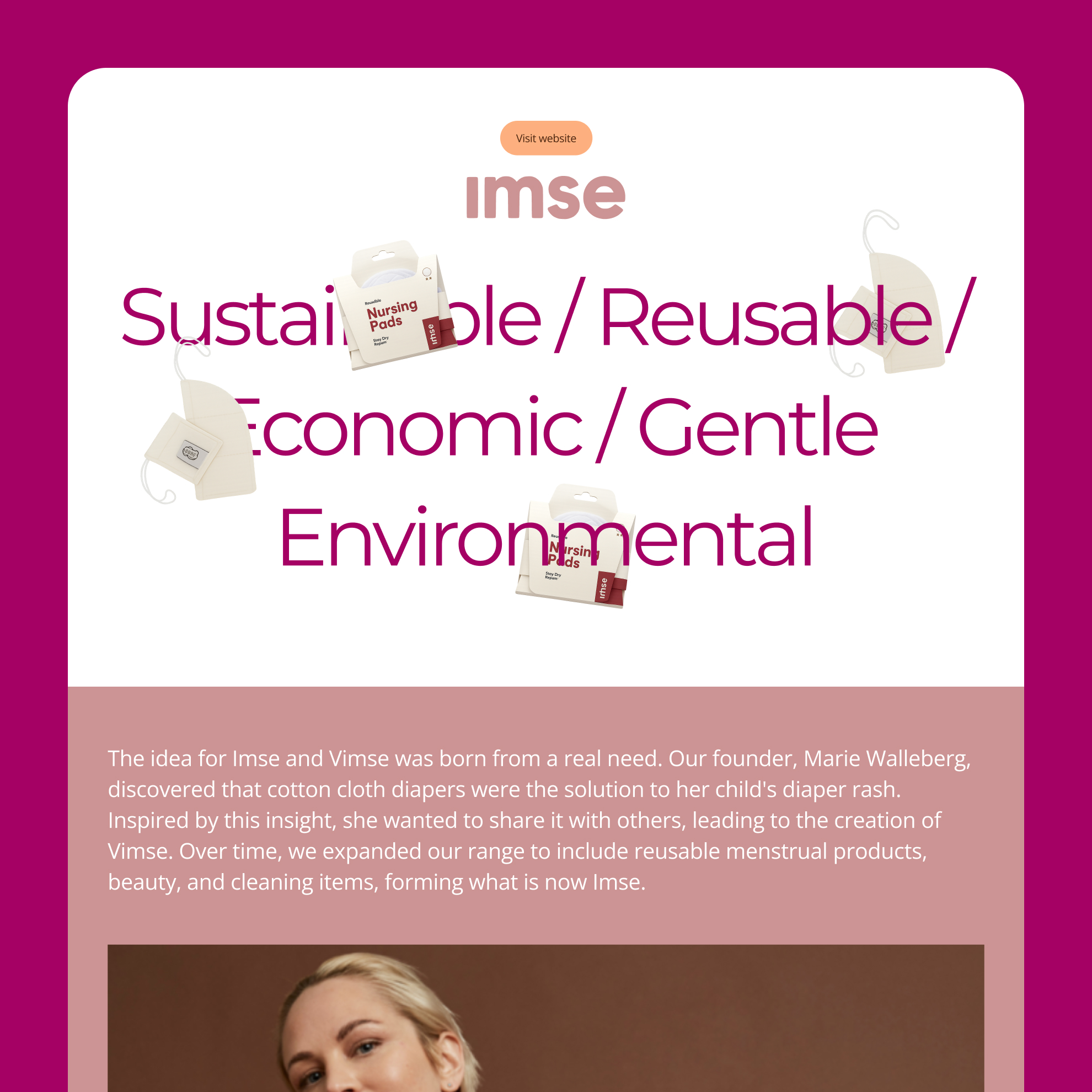
Diving deeper into a specific brand page for "imse." The goal was to tell a compelling story, blending bold typography with clean product imagery to highlight the brand's unique focus on sustainable and reusable products.
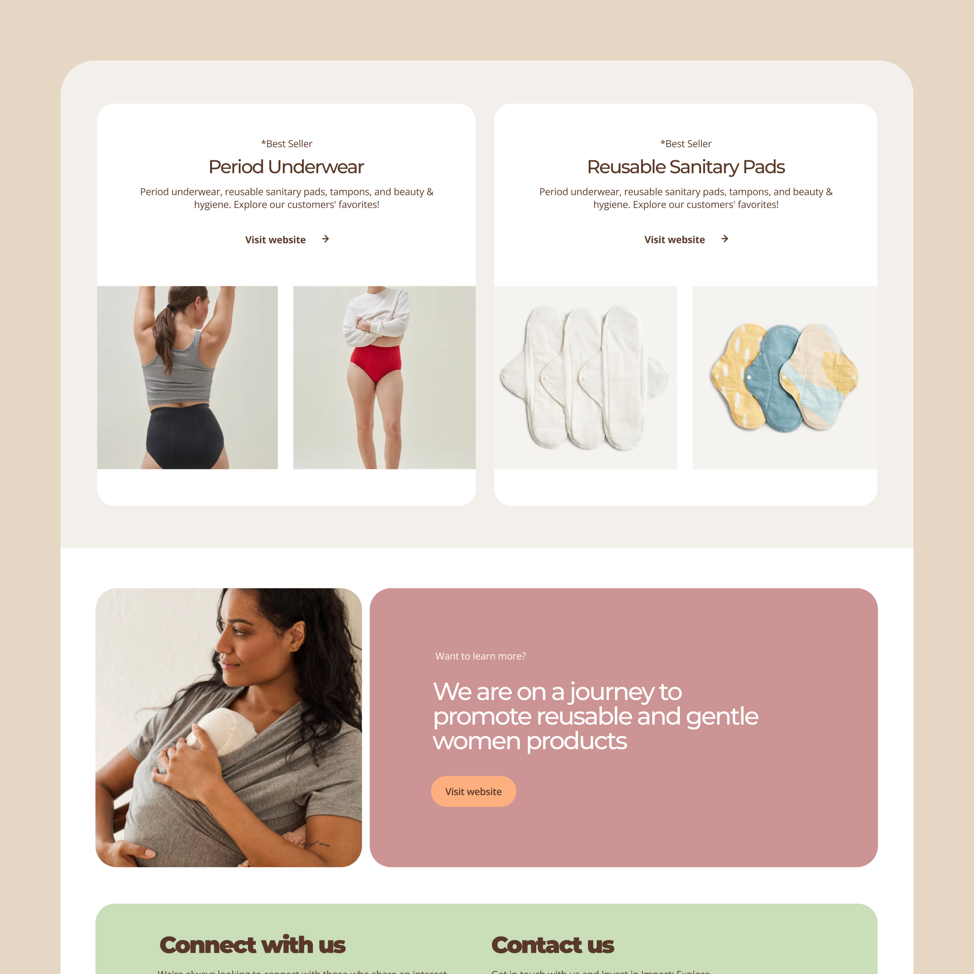
Designing the product showcase was all about clarity and trust. We used a clean grid layout with high-quality imagery and clear "Best Seller" tags to guide users to popular, trusted products, making the shopping experience smooth and simple.

Here's the brand page for 'boob,' designed for mothers. We used a dynamic, layered typographic hero to grab attention and immediately communicate the brand's unique focus.

This shot features another look at the product grid. The clear CTA and the central banner guide users deeper into their journey of discovering reusable products.
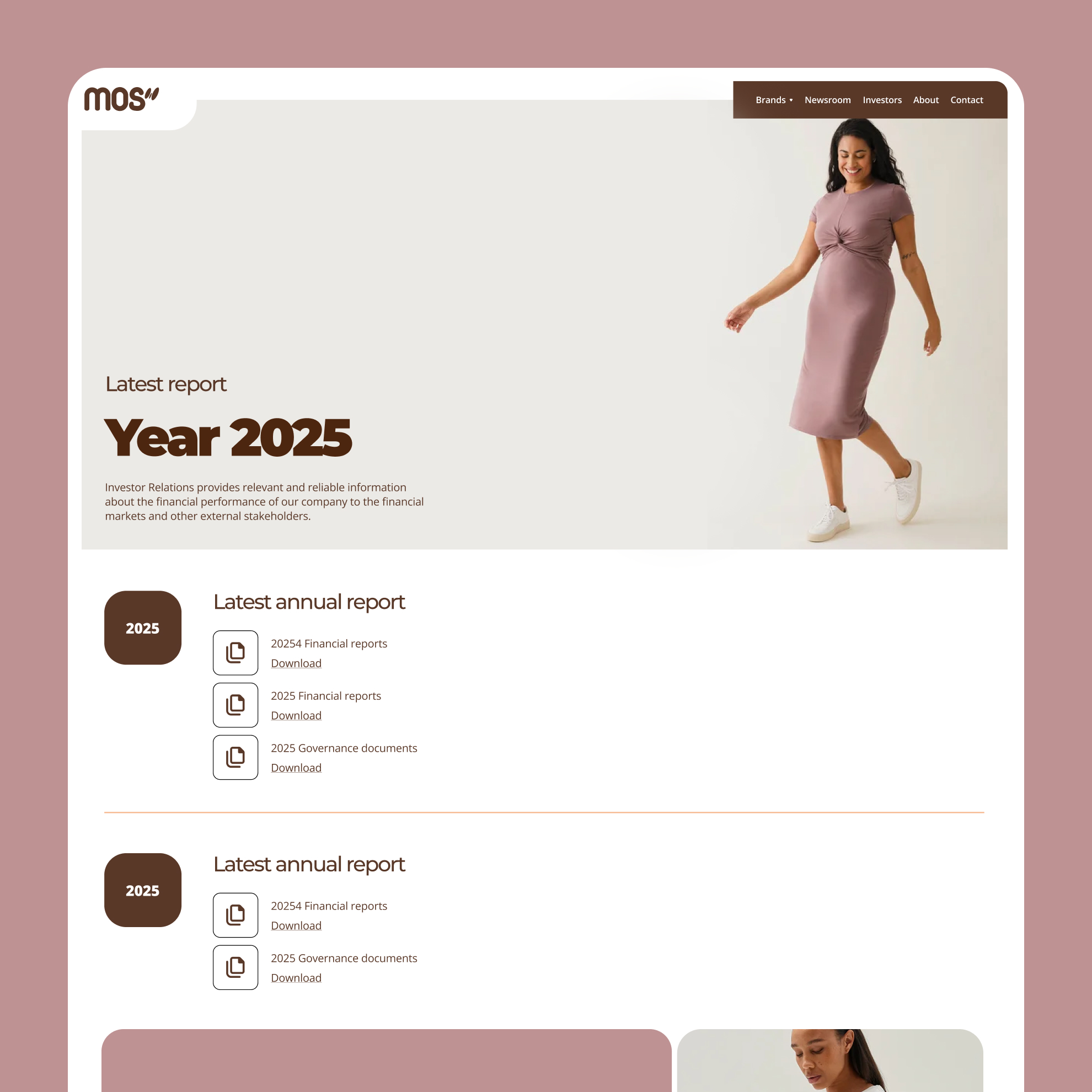
The Investor Relations page needed to be professional and simple. We focused on function, using clear typography and downloadable document components for a frictionless experience.

Even a contact form deserves great design! We focused on simplicity and usability with clear labels and a straightforward layout to make reaching out a frictionless experience.
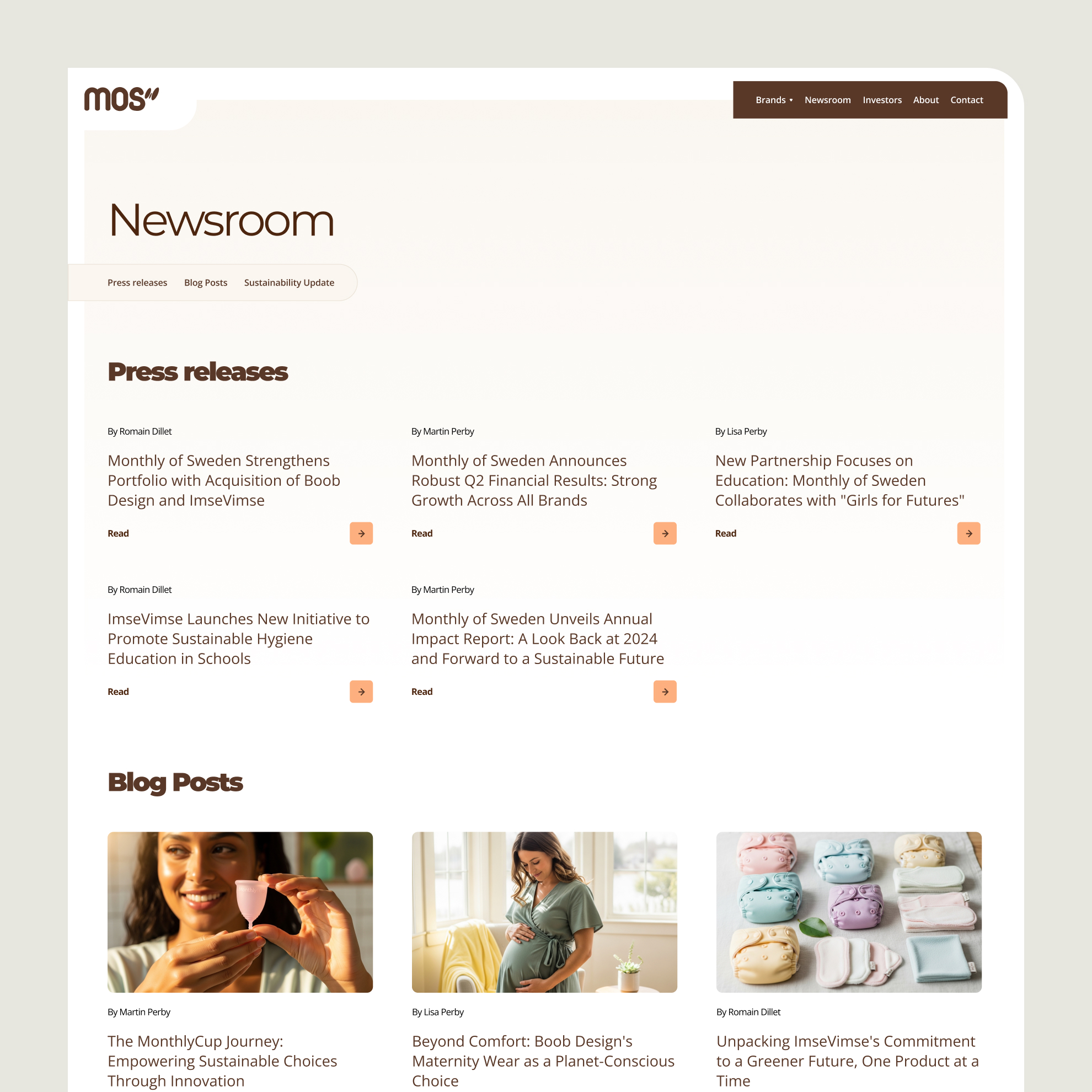
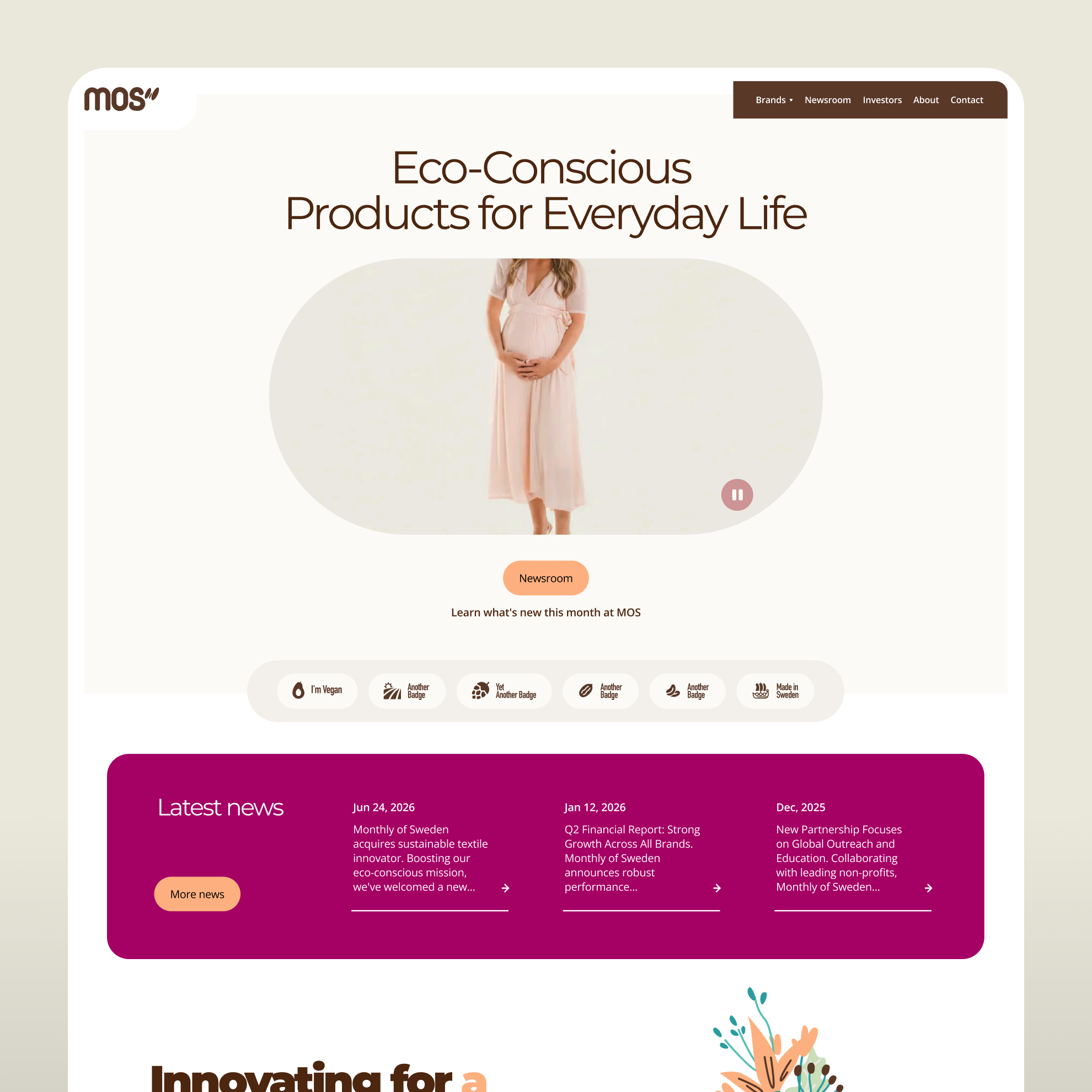
Crafting the Newsroom to be a hub for both press releases and blog content. A clean layout with clear visual hierarchy makes it easy for visitors to find the latest updates.

For the blog, we designed a minimalist and reader-friendly layout. Lots of white space and a prominent hero image create an immersive experience that lets the content shine.

Telling the MOS story through a visual timeline. This "Our Journey" section uses icons and a clear path to guide the user through the company's key milestones and mission.
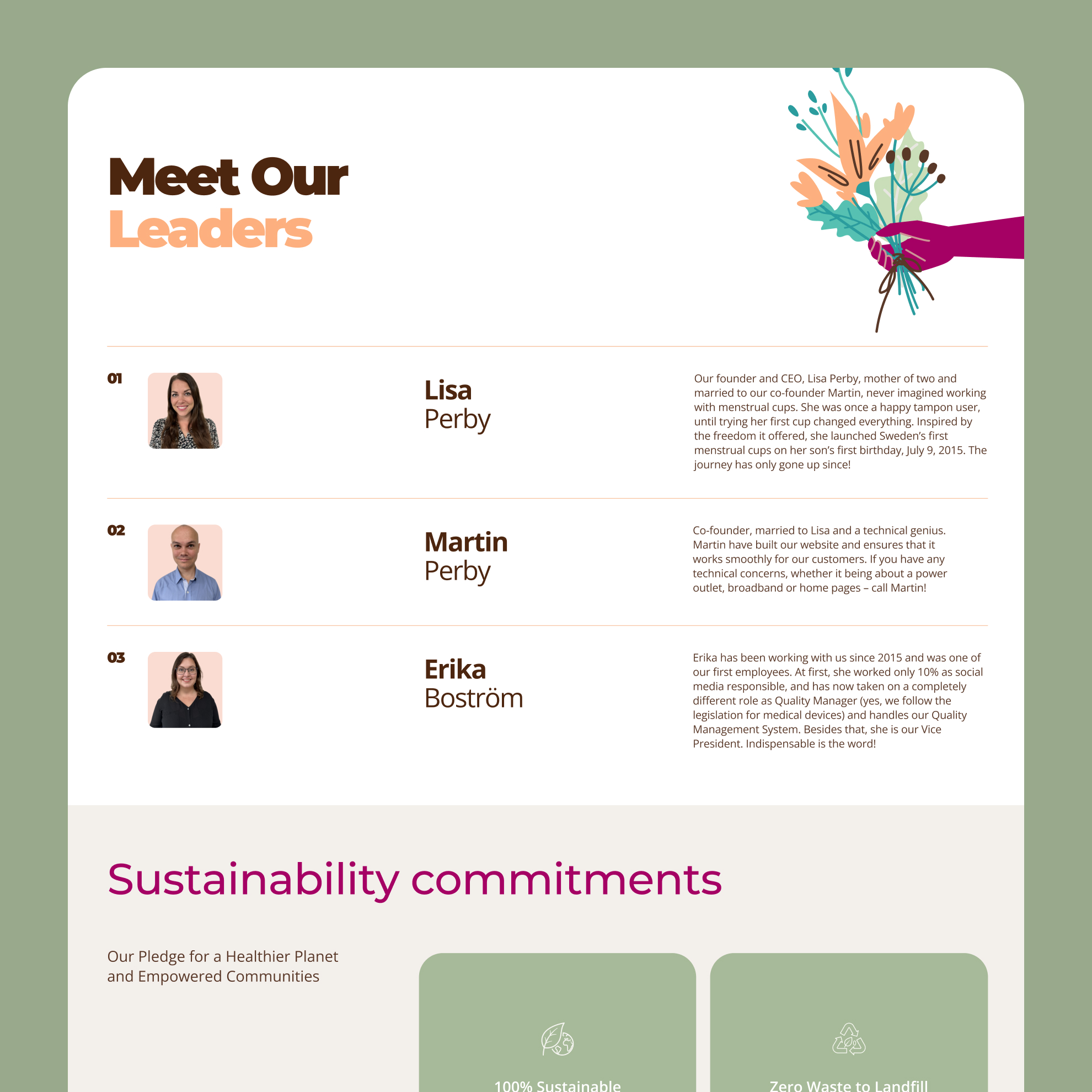
Building trust by putting a face to the brand. The "Meet Our Leaders" section uses a simple, clean layout to introduce the core team, adding a personal touch to the corporate site.