How atQuo built a marketing site that makes enterprise-grade financial services feel accessible

Client
PixelCrest Finance is a bookkeeping and financial advisory firm built for North American businesses that expect more than basic accounting. Their team brings over 25 years of finance leadership experience — from Fortune 500 corporations to growing startups — and delivers automated, insight-driven financial operations through a combination of intelligent tooling and human expertise. Their service stack spans automated bookkeeping, CFO-level advisory, accounting and financial insights, and integrations with platforms like QuickBooks, Xero, Dext, and A2X.
Description
PixelCrest Finance had a strong service offering and deep domain credibility — what they didn't have was a site that communicated either one clearly. atQuo came in to design and build the full marketing presence in Webflow: a site structured around three buyer profiles, a multi-tier pricing model, a network of service pages, and a consultation funnel designed to qualify leads before the first conversation happens.
The homepage as a layered trust argument – Pixel Crest
Segmenting three buyer types within a single page – Pixel Crest
A pricing page that helps the visitor self-qualify – Pixel Crest
Service pages built as standalone conversion surfaces – Pixel Crest
A footer that extends the conversion argument – Pixel Crest
The human layer that makes the service credible – Pixel Crest
The full integration stack, documented as a trust signal
A consultation form designed to qualify before the call – Pixel Crest
No items found.
The hero establishes positioning in a single pass, immediately followed by the integration logos that signal technical credibility — before the visitor has scrolled far enough to start asking questions.
The "Who we serve" tab structure lets startups, eCommerce brands, and professional service businesses each find a version of the pitch written specifically for their situation — without fragmenting the site into parallel tracks.
The expense slider reframes the pricing decision: instead of presenting three numbers and leaving the visitor to guess, it gives them a mechanism to understand which tier fits their business before they request a consultation.
Each service page functions independently — with its own hero, mechanism explanation, and call to action — so a visitor arriving from search lands in a page that addresses their specific problem without requiring them to navigate the full site.
The footer consolidates the full service map, the tool integrations, and the consultation CTA in a single surface — giving a visitor who reaches the bottom of any page a complete orientation and a clear next step.
In financial services, the team behind the numbers matters as much as the numbers themselves. The About page anchors the founding story, mission, and values to give the brand the human dimension that the rest of the site earns credibility from.
The integrations page works on two levels: it tells the visitor which platforms PixelCrest connects with, and it signals that their existing accounting and eCommerce tools are already part of the equation — reducing the perceived switching cost before the consultation even happens.
Rather than a generic contact form, the consultation entry point collects business type, expense volume, current accounting system, and main financial challenge — so the first conversation PixelCrest has with a prospect is already informed by the context that matters.

The brief

PixelCrest Finance operates in a category where trust is everything and the service itself is invisible — you can't demo bookkeeping the way you demo software. What you can do is communicate credibility precisely, structure your offer in a way that helps the right buyer self-identify, and design every surface of the site to reduce the friction between a business owner's first visit and their decision to book a consultation.

That was the job. PixelCrest came to atQuo with a clear service model and a team with real credentials, but without a digital presence capable of carrying the weight of either. The site needed to work for three distinct buyer profiles — startups and entrepreneurs, eCommerce and retail brands, and service and professional businesses — each with a different relationship to financial complexity and a different set of questions they'd arrive with.

What we built

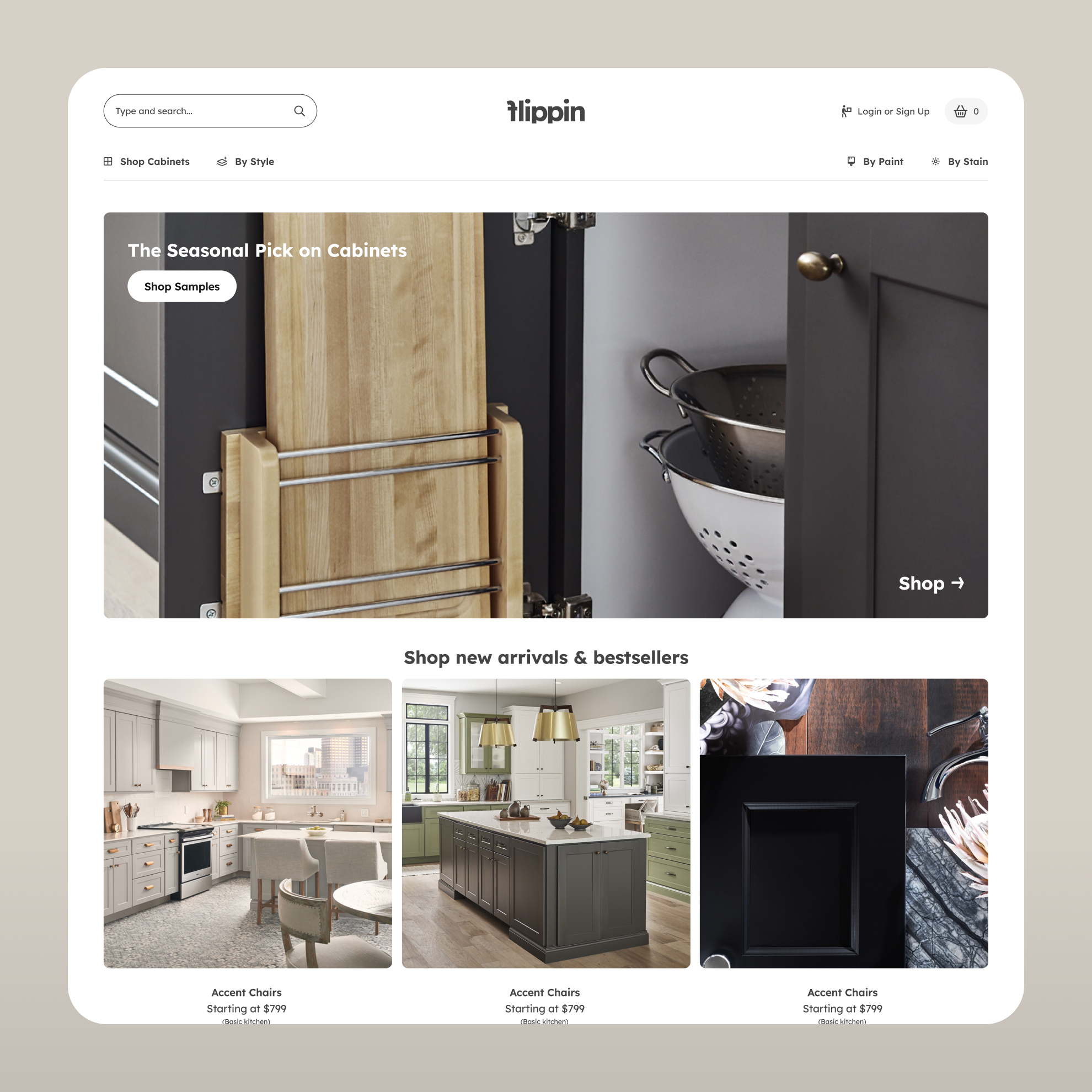
The homepage was designed as a sequential trust argument. The hero establishes the positioning in a single pass: smarter finance, real insights, human expertise. The social proof bar — a scrolling marquee of client logos — immediately follows. The features section maps the four pillars of the offering without burying the visitor in detail. The "Who we serve" section uses a tabbed layout to let each buyer profile self-select and read a version of the pitch written specifically for their situation.

The service pages were built as standalone conversion surfaces, not just subpages. Each one — Automated Bookkeeping, Accounting and Financial Insights, CFO-Level Advisory — has its own hero, its own explanation of the mechanism, its own call to action. A visitor arriving from search on a specific service lands in a page that speaks directly to their problem without needing to navigate the full site.

The pricing page carried one of the more interesting structural challenges. PixelCrest offers tiered monthly plans at CA$299, CA$499, and CA$699, but the right tier for a given business depends heavily on their monthly expense volume. We built a slider-based calculator that adjusts the pricing context dynamically based on the visitor's input — so the page doesn't just show numbers, it helps the prospect understand which plan actually fits their situation before they request a consultation.

The integrations section documents the full stack: accounting platforms on one side, business and eCommerce platforms on the other. For a financial services firm, this page does double duty — it demonstrates technical capability and signals to the visitor that their existing tools are already accounted for.

The consultation form was built as a structured qualification step rather than a generic contact form. It collects business type, monthly expenses, current accounting system, and main financial challenge — so the first conversation PixelCrest has with a lead is already informed by context, not starting from zero.

The About page anchors the human layer of the operation: the founding story, the mission, the values, and the visual evidence of the team behind the service.

The full site was designed and built in Webflow by the same atQuo team — no handoff, no translation loss between design and production.

Keep| reading, browsing, paging

Our case studies unite high-performance design and tangible results.
Ready to get started?

Deploy your stack

Whether you need to invent the future (Human Layer) or scale the present (Efficiency Layer), the infrastructure is ready.
[ Let's talk → ]

Need something else from the atQuo infrastructure?

Enter frontier layer
(You are here)
Relia
Integrated Teams