

Trivie needed a design and development partner for a full marketing site rebuild. The platform — AI-powered knowledge retention for enterprise training teams — had strong traction, real outcomes data, and a product that genuinely worked. What it needed was a web presence that could communicate all of that to a buyer who had thirty seconds of attention before deciding whether to keep reading.
The scope covered UI/UX design, front-end development, and full HubSpot CMS integration, including a specific requirement: a dynamic KPI personalization tool that let inbound leads interact with metrics relevant to their own business before talking to sales.
What started as a defined project became something longer. atQuo worked with Trivie across multiple engagements over the years — new pages, updated sections, feature launches, design system refinements, and implementation cycles that kept the platform's web presence in sync with a product that was constantly moving.
Enterprise SaaS buyers are skeptical by default. They've seen too many platforms that promise to solve problems and don't. So the job isn't just to explain the product — it's to build credibility fast, layer in the right amount of detail as trust accumulates, and make the path to a trial feel low-risk.
The secondary challenge was the CMS. Trivie's team needed to be able to manage and update the site without developer involvement. That meant building on HubSpot in a way that was genuinely flexible, not just technically compliant.
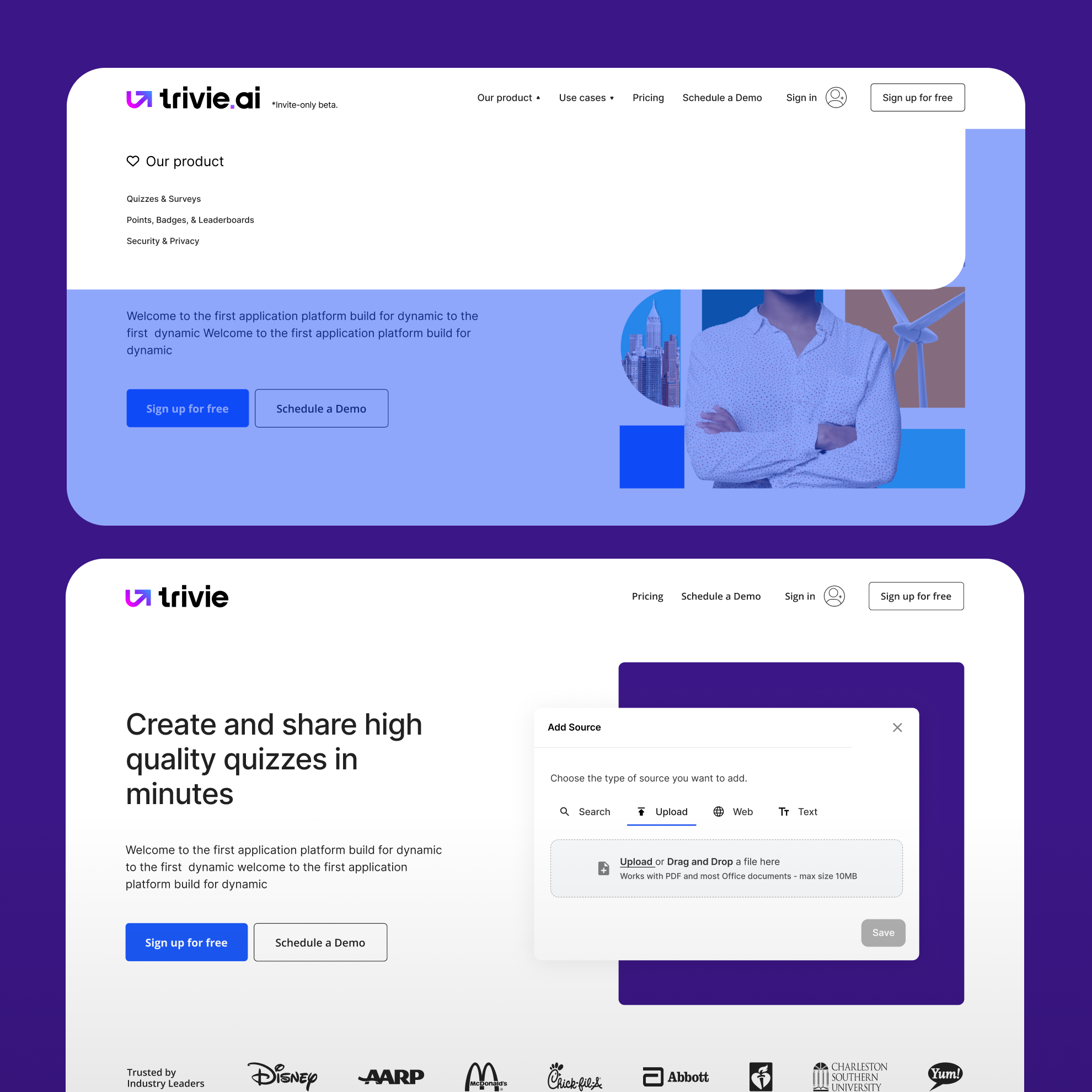
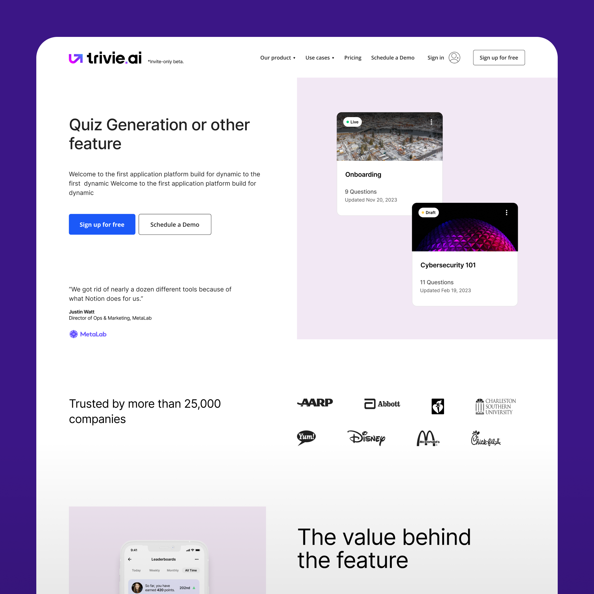
The hero section was designed to establish the value proposition and social proof simultaneously. Client logos and testimonials sit at the first scroll, not buried at the bottom — because for enterprise buyers, third-party validation matters before product explanation does. A preview of the dashboard gives the page immediate visual credibility.
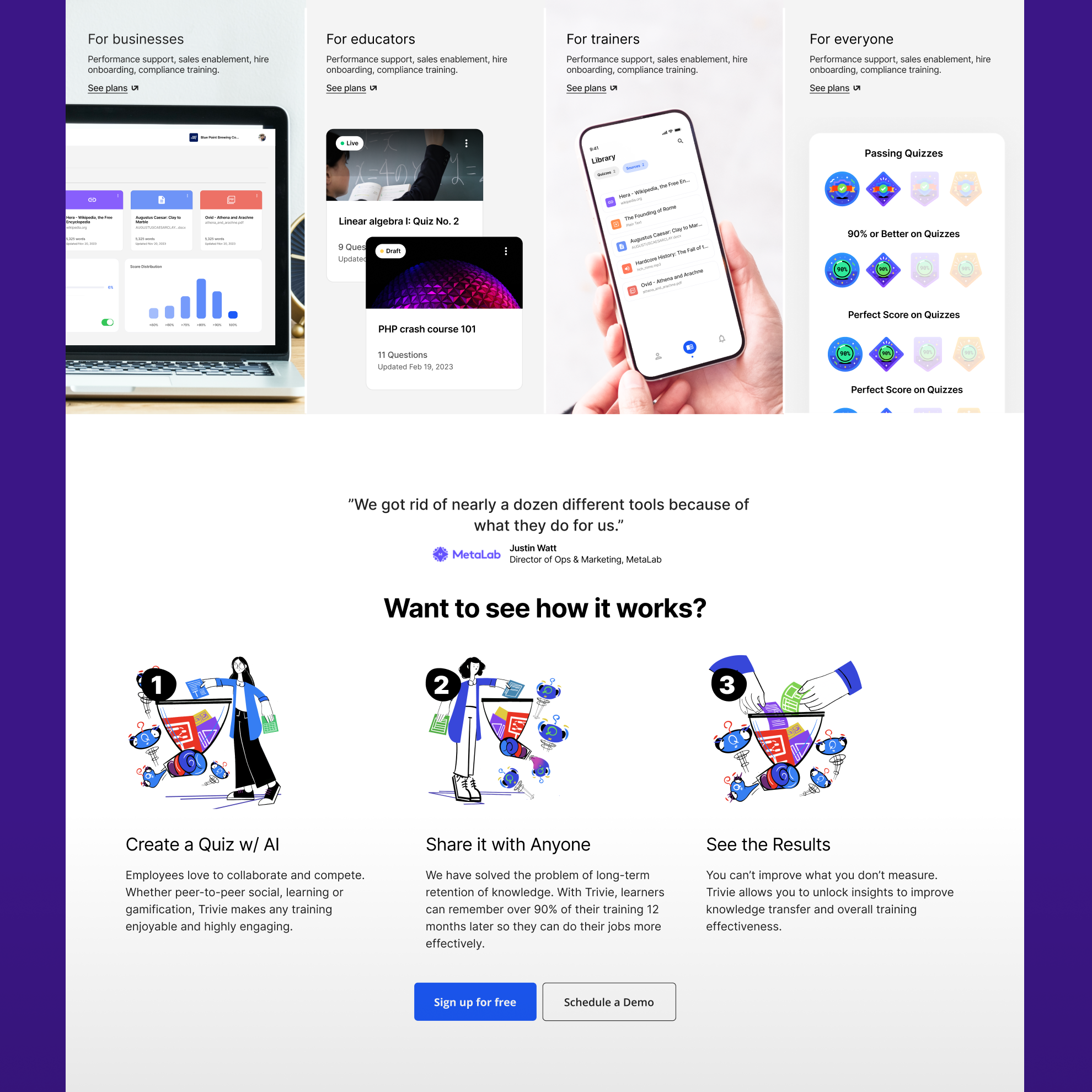
The use cases and how-it-works section was built around user personas rather than product features. The question a buyer asks isn't "what does this do" — it's "is this for someone like me." A three-step illustrated flow keeps the process explanation scannable without oversimplifying it.
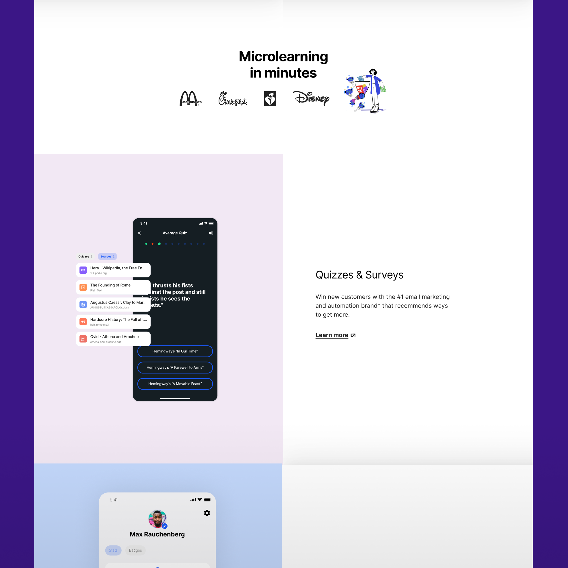
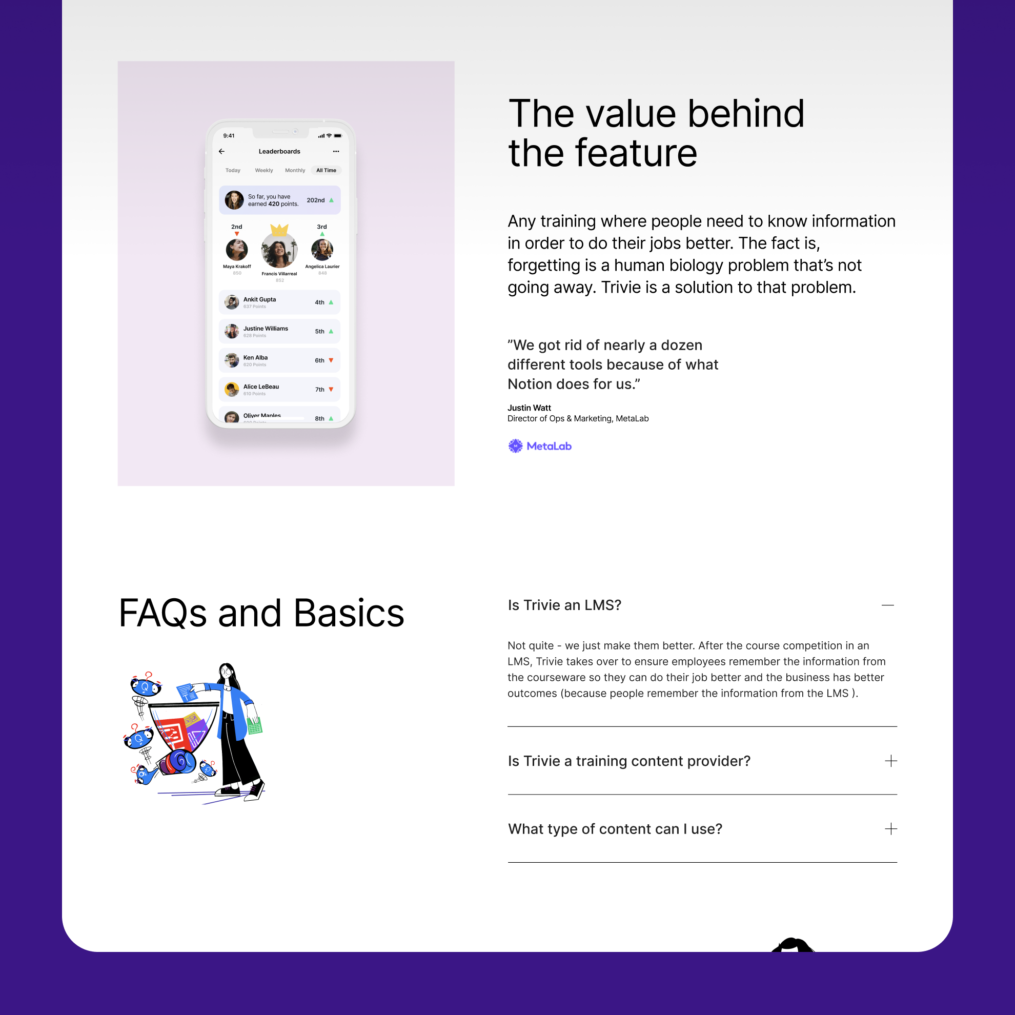
The microlearning section uses a split-column layout with mobile product mockups. For a platform that works on any device, showing the mobile experience early is both accurate and reassuring.
A full features grid was designed to be scannable rather than exhaustive — iconography and white space doing the organizational work so the feature density doesn't feel overwhelming.
The conversion sequence leads with a benefit-oriented headline and removes friction explicitly: no credit card required, social proof visible at the decision point. The HubSpot integration makes the form submission part of the same CRM workflow as the rest of Trivie's sales motion.
The work described here is a snapshot of a longer relationship. Trivie wasn't a project with a start and end date — it was an ongoing engagement that grew as the company did. Over the years, atQuo supported Trivie across multiple design and development cycles: new pages, updated sections, feature launches, design system refinements, and implementation work that kept the platform's web presence in sync with a product that was moving fast.
That kind of continuity changes how the work gets done. You stop re-explaining the product and start anticipating what it needs. The decisions get faster, the output gets tighter, and the relationship becomes less about briefing and more about knowing. By the time Trivie was acquired by Quantum5 in 2024, atQuo had been part of the team long enough to have contributed to more than a few of the touchpoints that made that outcome possible.
A complete HubSpot CMS site that gives Trivie's marketing team full content control and gives their buyers a clear, credible path from first impression to trial — with a dynamic KPI tool that makes the value proposition personal before a sales conversation starts. Delivered as part of a sustained partnership that lasted years and touched far more than a single launch.


.png)
.svg)

.svg)


.svg)
.svg)
.svg)


.png)


.png)