
Designing navigation bars for eCommerce sites presents unique challenges on both desktop and mobile. A common debate revolves around whether to prioritize a mobile or desktop-first UI approach. However, acknowledging the fundamental differences between mobile and desktop experiences suggests that each platform should be treated with a distinctly separate design strategy.
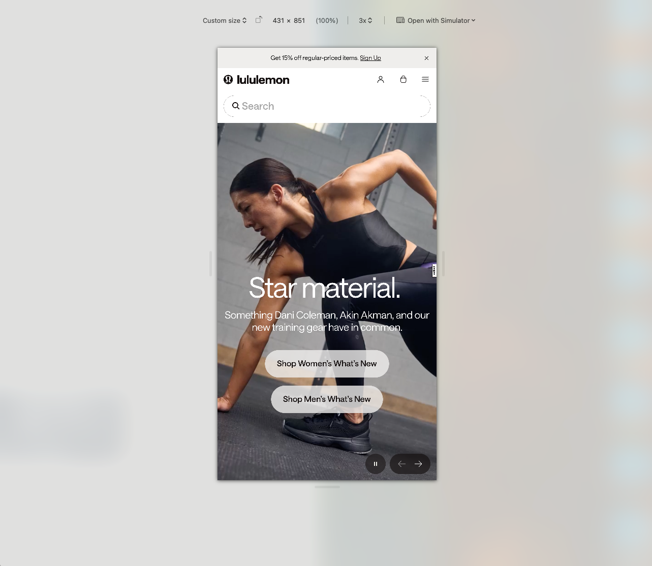
Mobile navigation prioritizes speed, relying on touch haptics (sacrificing precision) within a small vertical blueprint. Conversely, desktop environments favor in-depth browsing, offer mouse precision, and utilize a large horizontal space.
Here is a quick comparison on how a cluster of global sports titans are approaching their navigation for mobile.


Thesis: these brands are not just shrinking their desktop sites for mobile; they are fundamentally changing the interaction model and information architecture based on the device.
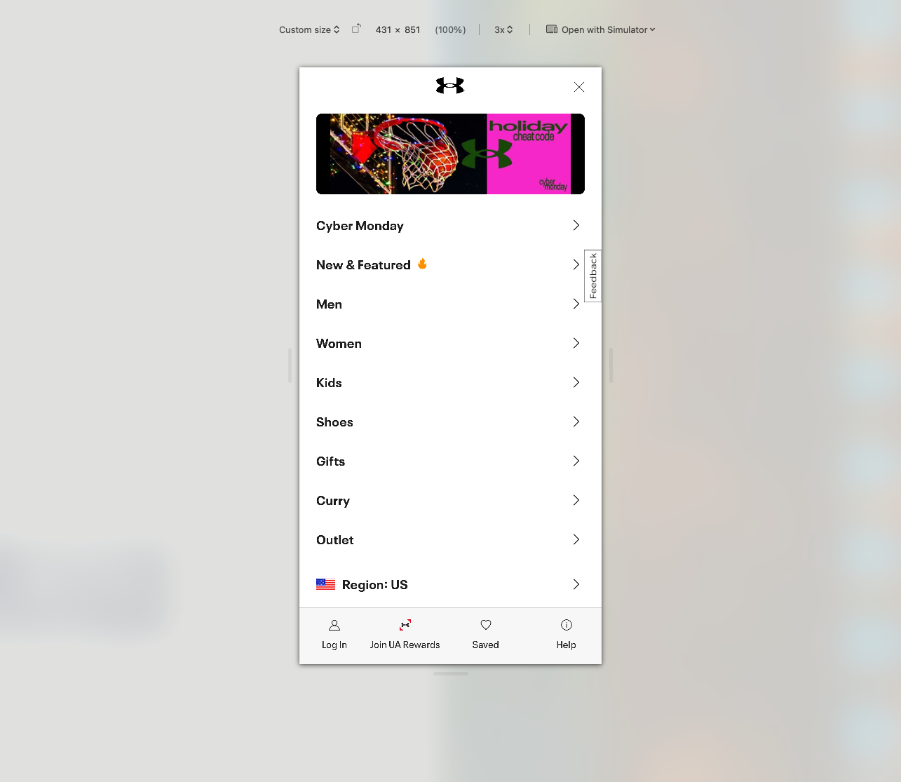
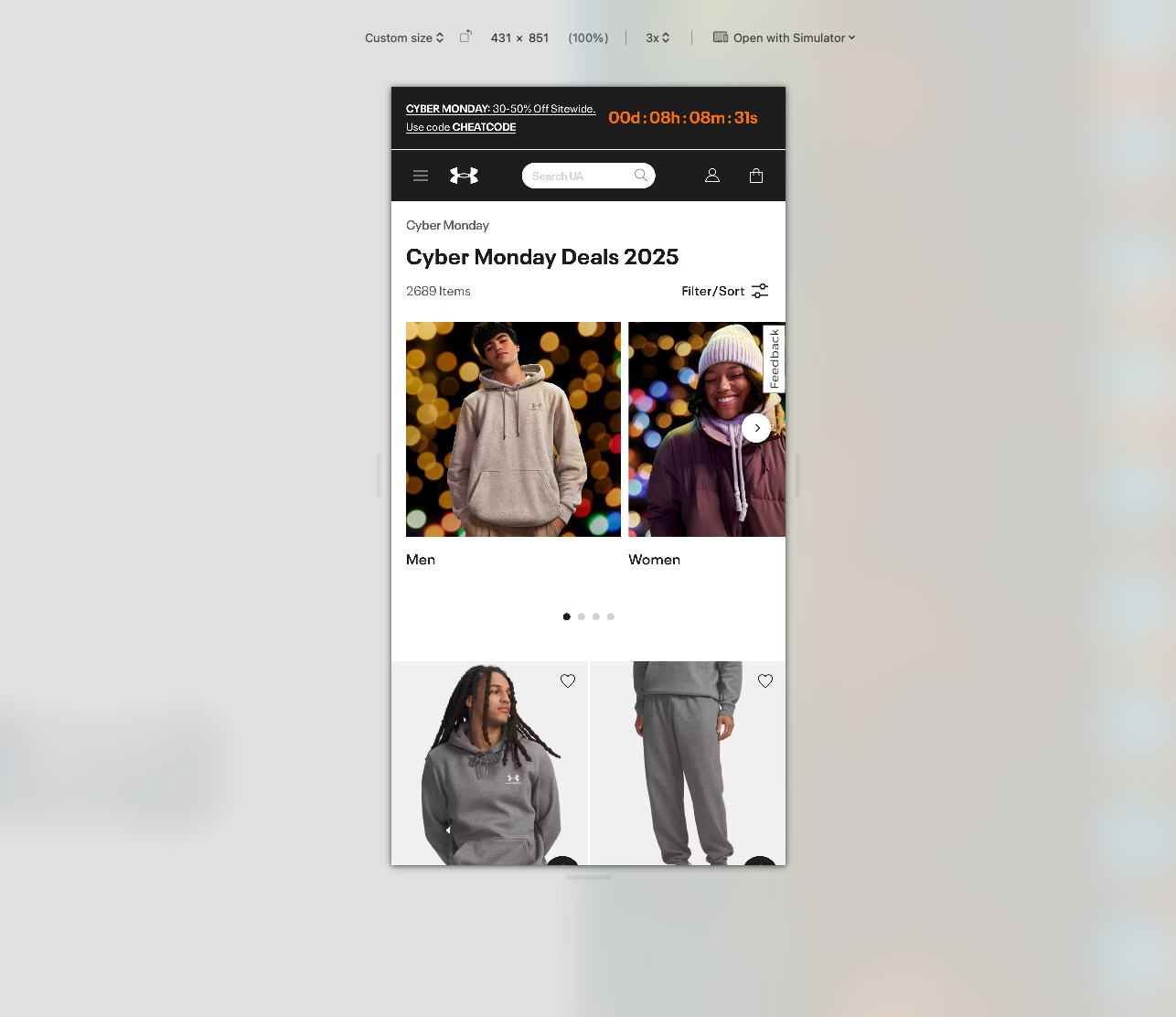
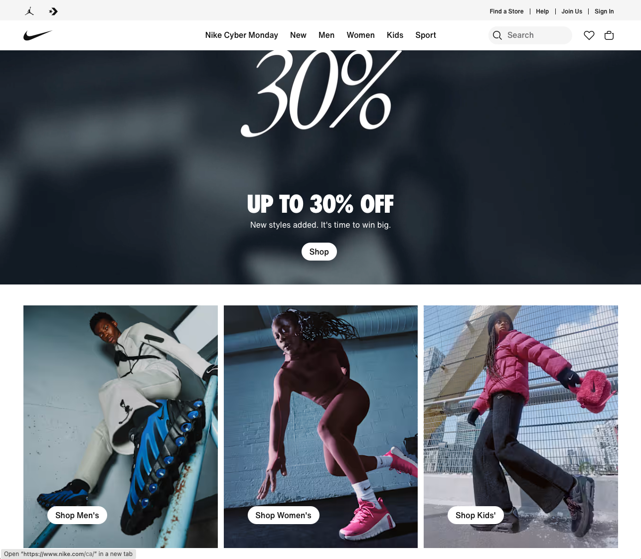
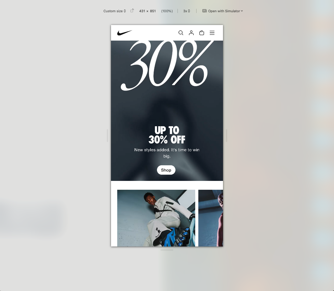
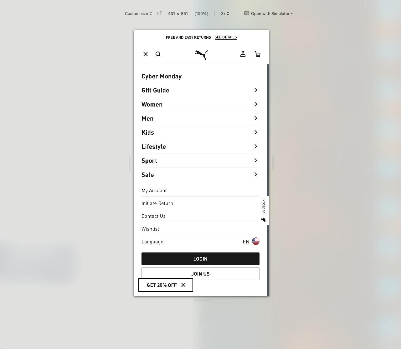
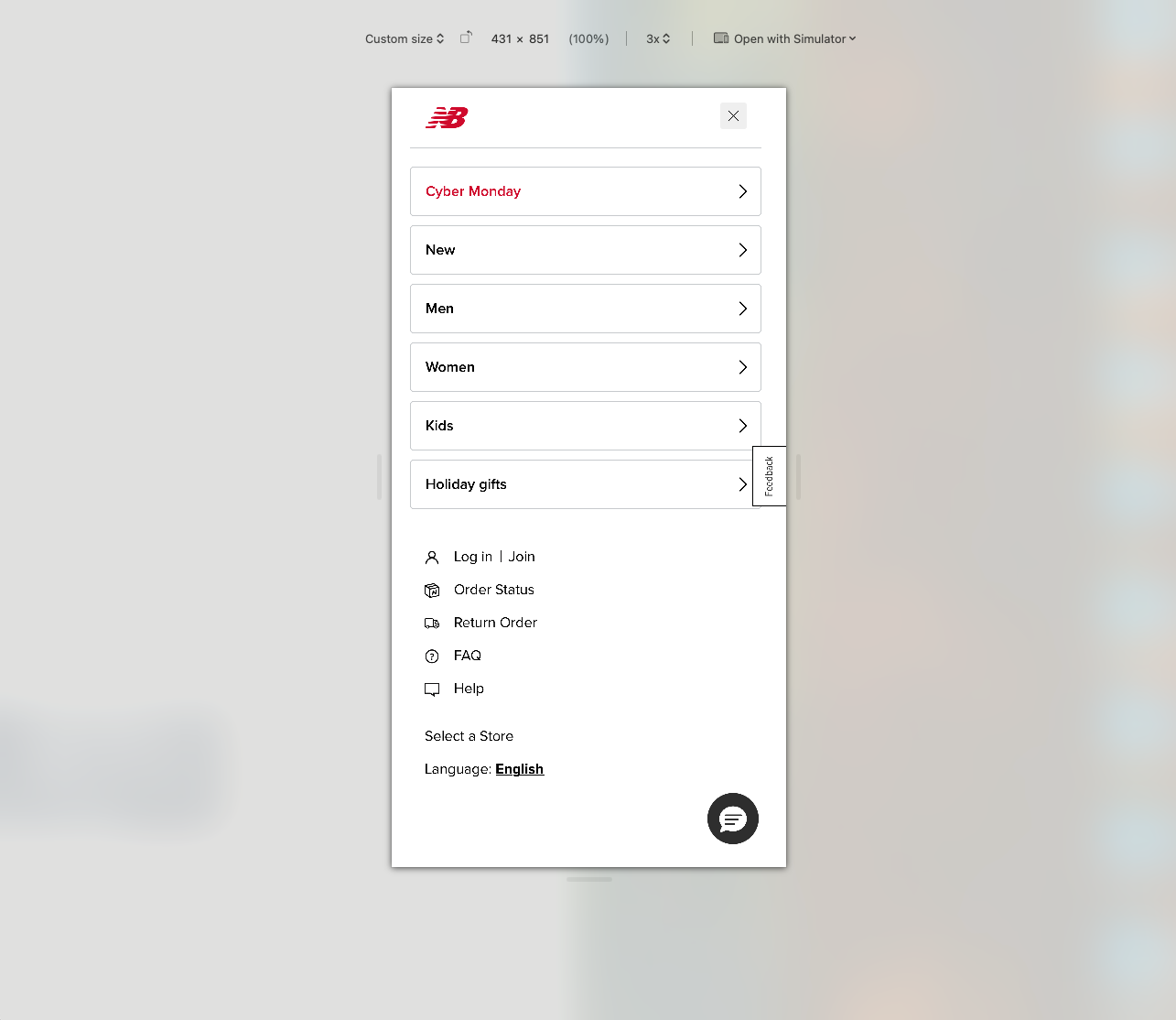
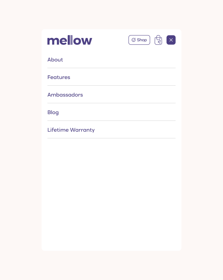
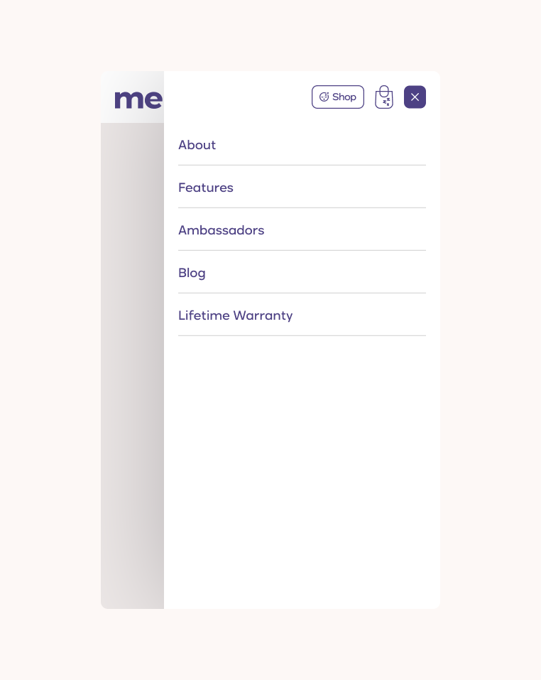
Take aways: the mobile nav can show by default nothing more than the brand’s logo (which links to the homepage), a CTA button, the bag/cart icon, and the menu icon that opens a drawer with more links. The menu icon can be either placed at the right or left, although the right side appears with a higher frequency for the cases studied. The latter also makes sense with the majority of the population being right handed. The drawer can either occupy the full screen or about 70 percent of it: we can go either way and be safe in our choice.
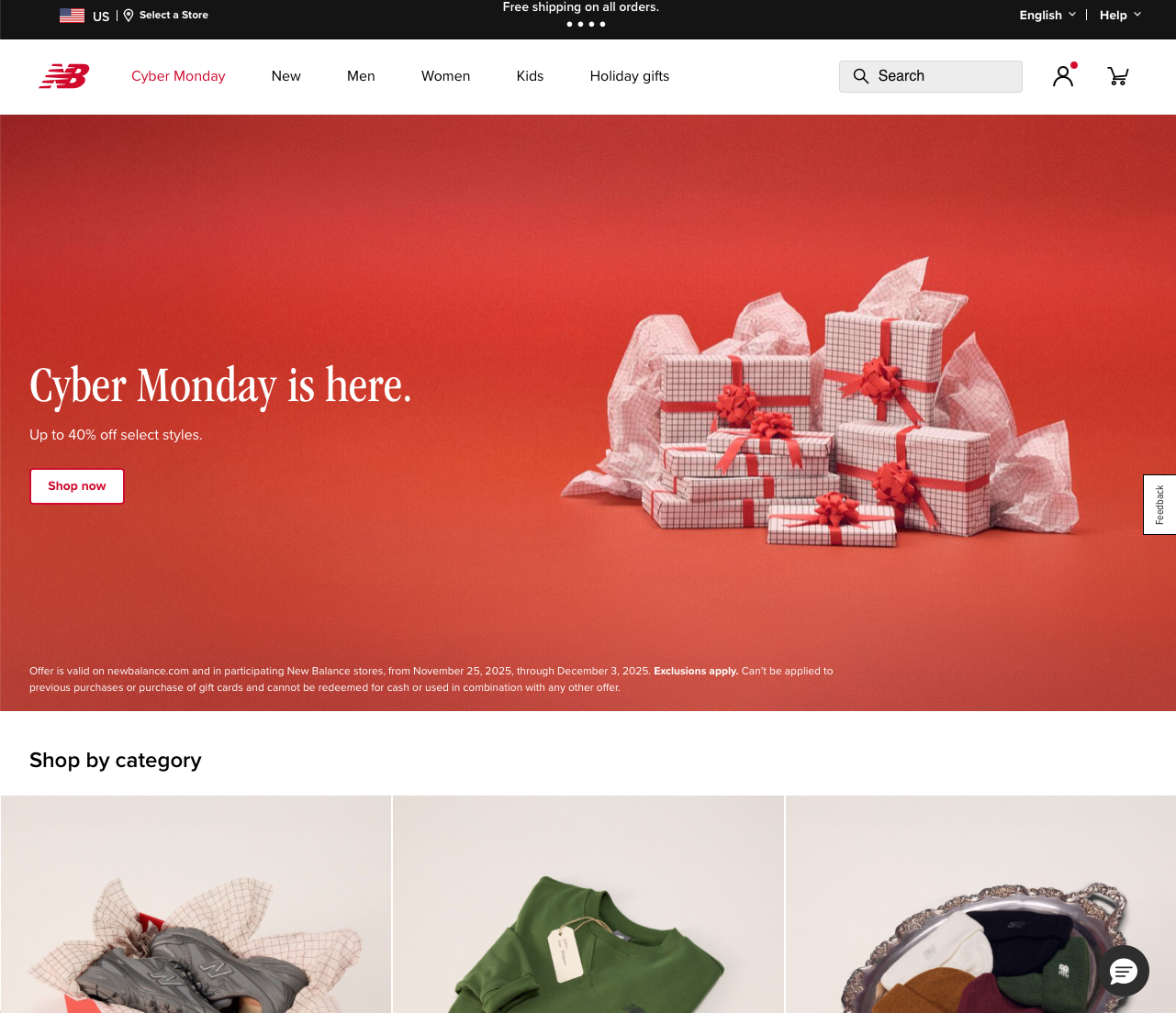
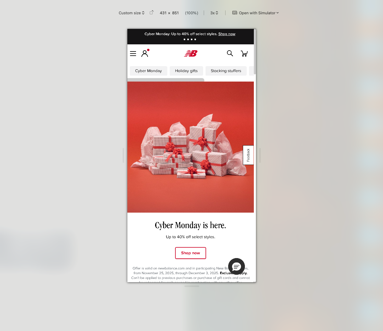
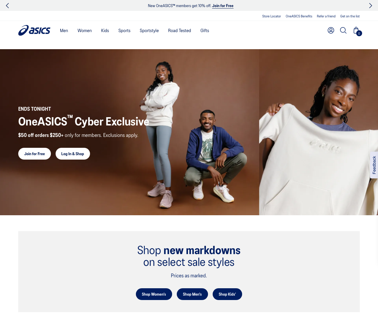
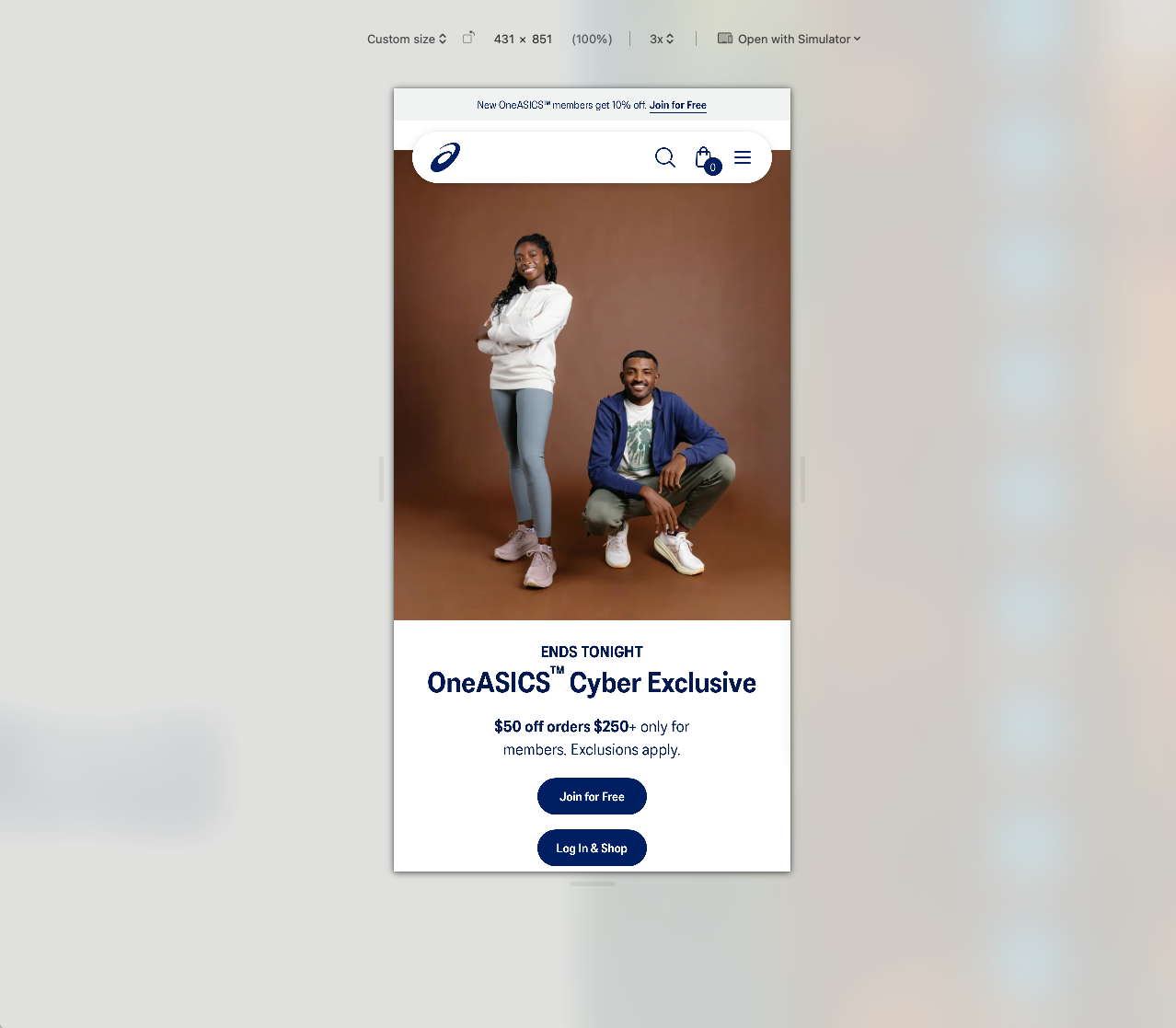
Mobile navbar, default:

Mobile navigation drawer, full screen:
Mobile navigation drawer, non-full screen:
A comparison:


.png)
.svg)

.svg)


.svg)
.svg)
.svg)


.png)


.png)


