Working on a customized template for a Shopify Store

Client
Ginjan is a Harlem-based beverage company founded by brothers Mohammed and Rahim Diallo, who are bringing traditional West African drinks to a global audience. Inspired by the ginger-based "ginjan" juice of their childhood in Guinea, they have created a celebrated line of cold-pressed juices and coffees that are "Born of Africa, Made in New York." The brand is deeply rooted in culture and community, having grown from a street cart to stocking shelves at Whole Foods and opening its own Harlem cafés.
Description
Ginjan Bros is a Harlem-based beverage company founded by brothers who brought traditional West African ginger drinks from Guinea to New York — from a street cart to Whole Foods shelves and their own cafés. The brand has a clear identity, a real origin story, and a product line that spans cold-pressed juices, coffees, and merchandise. The job was to take a design by The Bright Republic and turn it into a fully working Shopify store, built with Liquid and Tailwind CSS, flexible enough for a marketing team to manage without developer dependency.
Ginjan - Merchandise Product Grid
Ginjan - E-commerce Product Lineup
Ginjan - Product Detail & Cross-Sell
Ginjan - Product Page UI
Ginjan - "About Us" Storytelling Section
Ginjan - Brand Story & Timeline
Ginjan - Homepage CTA & Footer
Ginjan - Blog & Featured Articles
Ginjan - Content Hub & Newsletter CTA
Ginjan - Article Page Design
Ginjan - Café Landing Page
No items found.
A clean and modern product grid showcasing Ginjan's merchandise. The design uses ample white space and consistent "Learn More" and "Box" CTA buttons to create an uncluttered, premium shopping experience that is easy to navigate.
The primary e-commerce section for Ginjan's beverage and coffee products has a UI design that highlights the entire product family with vibrant imagery and clear pricing, utilizing consistent layouts for each item to ensure a cohesive and scannable shopping experience.
The product detail page for the Kakoulima Tumbler has a design that features a prominent product image, clear purchasing options, and a "You may also like" section that effectively cross-sells related products, driving further engagement and sales.
The product page UI for a 12-pack of Ginjan's drinks has a design that prioritizes conversions with clear one-time purchase and "Subscribe & Save" options, supported by benefit-driven icons and detailed nutritional information to build customer confidence.
The created "About Us" page uses powerful imagery and typography to tell the brand's origin story: the design conveys an emotional connection by weaving a compelling narrative with a visually engaging, timeline-style layout.
We coded the design for a unique layout on the brand's story, combining a detailed narrative with a clean, minimalist timeline of company milestones. This design effectively communicates Ginjan's journey and achievements, building brand authenticity and trust.
As a highlight on the small details: the lower half of the homepage is designed to drive action: The "World, meet Africa. Again." headline is paired with a clear "Take Your First Sip >" call-to-action, leading into a comprehensive, well-organized footer with newsletter signup and social links.‍
The design for Ginjan's blog and content hub uses a strong visual hierarchy with a large featured article and a grid of smaller cards below, creating an engaging and easy-to-browse experience for readers.
A content-rich section of the website showcase cocktail recipes and featured stories under a design that uses a visually appealing card-based layout and incorporates a bold, patterned newsletter signup form to capture leads effectively.
A clean and immersive article page design prioritizes readability with a strong hero image, clear typography, and social sharing icons, creating a seamless experience for users engaging with the brand's content.
The landing page for the Ginjan Café is designed for local customers: The UI immediately presents the three most critical user actions—Order Delivery, View Menu, and Get Directions—in a prominent action bar. This user-centric approach, combined with vibrant food photography, aims to drive online orders and foot traffic.

The brief

Ginjan Bros came to atQuo with a design already in hand — created by The Bright Republic — and needed a development partner to bring it to life in Shopify. The scope covered the full site: ecommerce pages, brand content, a café section, and a blog. The build had to be flexible enough for a marketing team to manage independently, which meant the architecture decisions mattered as much as the visual output.

The technical approach

The theme was built using Shopify's Liquid templating language and JSON templates, styled with Tailwind CSS. This combination gave the site a clean separation between structure and content — sections are modular, content is editable through the Shopify admin, and adding or rearranging pages doesn't require touching code.

For a brand that moves as fast as Ginjan — new products, seasonal campaigns, café updates, editorial content — that kind of autonomy isn't optional. It's the difference between a site that keeps pace with the brand and one that creates a bottleneck.

What we built

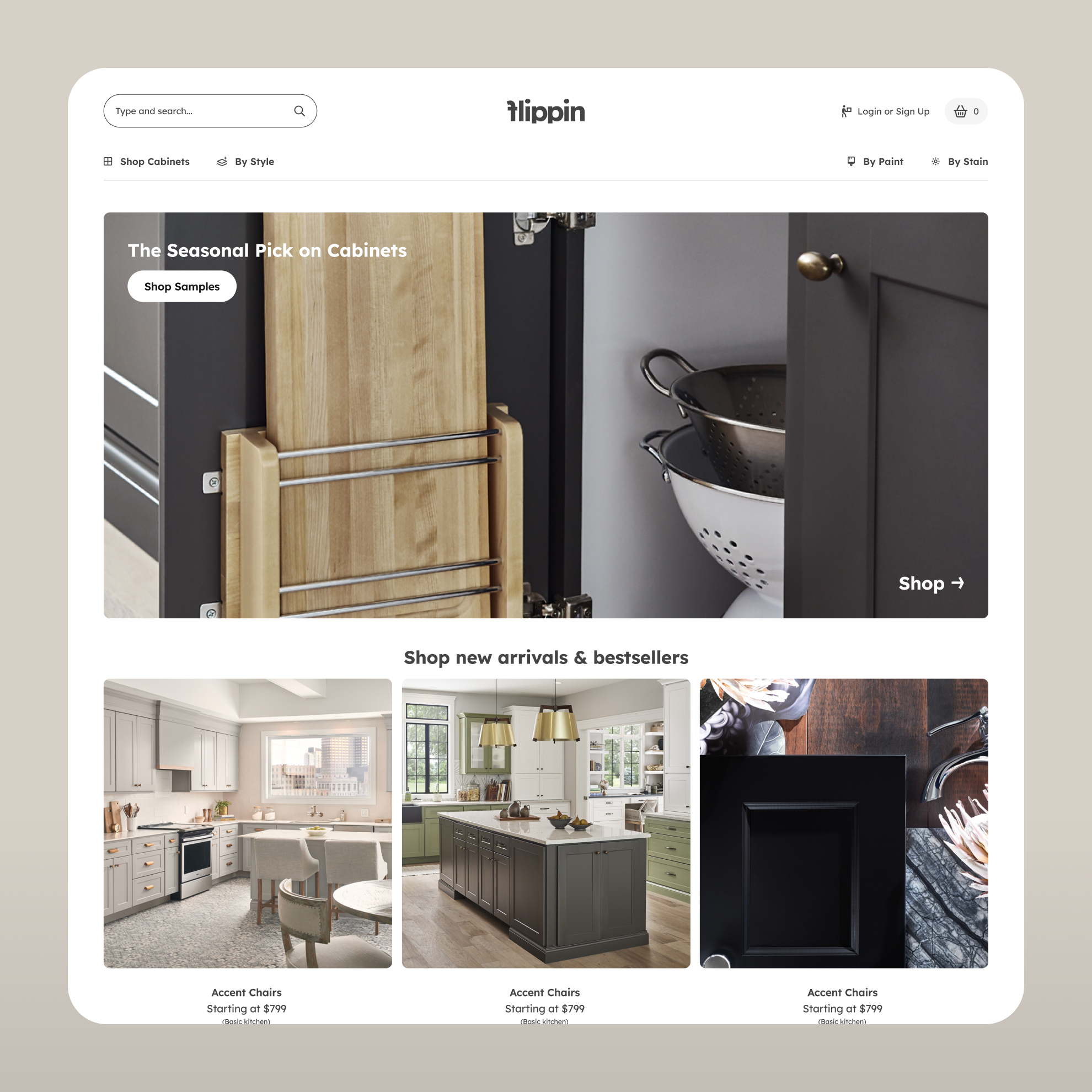
The product catalog covers both beverages and merchandise, each with consistent grid layouts that make browsing easy without flattening the brand. Product detail pages include subscription and one-time purchase options, nutritional information, and cross-sell sections that keep customers moving through the catalog.

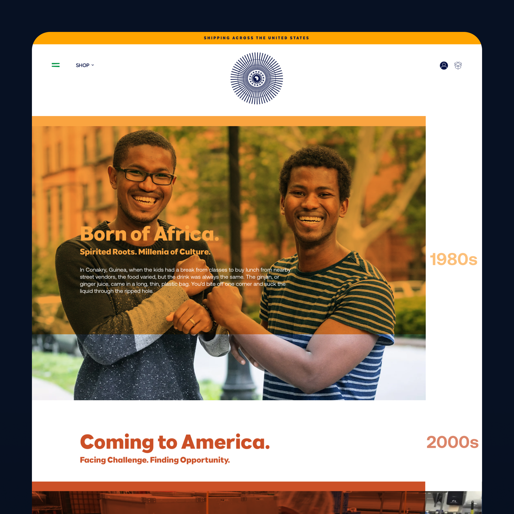
The About Us section was built to carry the full weight of the Ginjan origin story — the brothers, Guinea, Harlem, the street cart, the growth. A timeline layout organizes the milestones without making them feel like a press release. The design uses photography and typography to let the story do the work.

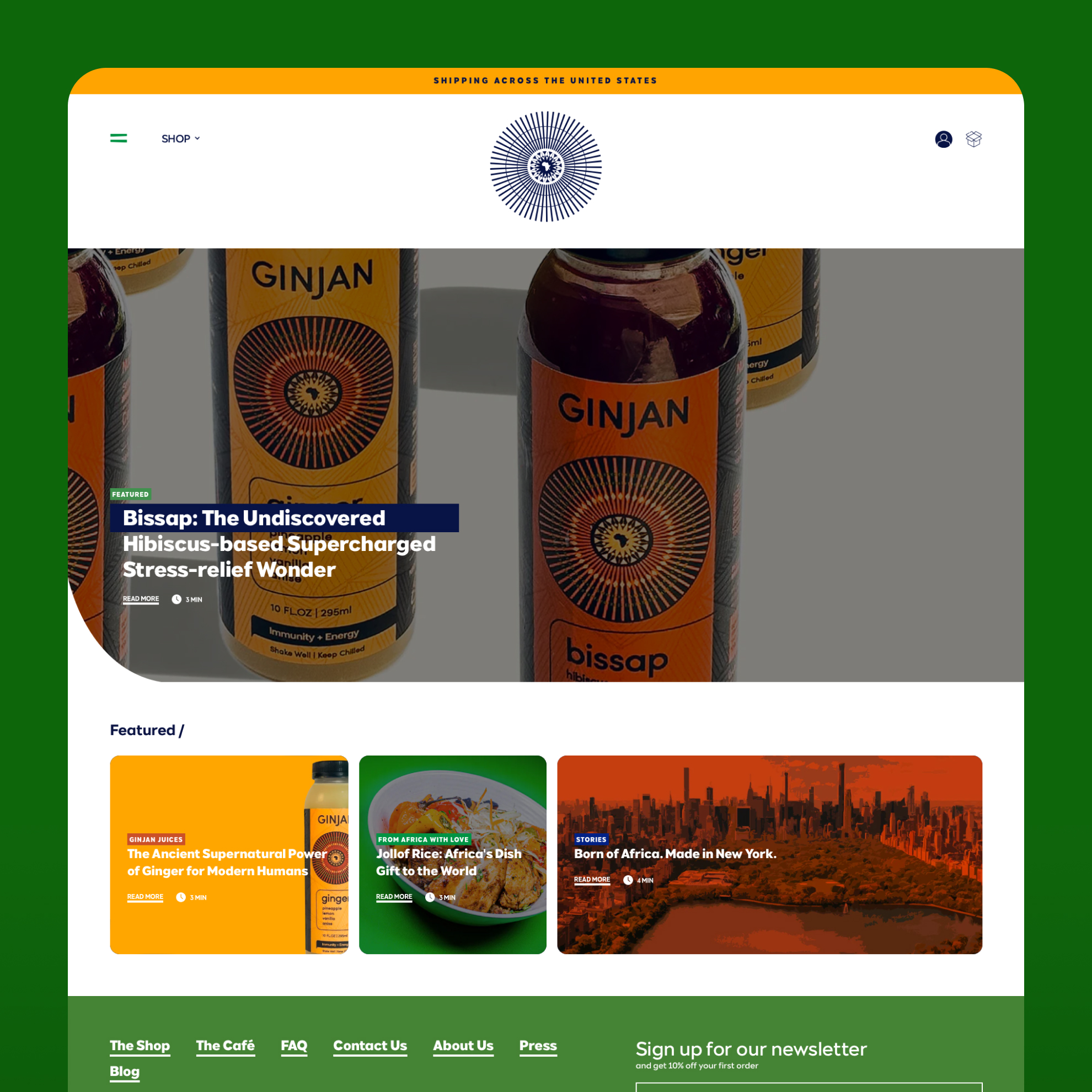
The blog and content hub was built with a featured article format and a card grid below it, structured for both editorial content and cocktail recipes. A newsletter signup with a distinctly Ginjan visual treatment sits within the content section rather than as an afterthought.

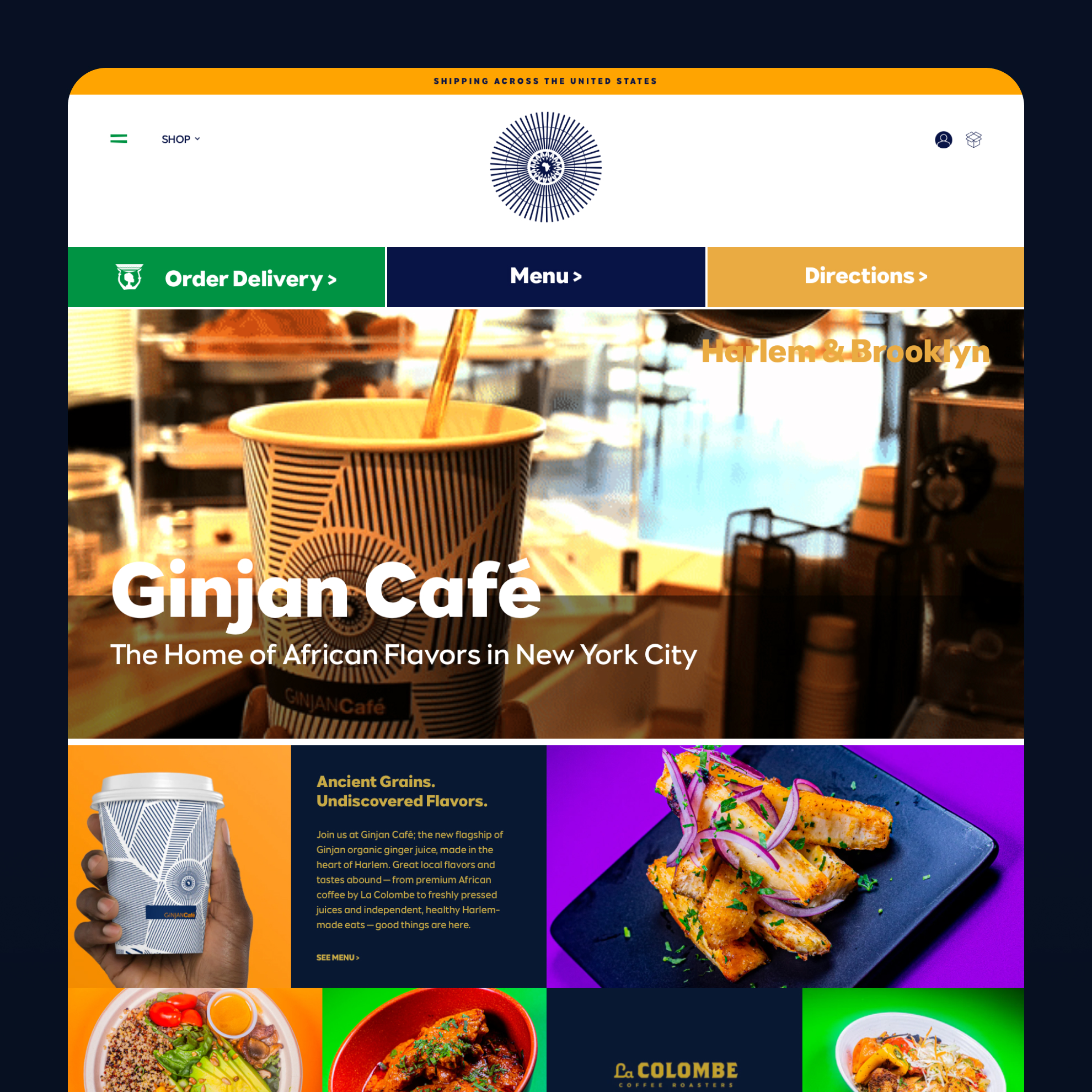
The café landing page is built around action: an immediate bar with delivery, menu, and directions CTAs, supported by food photography. For a physical location, the page's job is to move people from screen to door as quickly as possible.

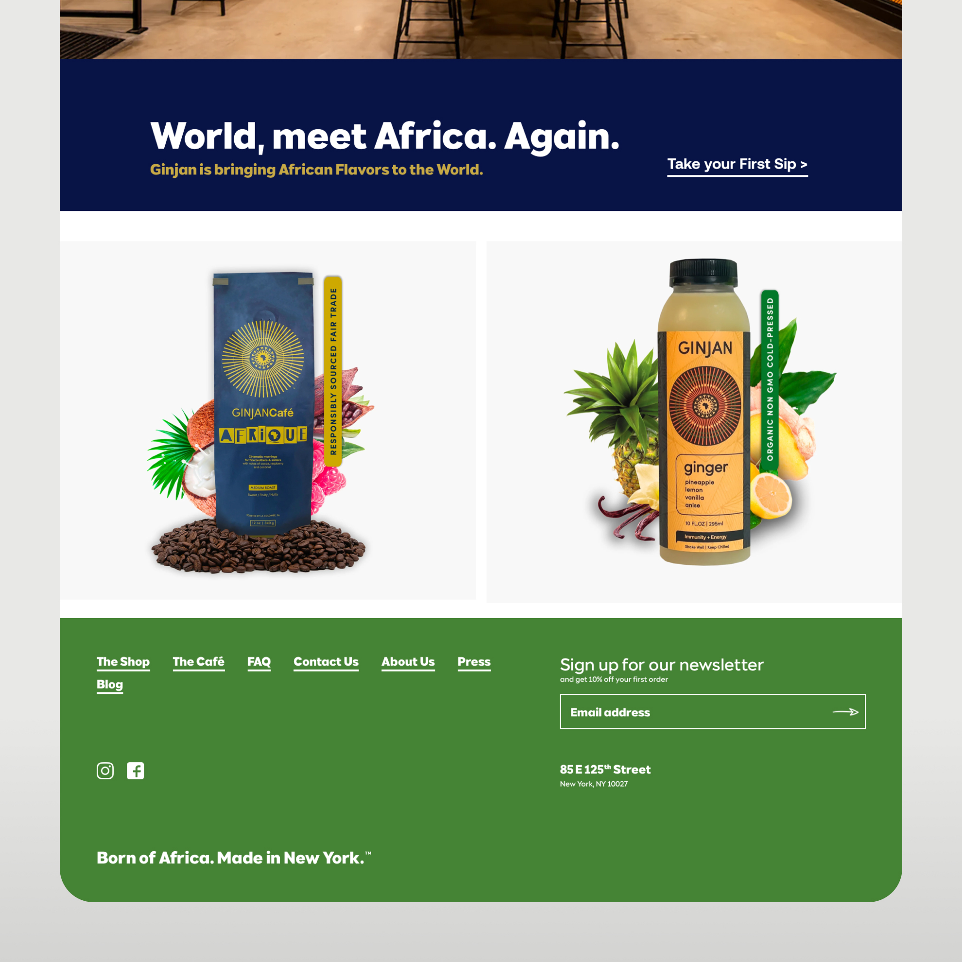
The homepage closes with a CTA section anchored by "World, meet Africa. Again." — the brand's voice at its clearest — leading into a footer with social links and newsletter capture.

The outcome

A fully functional Shopify store that executes the original design faithfully and gives Ginjan's team the tools to keep the site alive without outside help. The brand story, the commerce, and the café experience all live under the same system — and the team can update any of it on their own.

Keep| reading, browsing, paging

Our case studies unite high-performance design and tangible results.
Ready to get started?

Deploy your stack

Whether you need to invent the future (Human Layer) or scale the present (Efficiency Layer), the infrastructure is ready.
[ Let's talk → ]

Need something else from the atQuo infrastructure?

Enter frontier layer
(You are here)
Relia
Integrated Teams