Series
Work
• 
Making
Client
Talent Pronto
Read time
00h10m

Enhancing visual hierarchy: a strategic redesign of the applicant interface

In brief

The original layout treated applicant data like a spreadsheet: functional, dense, and forgettable. The redesign reorganizes that same data into grouped cards with serif typography, an earthy palette, and generous spacing — shifting the interface from administrative tool to premium product. Key metrics like AI scores and screening status are surfaced with deliberate hierarchy, making the candidate review process feel focused rather than overwhelming. The byproduct of getting the UI right was a visual strong enough to use as a homepage hero — a practical reminder that well-designed product UI is also marketing material.

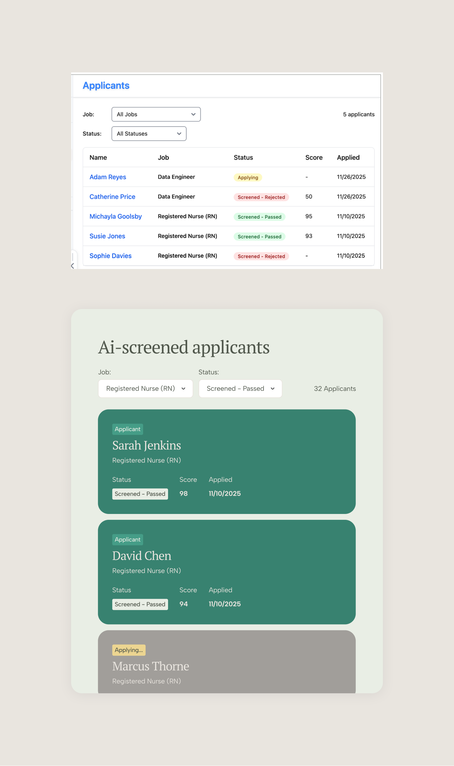
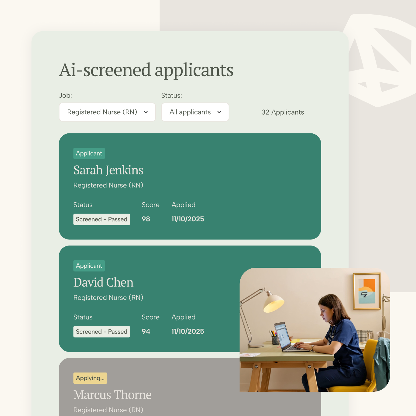
The visual comparison illustrates a dramatic UI modernization, shifting from a utilitarian, spreadsheet-style table view to a sophisticated, card-based interface designed for enhanced readability and user engagement. While the "Before" layout prioritizes data density via a standard administrative grid, the "After" design adopts a contemporary aesthetic with elegant serif typography, a softer earthy color palette, and generous spacing that significantly elevates the content's perceived value. This transformation improves visual hierarchy by grouping applicant data into digestible modules, strategically highlighting key metrics such as AI scores and screening status to make the candidate review process feel more intuitive, focused, and premium.

Before and after.

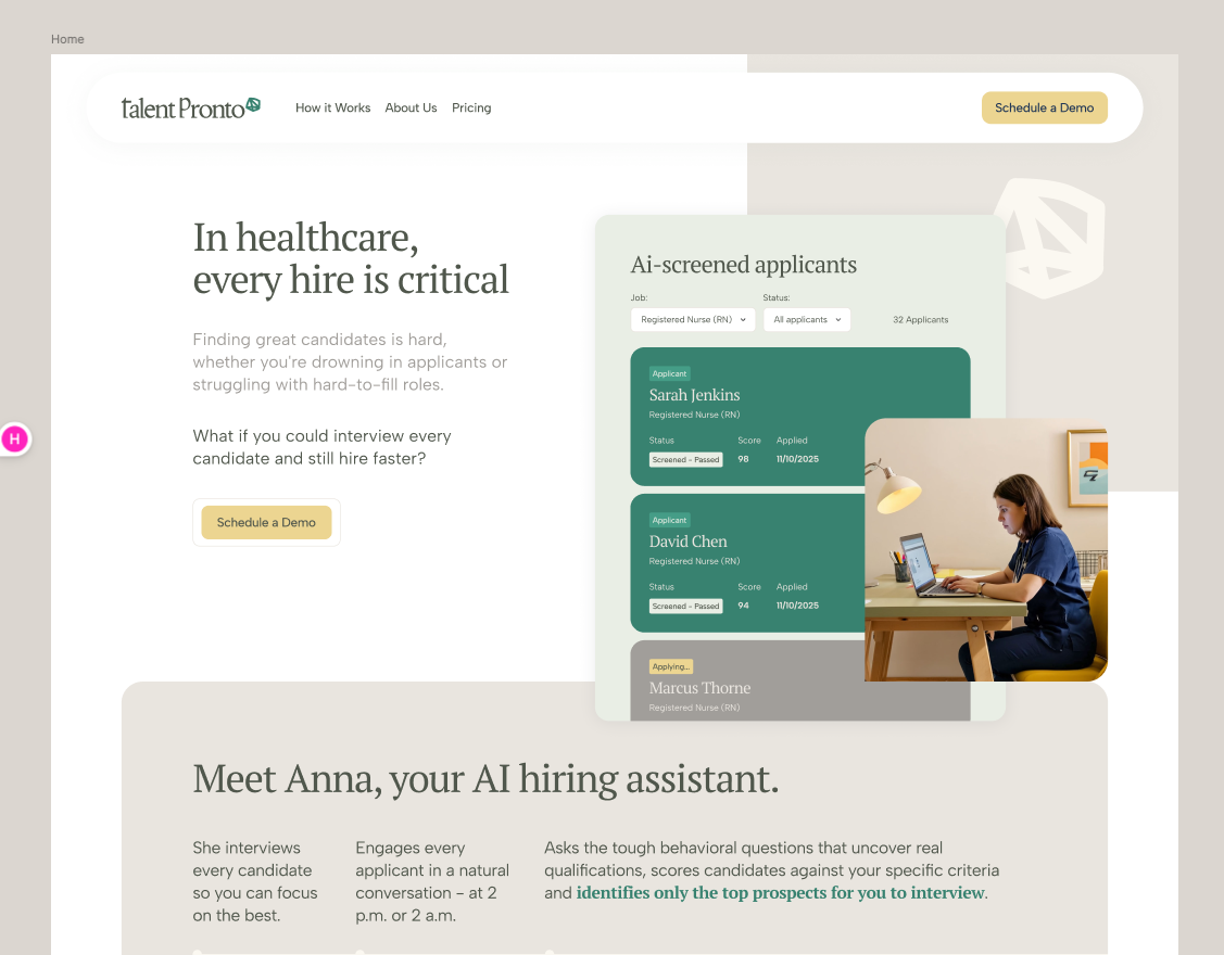
That allows us to get the homepage hero section to dress with a great visual. The visual for such an interface looks like this:

More on our work
Browse all
Ready to get started?

Deploy your stack

Whether you need to invent the future (Human Layer) or scale the present (Efficiency Layer), the infrastructure is ready.
[ Let's talk → ]

Need something else from the atQuo infrastructure?

Enter frontier layer
(You are here)
Relia
Integrated Teams