MOS Website, www.mosweden.com, https://www.mosweden.com


Monthly of Sweden came to atQuo with a structural problem. They had built a portfolio of genuinely strong brands — MonthlyCup, Imse, Boob — each with its own identity, audience, and product focus, all united by a commitment to sustainable, eco-conscious living. What they didn't have was a digital home that could hold all of it coherently.
The ask was a Webflow site designed and developed from scratch: a unified brand group platform that served consumers, investors, and the press simultaneously, and gave the MOS team the ability to manage content independently without creating a development bottleneck every time something needed to change.
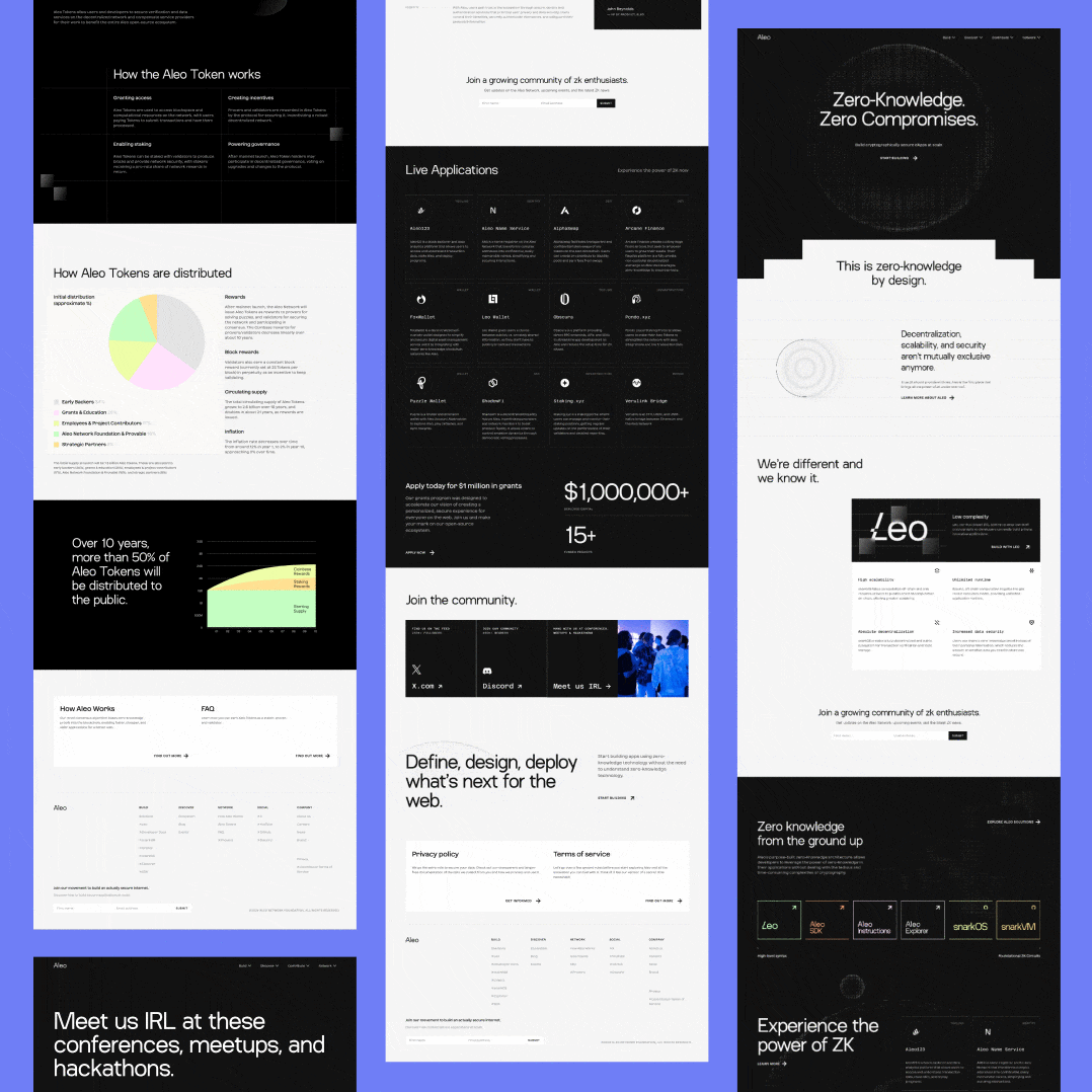
Brand group sites fail in one of two directions. Either everything gets merged into a visual soup where nothing has its own character, or the sub-brands feel so separate that the group itself has no identity. The design task was threading that correctly — building a shared visual language warm enough to carry the sustainability mission, with enough flexibility for each brand to have its own moment.
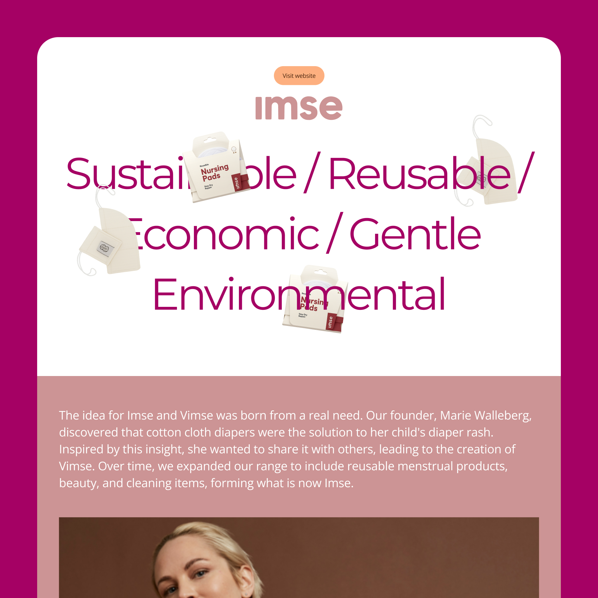
The earthy palette and clean typography establish the MOS group-level character. The brand pages for Imse, Boob, and MonthlyCup each have their own treatment — different heroes, different tone — while remaining clearly part of the same family.
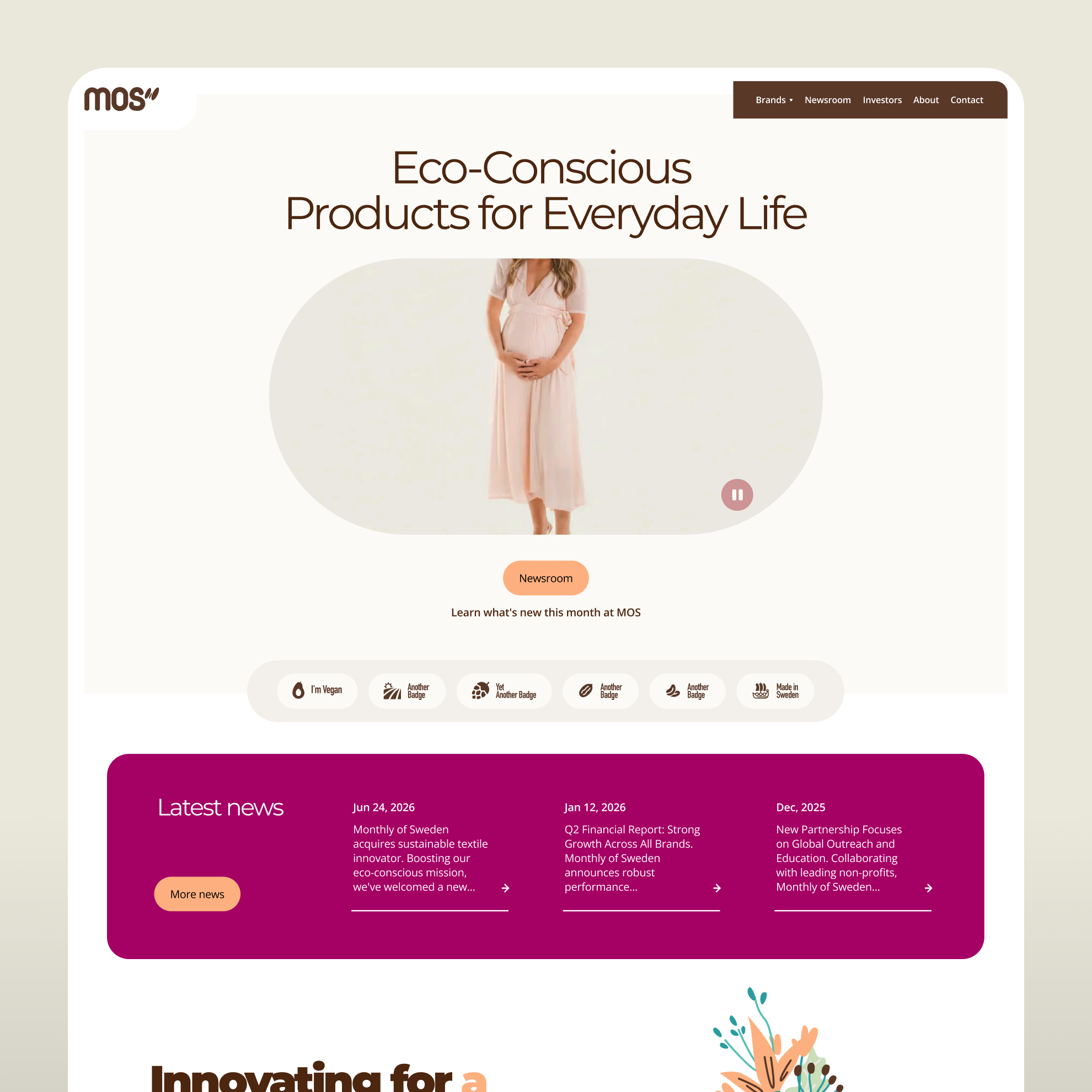
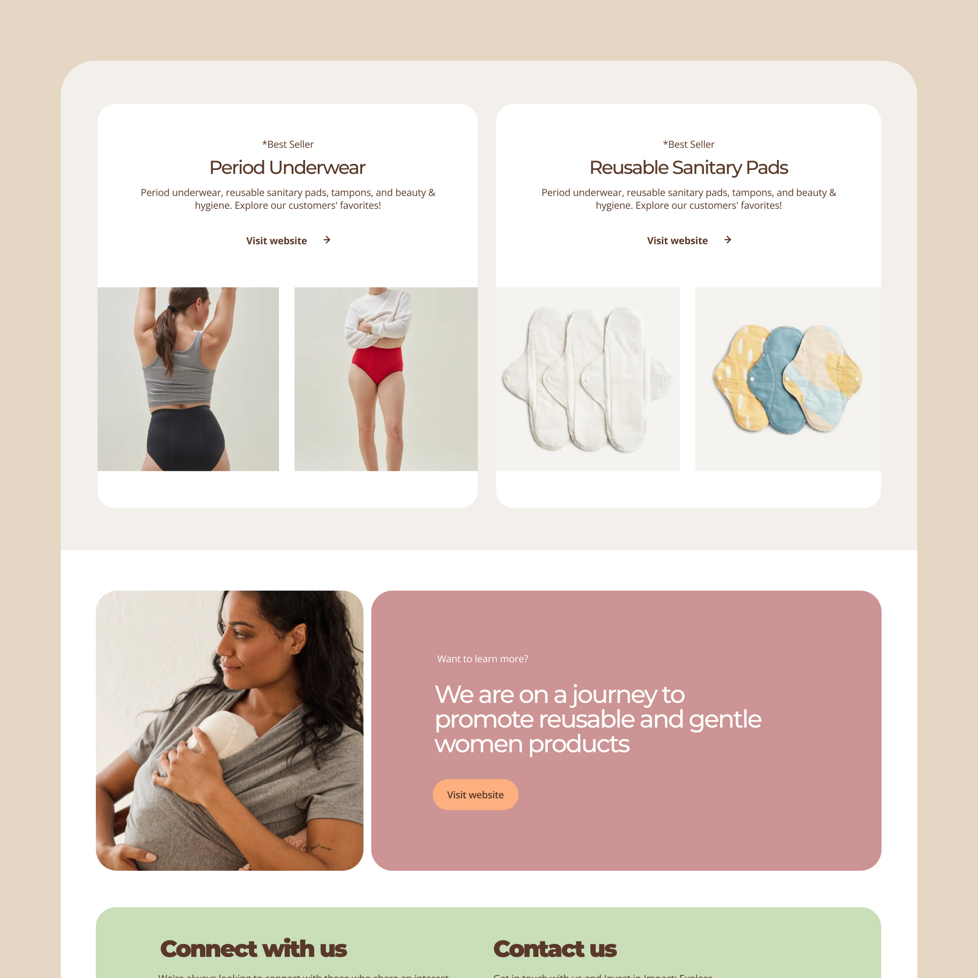
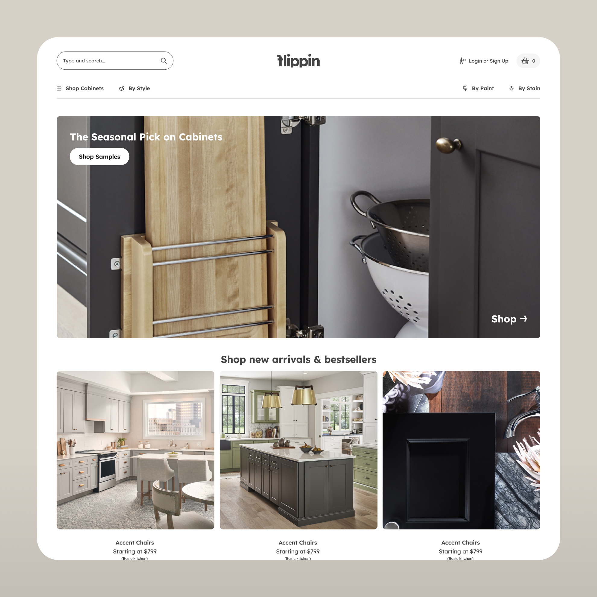
The homepage sets the mission immediately and moves visitors toward the brand they're looking for. The sub-brand section introduces all three with enough context to orient without overwhelming, using a card structure that lets each brand speak for itself.
The individual brand pages go deeper. Imse's page uses bold product imagery and clean grids to communicate reusability and sustainability. Boob's page was designed for mothers, with a layered typographic hero that leads with the audience before the product. MonthlyCup gets a product grid with bestseller labels and clear purchase paths, built for someone who already knows what they want.
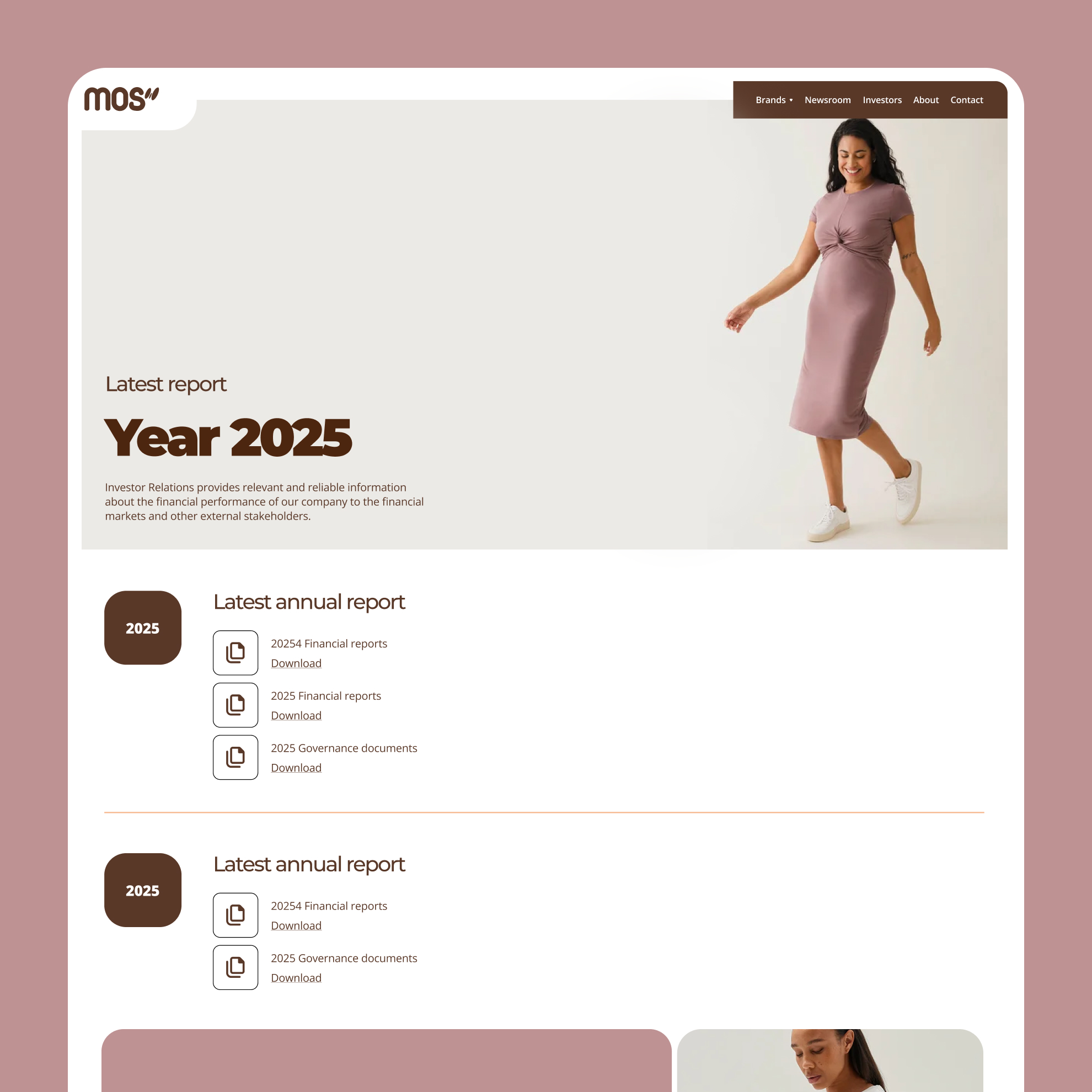
The investor relations section was built to be professional and frictionless — clear typography, downloadable document components, and a simple contact form. For a growing brand group actively seeking investment, that section has to work as well as the consumer-facing pages.
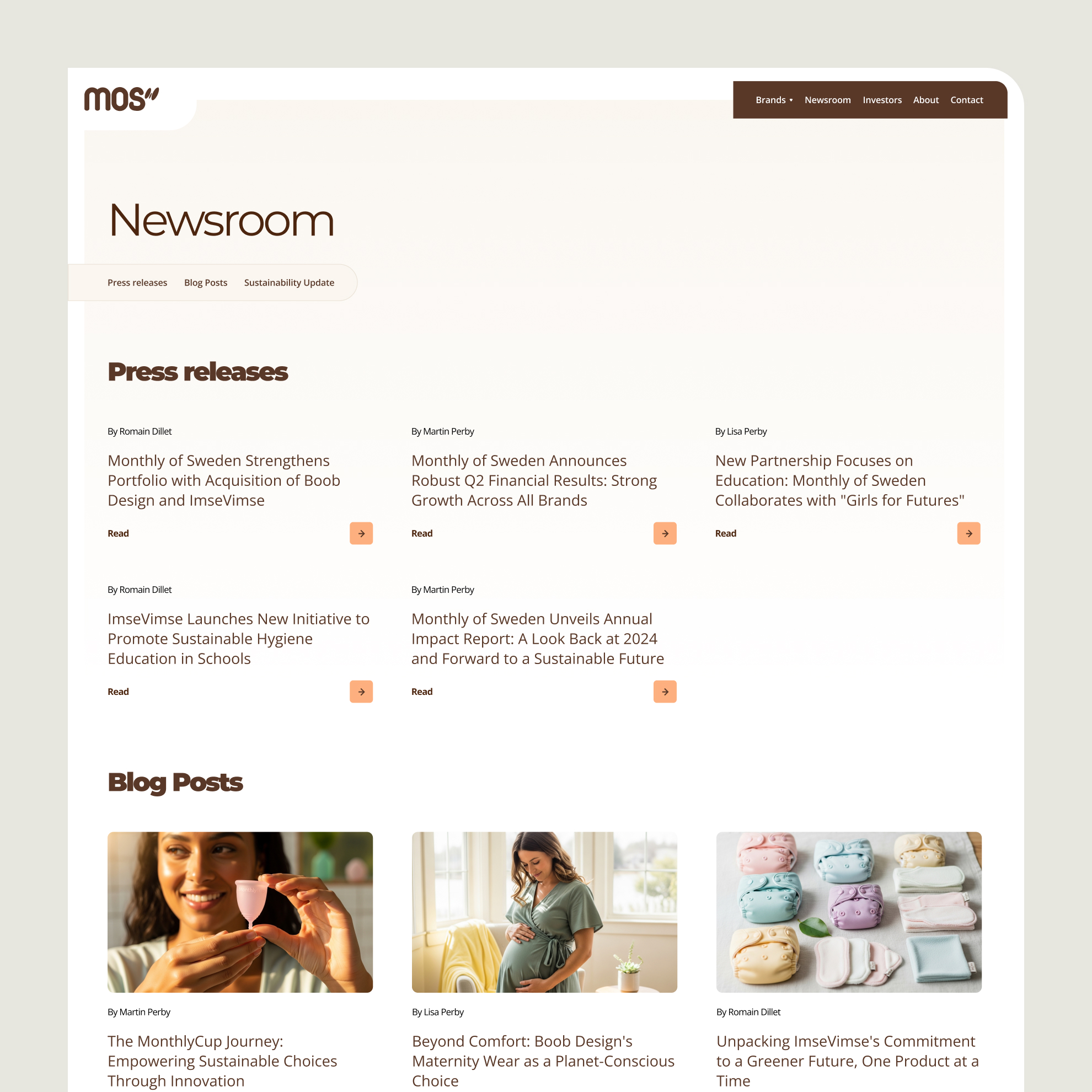
The newsroom handles both press releases and blog content under the same system, with a featured article format that gives editorial content the visual weight it needs to perform. Individual article pages use generous white space and a strong hero image to keep the reading experience clean.
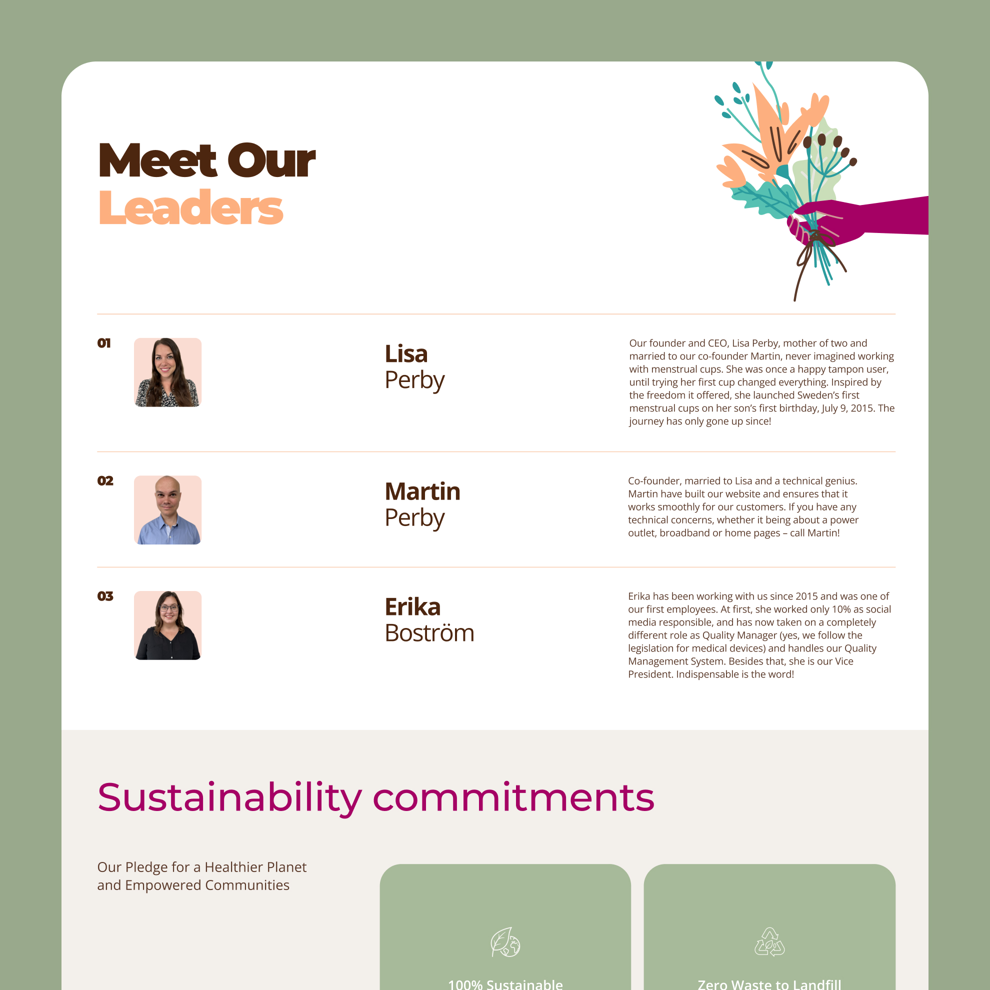
The company timeline and team page round out the brand story — milestones that show trajectory, faces that make the mission personal.
A scalable Webflow platform that gives Monthly of Sweden a digital headquarters worth the ambition of the brand group it represents — and a CMS that lets their team keep it current without depending on anyone outside the building.


.png)
.svg)

.svg)


.svg)
.svg)
.svg)


.png)


.png)