
Flippin Kitchens arrived with a product that most eCommerce templates aren't built for. Custom cabinetry is not an impulse purchase — it's a considered, configured, deeply personal decision. The client had the craft. What they needed was a digital platform that could match it: something that communicated premium without being cold, and guided a complex buying process without making it feel like work.
The ask was a custom Shopify build from scratch. No template. No shortcuts.
Most eCommerce sites treat products as items in a list. You browse, you click, you buy. That logic collapses when the product has dozens of configurations — paint colors, stain options, door styles, cabinet dimensions — and the customer needs to feel confident before committing.
The core design problem wasn't aesthetic. It was architectural: how do you build a shopping experience around a product that requires judgment, not just selection?
We designed and developed the entire Shopify theme from the ground up. Every section, every interaction, every filtering logic was built around the actual decisions a kitchen buyer makes at each stage of their journey.
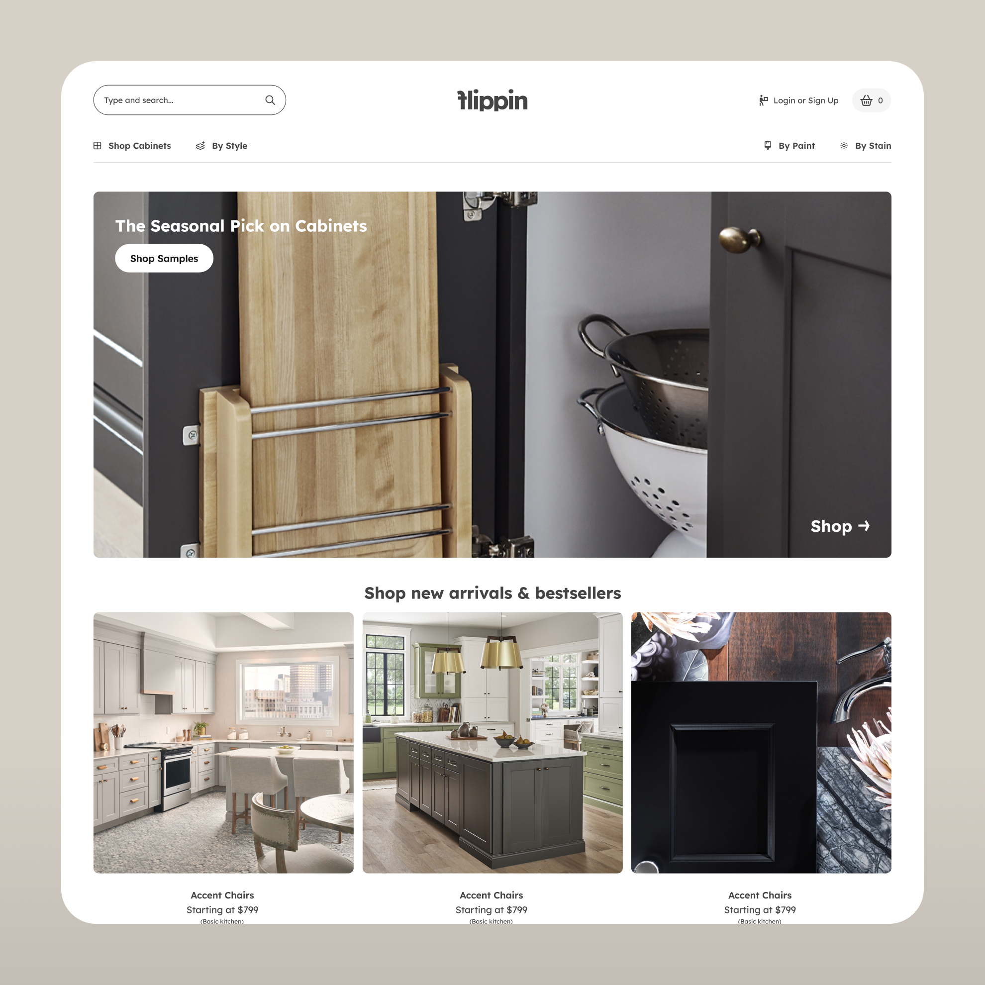
The homepage establishes tone before it sells anything. A clean layout, seasonal picks surfaced prominently, and a search experience accessible from the first moment. The goal was to signal quality and ease simultaneously — two things that usually fight each other in eCommerce.
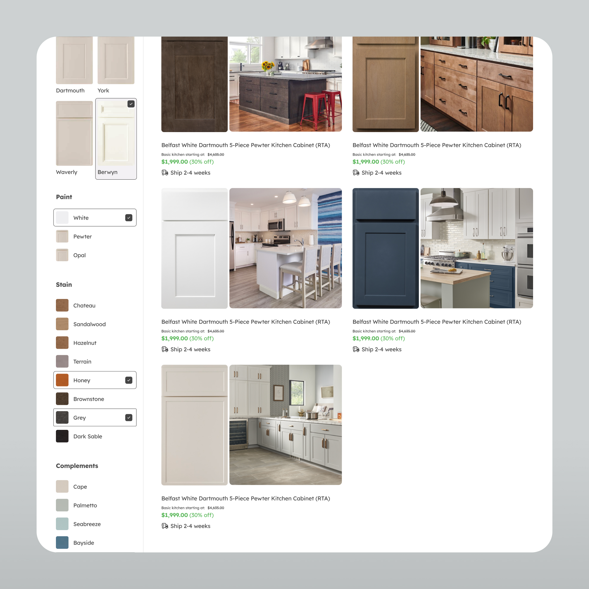
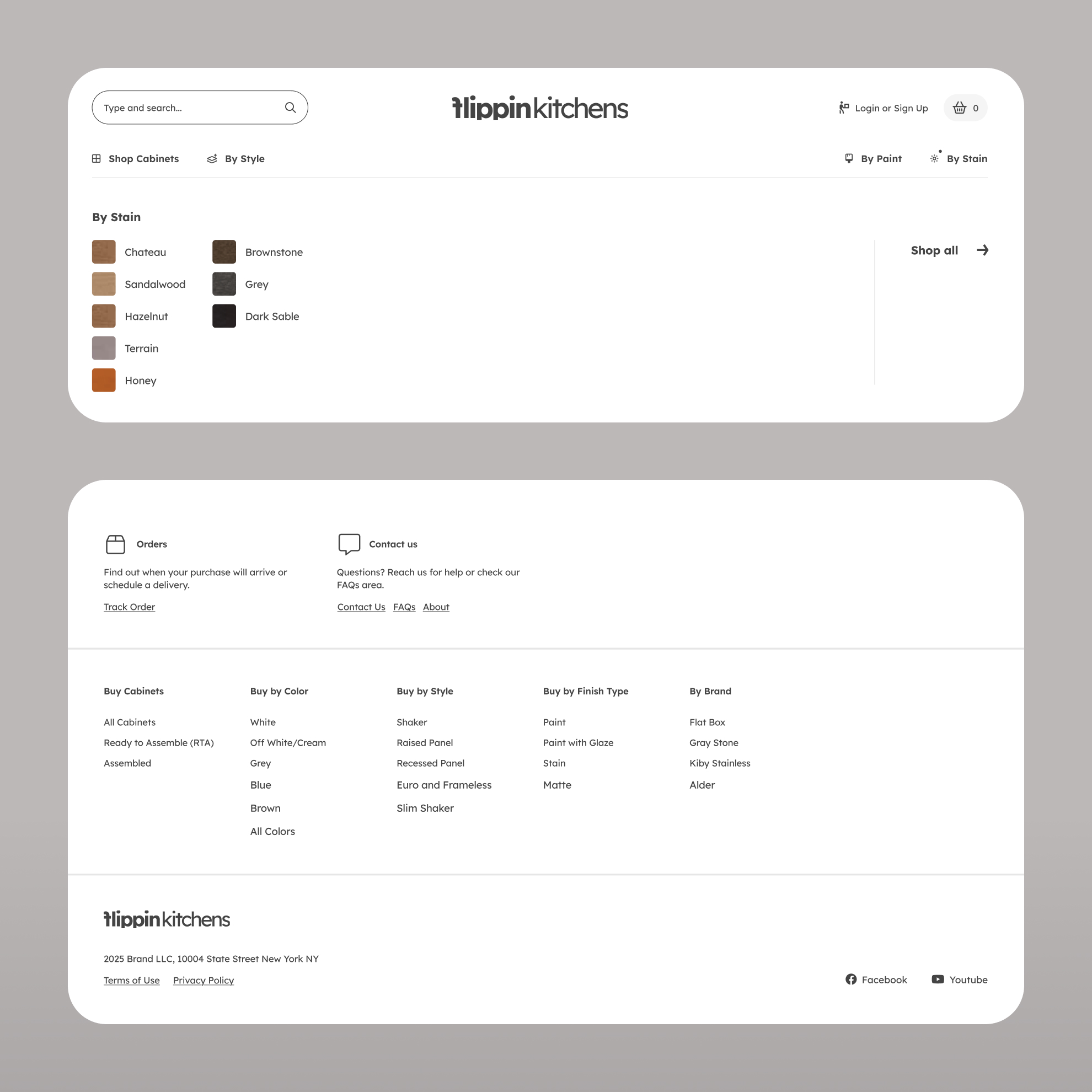
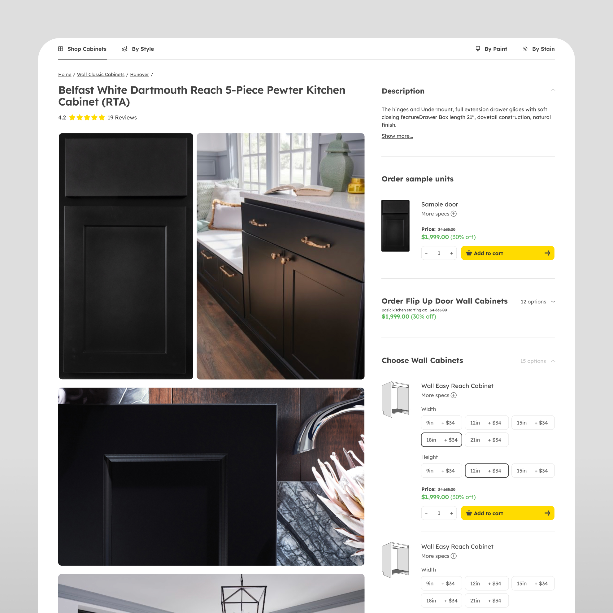
The product listing page is where the real architecture lives. We built a filtering system that lets customers narrow by paint color, stain, complement, and cabinet line — with active filter states that remain readable and clear as selections accumulate. This isn't decoration. It's the mechanism that makes a complex catalog navigable without friction.
The product detail page extends that logic further, giving customers the ability to configure dimensions, select door samples, and understand exactly what they're ordering before they commit.
The About page closes the trust gap. In a category where customers are spending significant amounts on something they can't touch before buying, brand story and credibility aren't secondary — they're conversion tools.
Throughout the project, two principles held constant. First, the visual language had to communicate premium without being inaccessible — warm, editorial, and clean rather than cold or corporate. Second, every interaction had to reduce cognitive load, not add to it. Complex product configuration only works when the interface is doing the thinking ahead of the customer.
The filtering system in particular required careful hierarchy decisions: which attributes surface first, how active states are displayed, and how the product grid updates without disorienting the user. These are small decisions that add up to an experience that either builds confidence or erodes it.
What Flippin launched with wasn't just a functional store. It was a platform built to scale — with the UX logic already in place for a catalog that will grow more complex over time. The site communicates the brand's quality before a single cabinet is selected, and guides the customer through a high-consideration purchase without requiring them to work for the information they need.


.png)
.svg)

.svg)


.svg)
.svg)
.svg)


.png)


.png)