Visit Website, Immerse Education, https://www.immerse.education/


Immerse Education had built something genuinely valuable: residential and online academic programs at Cambridge, Oxford, and other prestige locations, designed for ambitious students aged 11 to 18. The quality of the product wasn't in question. The problem was structural. Their catalog had grown into something that required work to navigate — multiple program types, age segments, locations, and formats all sitting on a platform that wasn't built to handle that level of complexity clearly.
The ask was a full redesign. Not a refresh. A rethinking of how a prospective student or parent moves from "I want something like this" to "I'm enrolling in this specific program."
Most educational websites fail in the same way: they present everything at once and ask the visitor to sort it out themselves. When your catalog includes residential summer courses at Cambridge colleges, online academic programs, 1:1 tutoring, global symposiums, and essay competitions — all for different age groups across different locations — that approach collapses immediately.
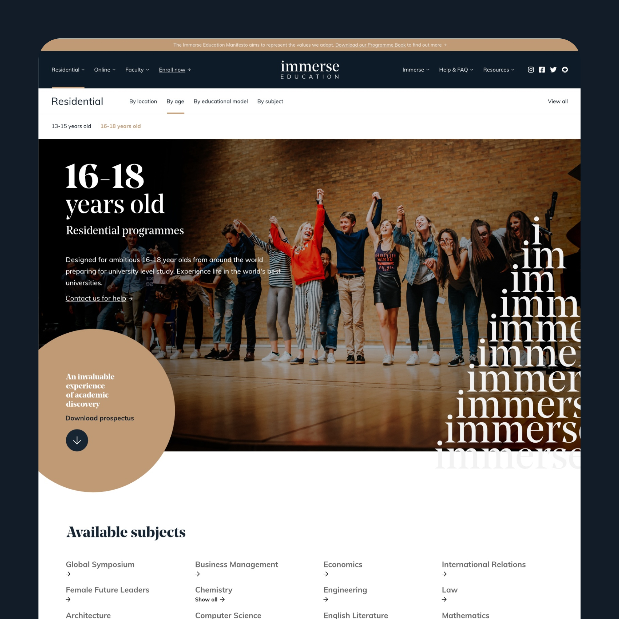
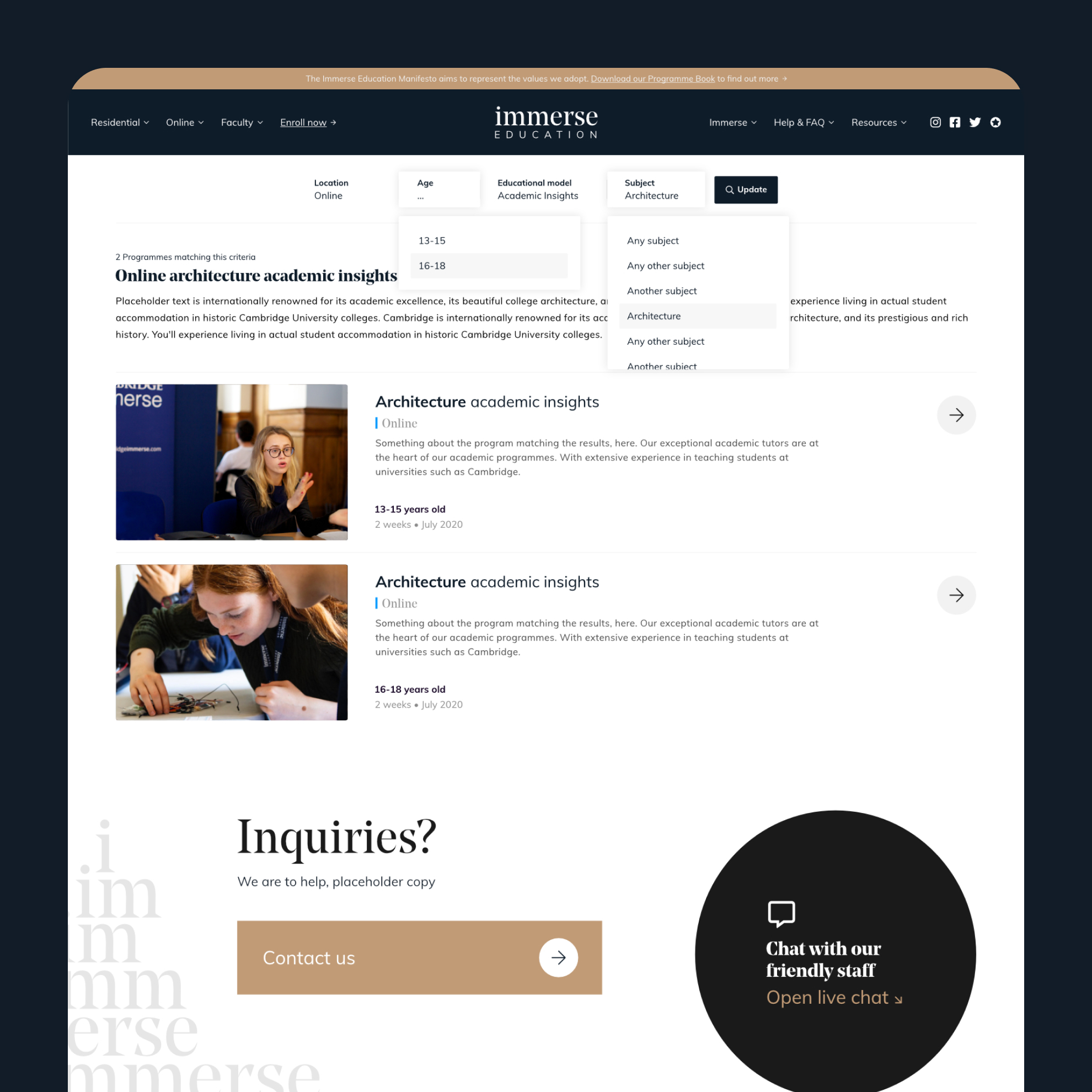
The first design decision was also the most important one: segment audiences at the entry point. Age, location, and program type needed to filter the experience from the first click, not as an afterthought buried in a sidebar.
The information architecture was rebuilt around how a prospective student actually thinks. Not "here is everything we offer" but "who are you, where are you, and what are you looking for?" — and then progressively revealing the right answer.
The interactive search engine processes multiple simultaneous inputs — location, age group, program model, subject — and returns relevant results instantly. It works the same way whether someone is looking for a residential Architecture program at Cambridge or an online Oxbridge 1:1 session, without requiring them to understand Immerse's internal taxonomy first.
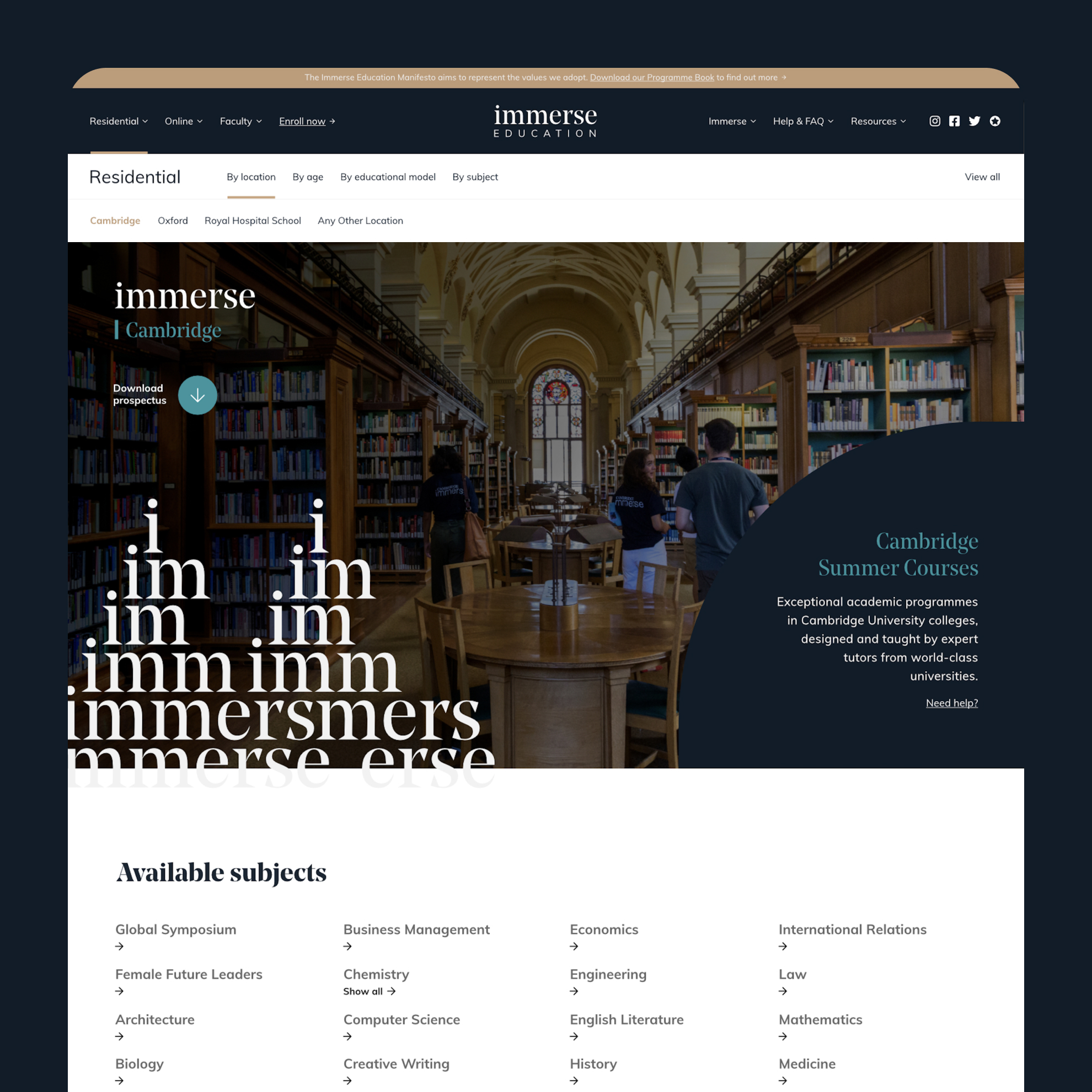
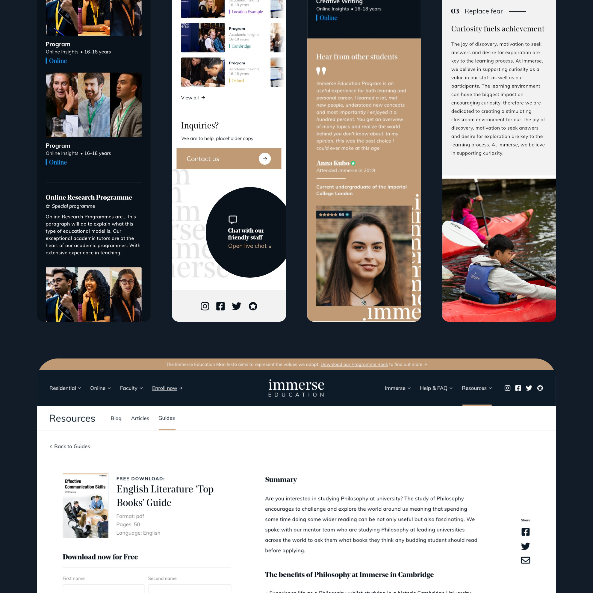
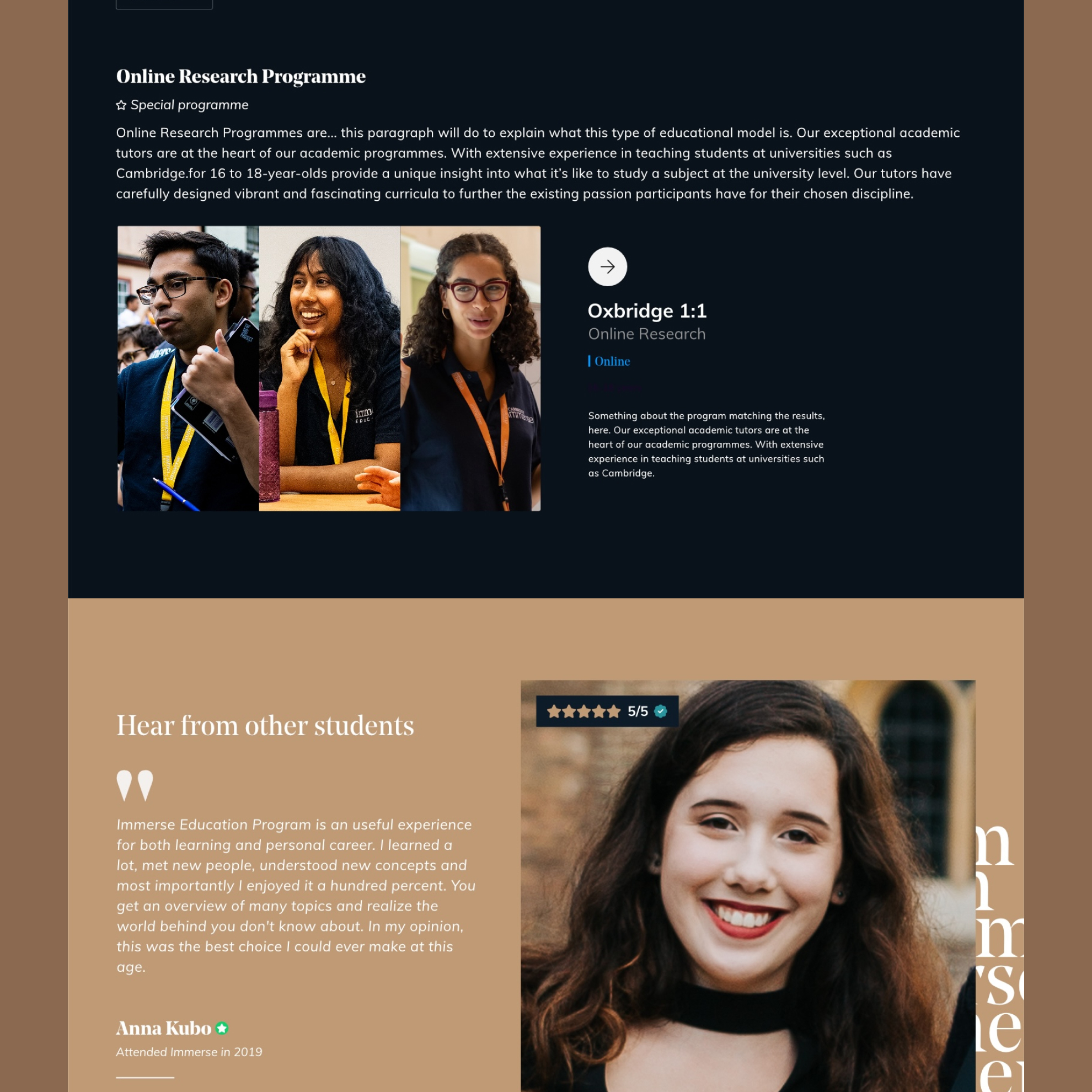
Each program type got its own landing page template, and each location got a dedicated destination page with its own visual treatment and supporting content. The Cambridge pages carry photography of the colleges themselves — Gonville & Caius, the courts and quads — because for this audience, the setting is part of the value proposition.
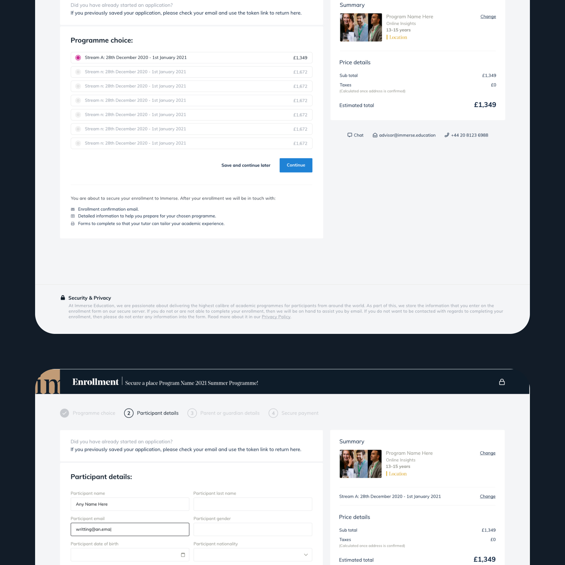
The enrollment flow was rebuilt as a multi-step sequence with real-time price summaries and clear progress indicators. Checkout for a residential academic program is a significant commitment; the design had to match that seriousness without adding friction.
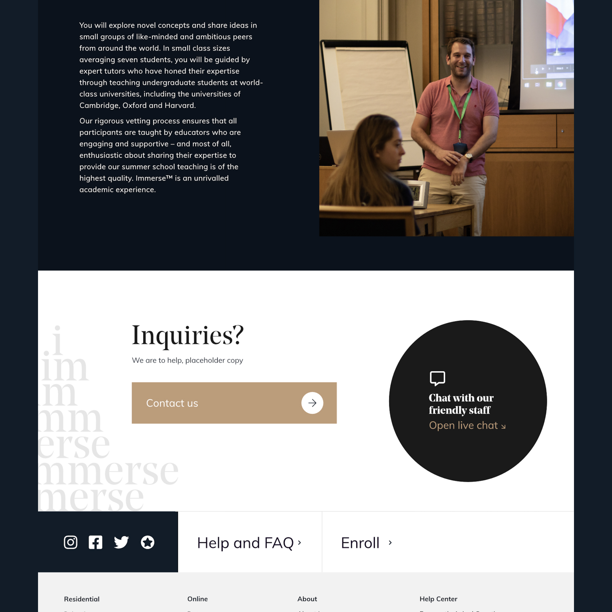
Social proof was integrated at the program level rather than siloed on a testimonials page. For an audience that includes both students and the parents making the financial decision, validation at the moment of consideration matters.
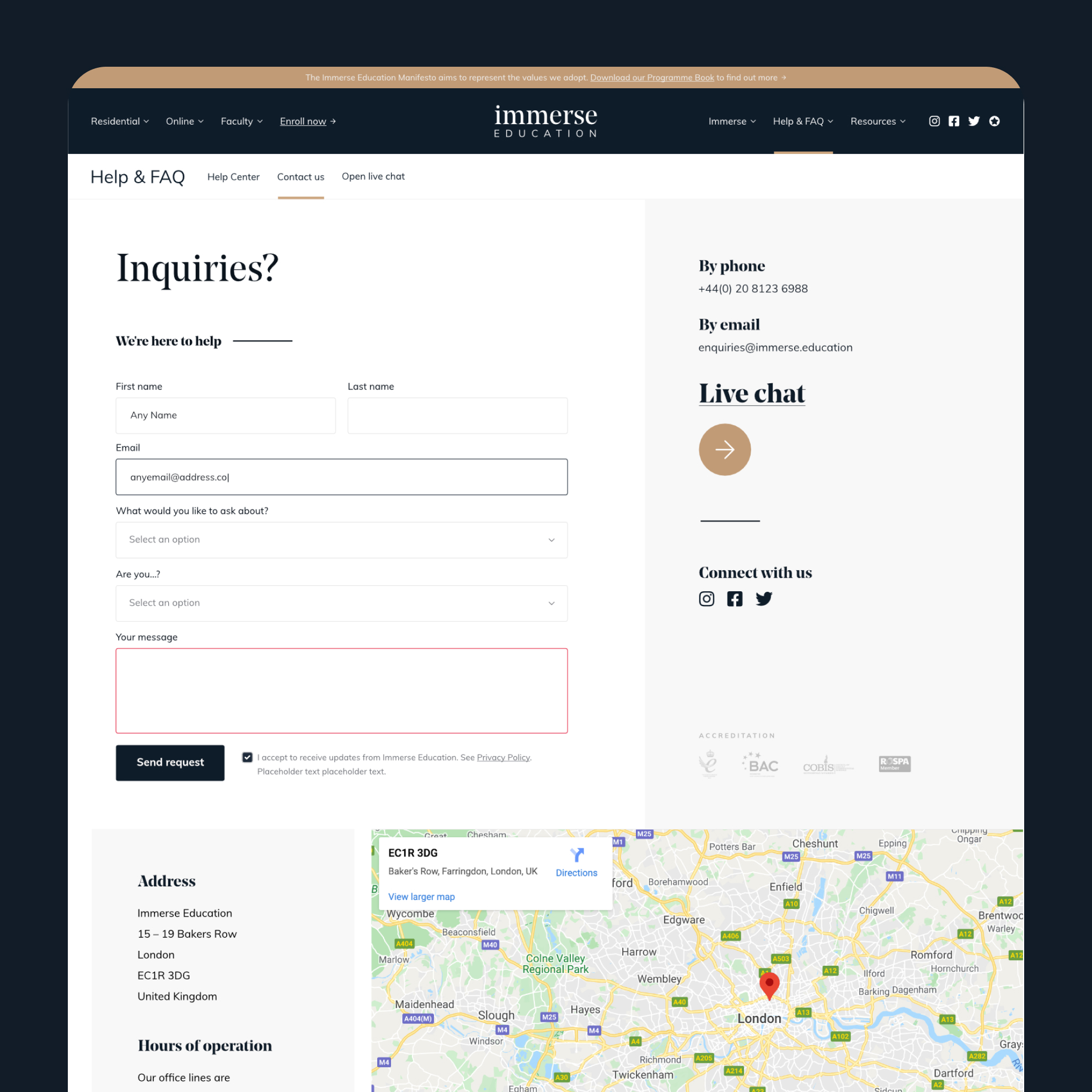
A standardized inquiry module was built for placement across relevant pages, offering two contact channels — a form and a live chat option — to meet different preferences at the point of decision. The resources hub was structured to serve both lead generation and genuine utility, with downloadable prospectuses and long-form content sitting in the same consistent template.
Mobile was treated as a primary concern throughout. The mega-menu was redesigned to handle the full catalog scope without collapsing into an unusable list on smaller screens.
A platform that can actually hold the complexity of what Immerse offers without making that complexity visible to the user. The architecture does the filtering work so the visitor doesn't have to, and the conversion path from discovery to enrollment is clear at every stage.


.png)
.svg)

.svg)


.svg)
.svg)
.svg)


.png)


.png)