US & Global


Navigation is a decision, not a list
We were working on a coastal, island-only hospitality property: a hotel and event venue reachable only by ferry, recently shifted from seasonal to year-round operation. That shift was the real problem behind the project. The property used to have one story to tell during one part of the year. Now it has several stories running in parallel, all the time, and the client's own words for the resulting website were "so much noise it's hard for a person to get on our site and understand who we are."
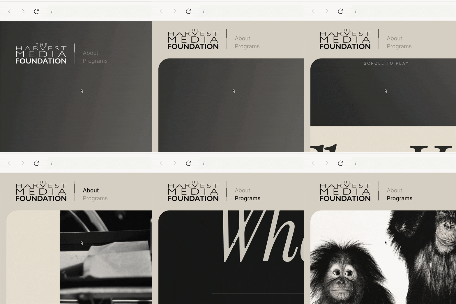
The homepage was already resolved before this part of the work started: a horizontal, scroll-driven experience that tells the property's story as a single thread, the way a person would pitch it in conversation rather than the way a sitemap usually forces a visitor to browse tab by tab. That decision mattered for what came next, because it meant the internal pages didn't need to repeat the story. They needed to hold it once the visitor decided to go deeper.
That's a different design problem than it sounds like. The question wasn't "what pages does this site need." It was "what does each visitor actually come here to do, and where do we owe them a page." Those aren't the same question, and starting from the wrong one is how sites end up with a navigation bar that mirrors an org chart instead of a set of decisions.
The obvious starting point is to organize by department, because that's how the information arrives. A wedding team hands over pricing. A kitchen has a new chef and a farm-to-table story. Facilities has rooms and a private beach. Programming has wine tastings, film screenings, live music. Map each of those to a page, and you get something like: stay, dine, weddings, events, experience, plan your visit.
This isn't a bad structure. It's easy to maintain, because whoever owns a piece of the business owns the page that describes it. It's easy to get client sign-off on, because it mirrors how the client already talks about their own property. And each page can carry a single, clean conversion goal without competing content diluting it.
But it answers the wrong question for a first-time visitor. It tells you what the property has, not why you, specifically, are looking at it. And this client had already told us, unprompted, that there were at least two very different kinds of visitor arriving at the same homepage: someone renting the venue for their own occasion, and someone coming to be a guest at someone else's. A department-based menu doesn't make that distinction visible. It makes a visitor do the work of figuring out which of six tabs is meant for them.
So we tried inverting the logic. Instead of asking what content exists, we asked what decision a visitor is trying to make in the first thirty seconds on the site, and built the top level of navigation around that instead.
Two intents emerged first: are you here to host something, or are you here to be hosted. That's a real functional split, not a cosmetic one. A wedding lead and a dinner guest don't need the same information, don't convert the same way, and shouldn't be competing for the same page's attention.
Naming that second door turned out to be its own useful exercise. The instinct was to call it something like "stay," but that word quietly excludes a visitor the client had specifically flagged as high-value: someone arriving by boat for dinner only, with no room booked and no event to attend. A door named "stay" tells that visitor, correctly, that the page isn't for them — which is the opposite of what we wanted. Naming problems are often structural problems wearing a disguise. If a label doesn't fit cleanly, it's usually because the thing you're naming doesn't have a clean boundary yet, not because you haven't found the right word.
The fix wasn't a cleverer synonym. It was admitting that dining and staying weren't actually two different visitor intents on this property — they're the same intent, described from two angles. Someone coming to dine and someone coming to stay are both just visiting to experience the property as a guest, not to organize anything on it. Once that was named plainly — a single door covering rooms, food, the beach, the wildlife, and any event a guest can simply walk into without hosting it — the two categories collapsed into one without losing anything.
What that naming exercise surfaced is the real organizing principle for this site, and it's worth stating on its own: the split isn't by content type, it's by whether the visitor is organizing the occasion or attending one someone else organized.
A private event, a wedding, a corporate retreat: the visitor is choosing a space, a date, a package. A wine tasting, a film screening, live music, a dinner reservation: the visitor is showing up to something already built. Once that's the actual criterion, features stop needing their own page and start needing to be placed correctly. An aerial property map, for instance, only matters to someone deciding where on the property to hold their own event — so it belongs inside the hosting door, not floating as a general amenity page that a dinner guest has no reason to open.
That gave us three doors instead of six: host something here, come dine or stay, and the practical logistics every visitor needs regardless of intent — getting to the property, cost, FAQs. Three is not a smaller version of six. It's a different shape, built on a different question.
One more piece came out of the same conversation with the client, almost as an aside, but it's worth pulling out on its own: the property doesn't just have activities, it has a claim about seasonality — the idea that there's a reason to visit in every one of the roughly six or seven distinct seasons the property experiences. That's a strong hook, and most sites would express it as a rotating banner or a seasonal callout buried in a hero section, which means it degrades the moment nobody remembers to update it.
We treated it instead as a permanent page with rotating content: a fixed position in the navigation that always resolves to whatever season the property is actually in. The page persists; the content underneath it doesn't. That's a small architectural choice, but it does something a banner can't — it gives a returning visitor an actual reason to check the site again, because the same navigation item shows them something different depending on when they look. It also has to be operable by the client without a developer in the loop, which is its own constraint worth designing for up front rather than discovering later.
None of this is specific to hospitality. The pattern is: resist the pull to let a navigation bar mirror how the business is internally organized, because that's the structure that's easiest to produce and the hardest for a visitor to use. Ask what decision each type of visitor is actually trying to make, and let naming problems do their job — when a label won't sit still, that's usually the project telling you the categories underneath it aren't settled yet, not that you need a better word.
atQuo is a creative partner that operates at the intersection of design, technology, and marketing strategy. Our **Insights and Talks** exist to demystify this intersection, sharing the expert knowledge required to make smarter decisions about the tools and tactics that drive growth. This same expertise fuels our services, where we execute on that strategy to build powerful digital experiences that help brands scale with clarity and confidence.

The decisions behind how we design and build. Animations, components, variables, structure — the reasoning we've written down so we don't have to reinvent it every time.


Navigation is a decision, not a list
We were working on a coastal, island-only hospitality property: a hotel and event venue reachable only by ferry, recently shifted from seasonal to year-round operation. That shift was the real problem behind the project. The property used to have one story to tell during one part of the year. Now it has several stories running in parallel, all the time, and the client's own words for the resulting website were "so much noise it's hard for a person to get on our site and understand who we are."
The homepage was already resolved before this part of the work started: a horizontal, scroll-driven experience that tells the property's story as a single thread, the way a person would pitch it in conversation rather than the way a sitemap usually forces a visitor to browse tab by tab. That decision mattered for what came next, because it meant the internal pages didn't need to repeat the story. They needed to hold it once the visitor decided to go deeper.
That's a different design problem than it sounds like. The question wasn't "what pages does this site need." It was "what does each visitor actually come here to do, and where do we owe them a page." Those aren't the same question, and starting from the wrong one is how sites end up with a navigation bar that mirrors an org chart instead of a set of decisions.
The obvious starting point is to organize by department, because that's how the information arrives. A wedding team hands over pricing. A kitchen has a new chef and a farm-to-table story. Facilities has rooms and a private beach. Programming has wine tastings, film screenings, live music. Map each of those to a page, and you get something like: stay, dine, weddings, events, experience, plan your visit.
This isn't a bad structure. It's easy to maintain, because whoever owns a piece of the business owns the page that describes it. It's easy to get client sign-off on, because it mirrors how the client already talks about their own property. And each page can carry a single, clean conversion goal without competing content diluting it.
But it answers the wrong question for a first-time visitor. It tells you what the property has, not why you, specifically, are looking at it. And this client had already told us, unprompted, that there were at least two very different kinds of visitor arriving at the same homepage: someone renting the venue for their own occasion, and someone coming to be a guest at someone else's. A department-based menu doesn't make that distinction visible. It makes a visitor do the work of figuring out which of six tabs is meant for them.
So we tried inverting the logic. Instead of asking what content exists, we asked what decision a visitor is trying to make in the first thirty seconds on the site, and built the top level of navigation around that instead.
Two intents emerged first: are you here to host something, or are you here to be hosted. That's a real functional split, not a cosmetic one. A wedding lead and a dinner guest don't need the same information, don't convert the same way, and shouldn't be competing for the same page's attention.
Naming that second door turned out to be its own useful exercise. The instinct was to call it something like "stay," but that word quietly excludes a visitor the client had specifically flagged as high-value: someone arriving by boat for dinner only, with no room booked and no event to attend. A door named "stay" tells that visitor, correctly, that the page isn't for them — which is the opposite of what we wanted. Naming problems are often structural problems wearing a disguise. If a label doesn't fit cleanly, it's usually because the thing you're naming doesn't have a clean boundary yet, not because you haven't found the right word.
The fix wasn't a cleverer synonym. It was admitting that dining and staying weren't actually two different visitor intents on this property — they're the same intent, described from two angles. Someone coming to dine and someone coming to stay are both just visiting to experience the property as a guest, not to organize anything on it. Once that was named plainly — a single door covering rooms, food, the beach, the wildlife, and any event a guest can simply walk into without hosting it — the two categories collapsed into one without losing anything.
What that naming exercise surfaced is the real organizing principle for this site, and it's worth stating on its own: the split isn't by content type, it's by whether the visitor is organizing the occasion or attending one someone else organized.
A private event, a wedding, a corporate retreat: the visitor is choosing a space, a date, a package. A wine tasting, a film screening, live music, a dinner reservation: the visitor is showing up to something already built. Once that's the actual criterion, features stop needing their own page and start needing to be placed correctly. An aerial property map, for instance, only matters to someone deciding where on the property to hold their own event — so it belongs inside the hosting door, not floating as a general amenity page that a dinner guest has no reason to open.
That gave us three doors instead of six: host something here, come dine or stay, and the practical logistics every visitor needs regardless of intent — getting to the property, cost, FAQs. Three is not a smaller version of six. It's a different shape, built on a different question.
One more piece came out of the same conversation with the client, almost as an aside, but it's worth pulling out on its own: the property doesn't just have activities, it has a claim about seasonality — the idea that there's a reason to visit in every one of the roughly six or seven distinct seasons the property experiences. That's a strong hook, and most sites would express it as a rotating banner or a seasonal callout buried in a hero section, which means it degrades the moment nobody remembers to update it.
We treated it instead as a permanent page with rotating content: a fixed position in the navigation that always resolves to whatever season the property is actually in. The page persists; the content underneath it doesn't. That's a small architectural choice, but it does something a banner can't — it gives a returning visitor an actual reason to check the site again, because the same navigation item shows them something different depending on when they look. It also has to be operable by the client without a developer in the loop, which is its own constraint worth designing for up front rather than discovering later.
None of this is specific to hospitality. The pattern is: resist the pull to let a navigation bar mirror how the business is internally organized, because that's the structure that's easiest to produce and the hardest for a visitor to use. Ask what decision each type of visitor is actually trying to make, and let naming problems do their job — when a label won't sit still, that's usually the project telling you the categories underneath it aren't settled yet, not that you need a better word.

Strategy, design, content and growth.