US & Global


While creating the site for The Harvest Companies there was this discussion on whether we would do a single page site or a multipage one. On the side of our inputs, there is the fact of making it cinematic, and we primarily thought of scrolling through for storytelling purposes. For scrolling through it makes sense having content to begin with. Then, on the side of the information architecture: we got to play with not a lot of content so if we had the site with multiple pages, the home itself would not benefit a lot on a scrolling storytelling approach that is our weapon of choice for approaching the cinematic part of it. Then, it came to us: how about a hybrid? The About and Program pages are condensing all the info that pitches the Harvest Media Foundation. Then Projects and Press are listing potentially external items. And as for Contact and Donate, these are action purposed areas, different from the pitching ones mentioned. So we went for a hybrid on a one pager plus multi page.
The navigation structure is divided into two distinct tiers:
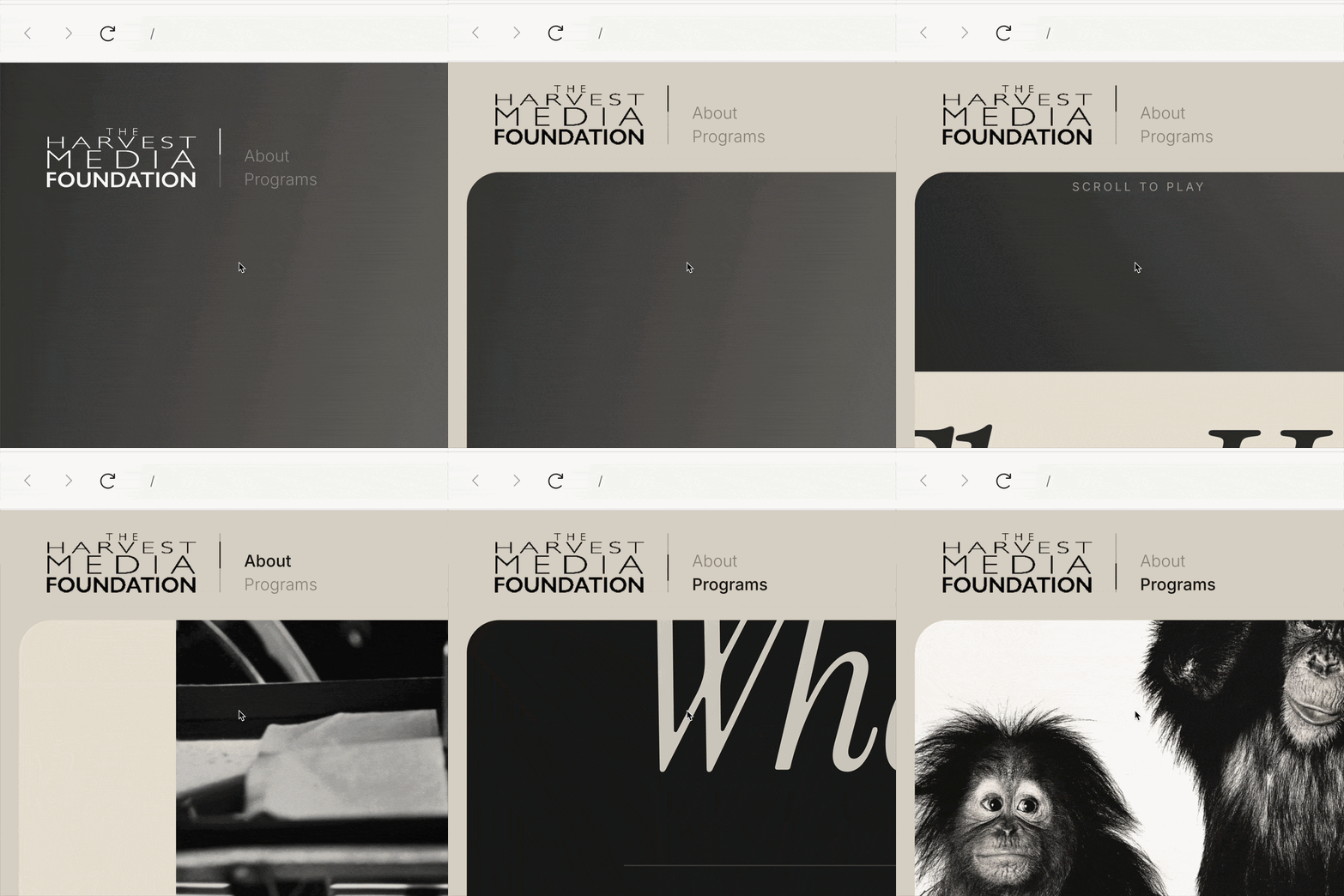
Covers the core single-page experience, guiding users through the homepage's narrative pitch with brand intro details, about information, and programs.
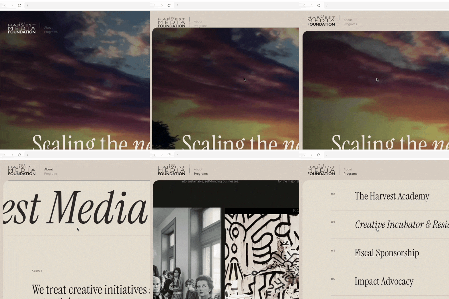
As the user scrolls down, the vertical line functions as a page index, with an overlaying darker line indicating current progress. Additionally, the page's primary sections—About and Programs—are highlighted as active whenever the index aligns with them.
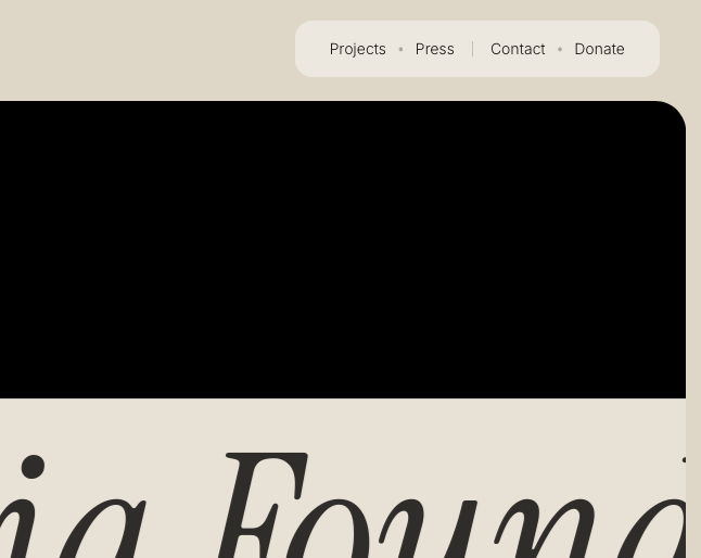
Houses links that serve distinct functions off the homepage—including Projects and Press (both linking to external resources), alongside Contact and Donate. (Note: These are termed secondary not due to lack of value, but because they occupy a separate navigational layer).
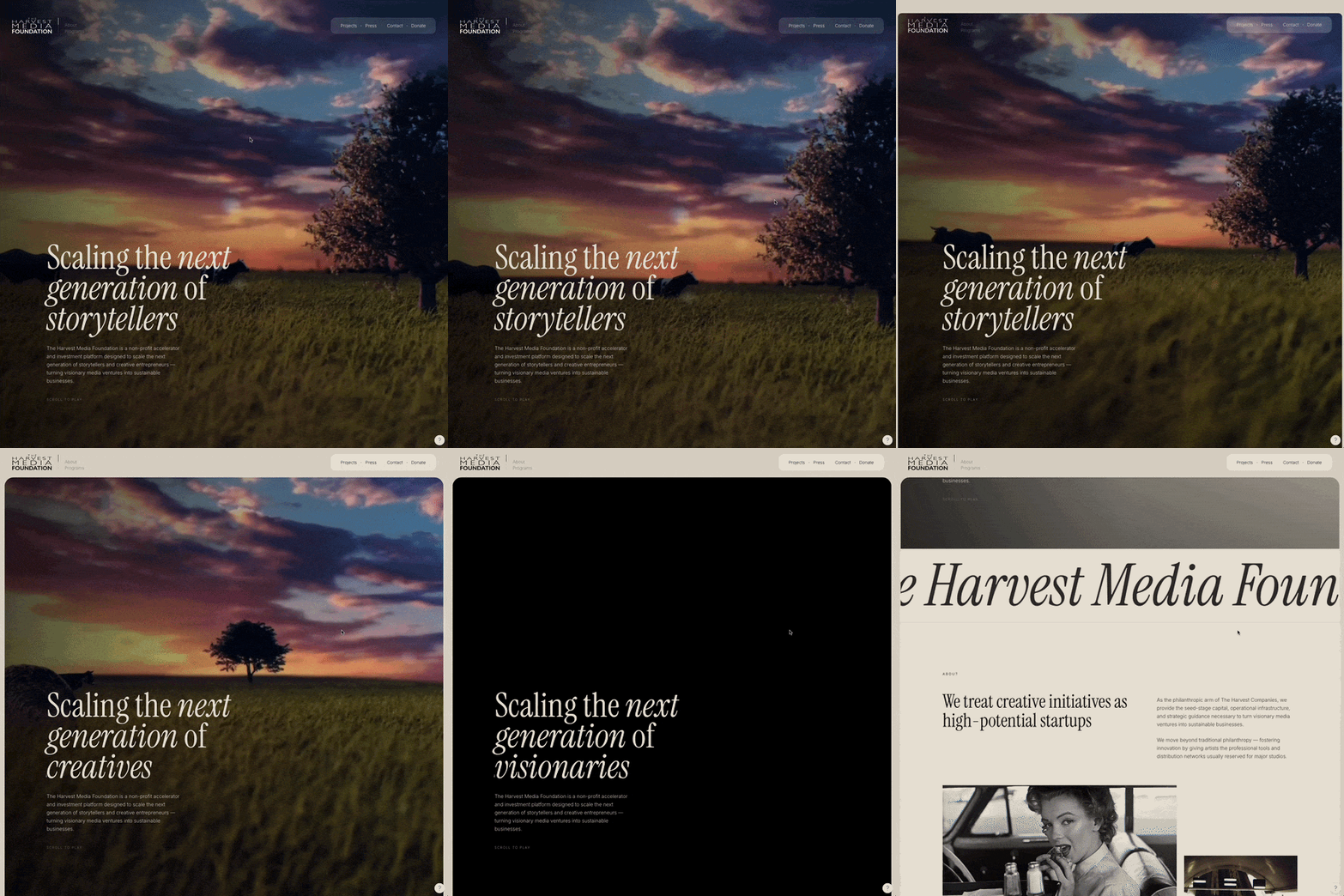
From hero at zero scrolled pixels to below the fold there are several things going on (aside from the navigation stuff). Initially, the video background is in its 1st frame doing a bounce effect that suggests users to scroll through and that there is some sort of movement - it’s not fully static even when users are doing nothing just yet. Then users start scrolling down, and the video triggers: it’s played frame by frame following the user's scrolling action - the user scrolls up or down and the video plays accordingly–. Yet another element that becomes a subtle part of the interaction is the third line of the title: there is a switch between the wording “storytellers”, “creatives”, “visionaries”, and “media entrepreneurs”, triggered by the user scroll action.
Moving below the fold, the content is framed to position The Harvest Media Foundation as a window, frame, or lens through which its work is viewed. Metaphorically, this transition represents moving from the outside into the core of what the foundation does.
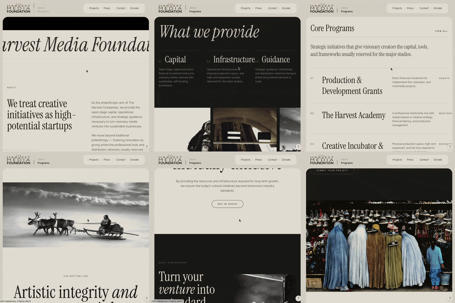
We are using the concept of a carousel-like gallery with rotating pictures.
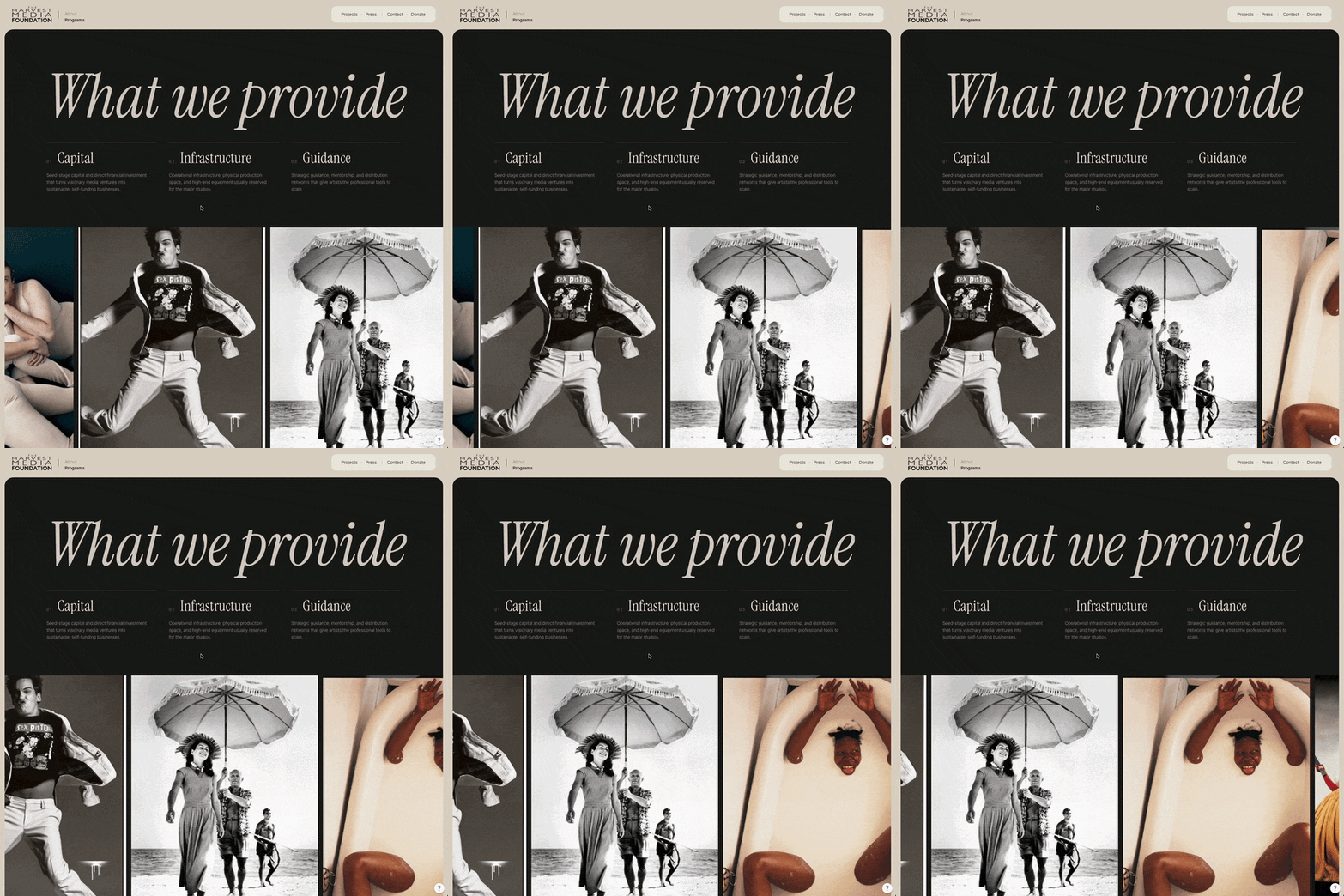
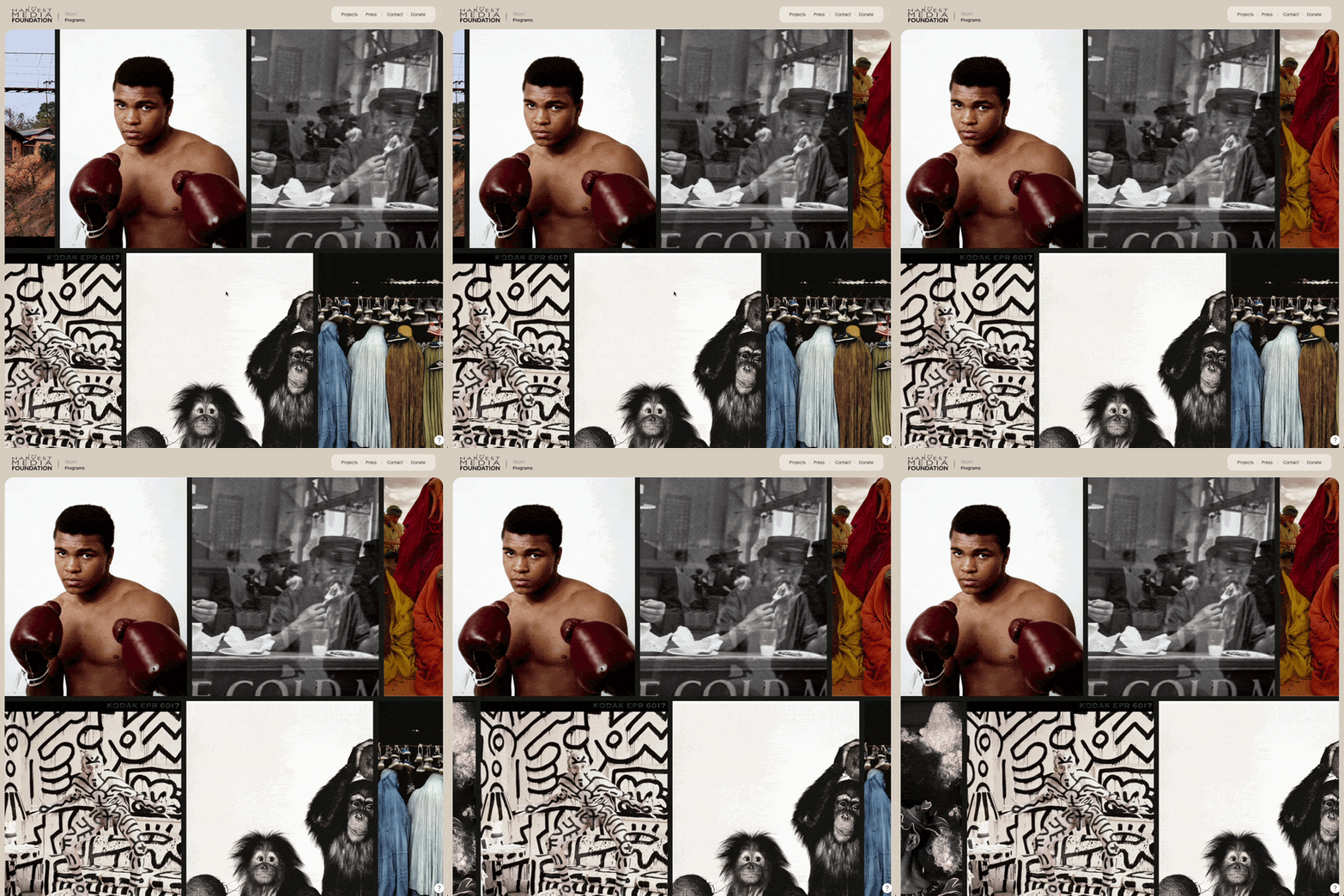
We implement this dual-carousel component to achieve a dual objective within a scrolltelling homepage framework: showcase an extensive gallery of 20+ images without imposing excessive scroll length on casual viewers, while enabling seamless, comprehensive browsing for interested users.Key advantages of this interactive design include:
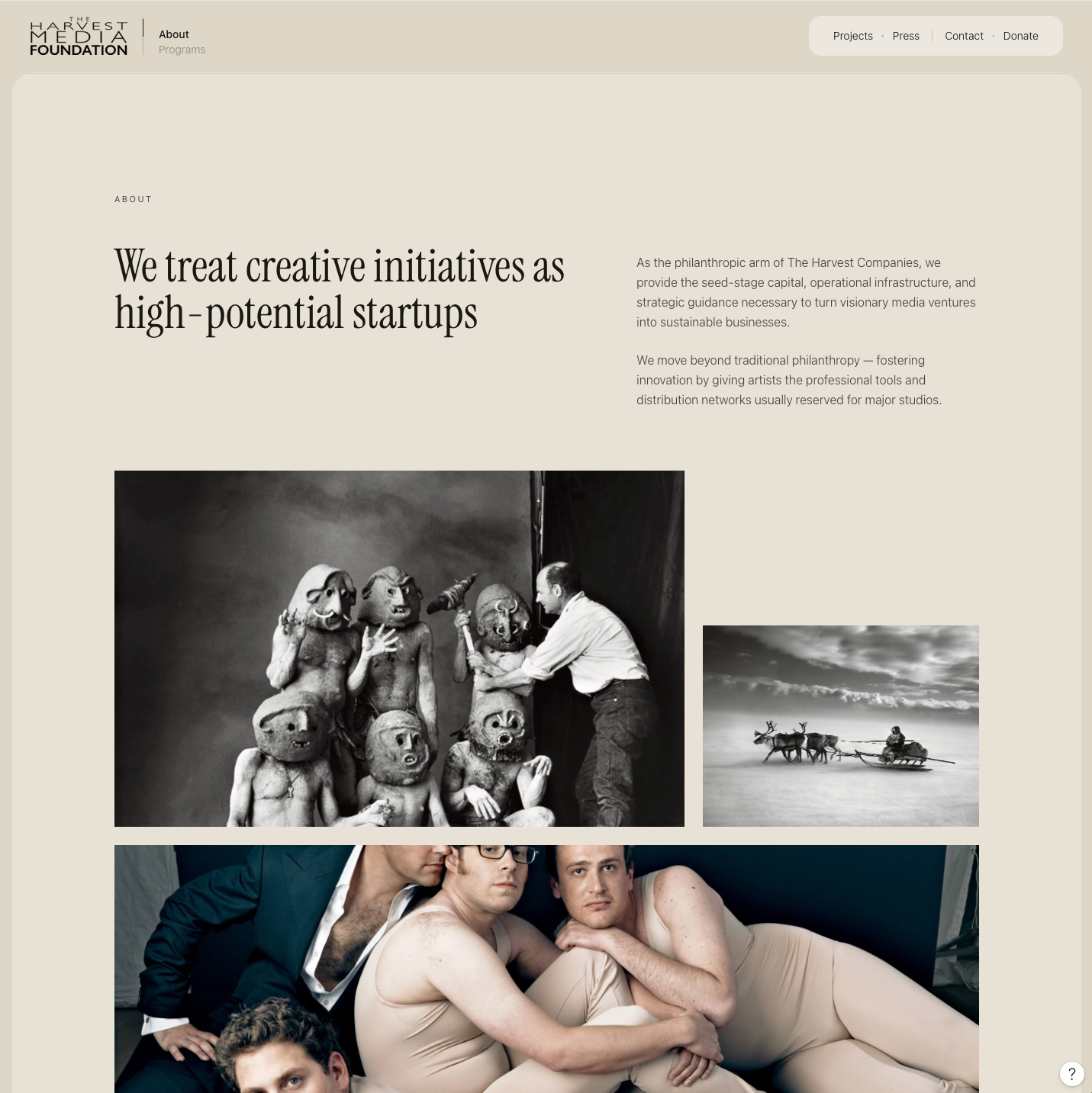
The About section is presented in a magazine-style UI for ticking the editorial box:
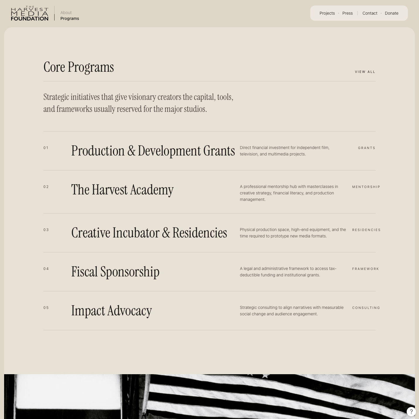
Core Programs is the section that follows after About.
A CTA section interrupts the user to highlight the artistic integrity approach of the pitch.
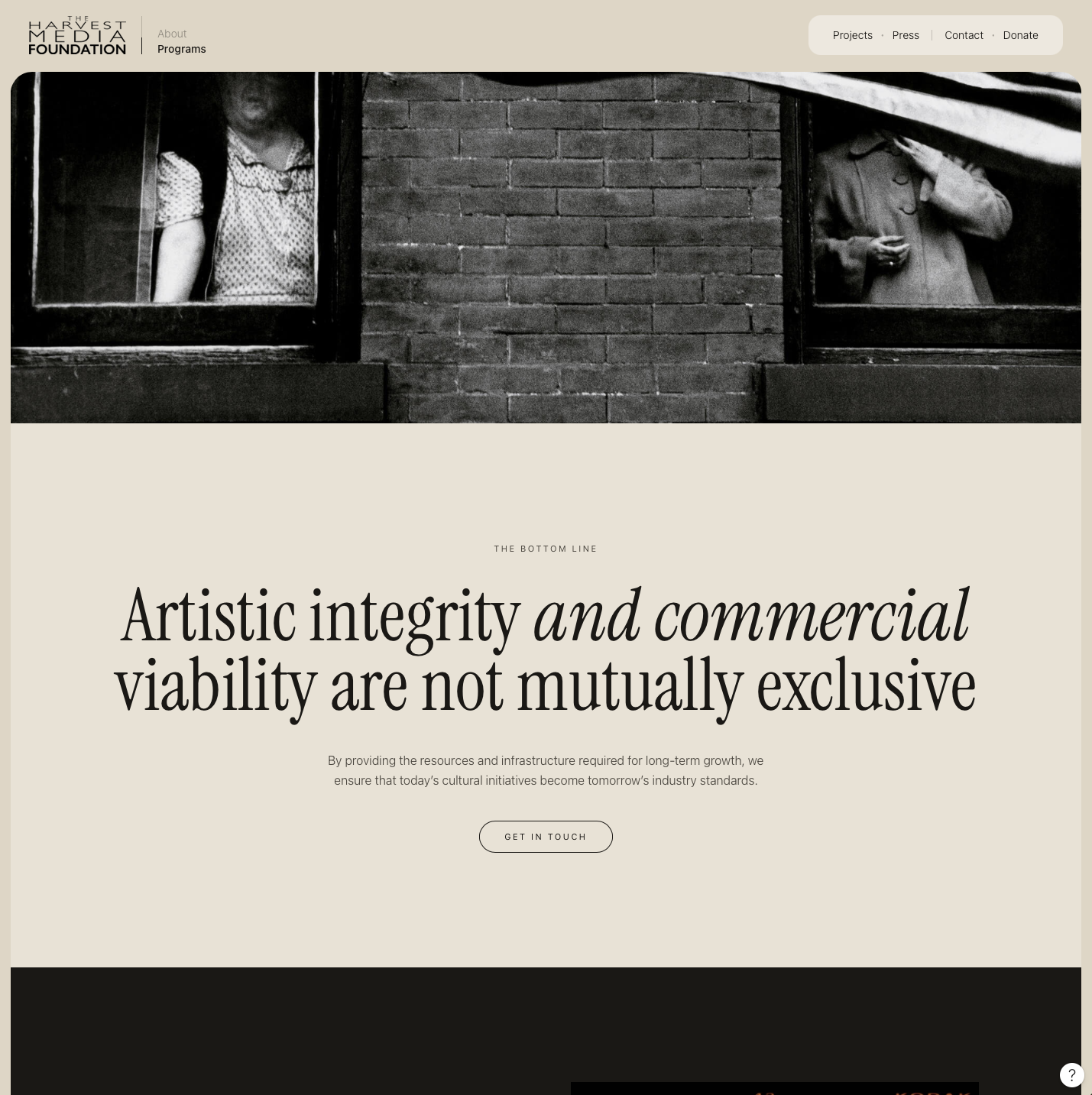
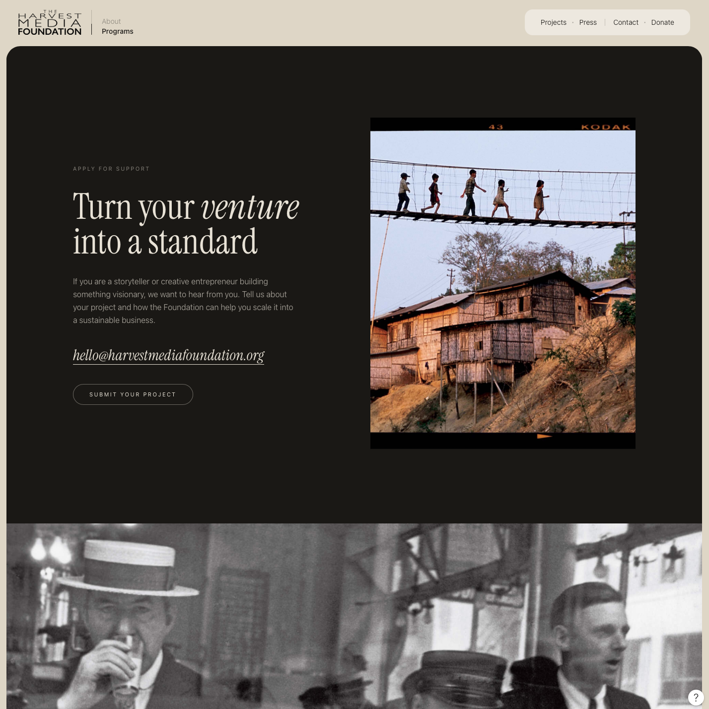
We then have a CTA for submitting a word.
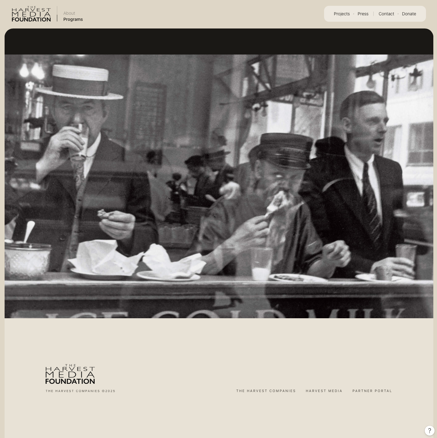
And since the key links are always visible at the top of the Harvest Media Foundation framed navigation, the footer only shows whatever was not shown before.
How about the rest of the pages? Stay tuned for another publication with more on that.

Strategy, design, content and growth.