US & Global


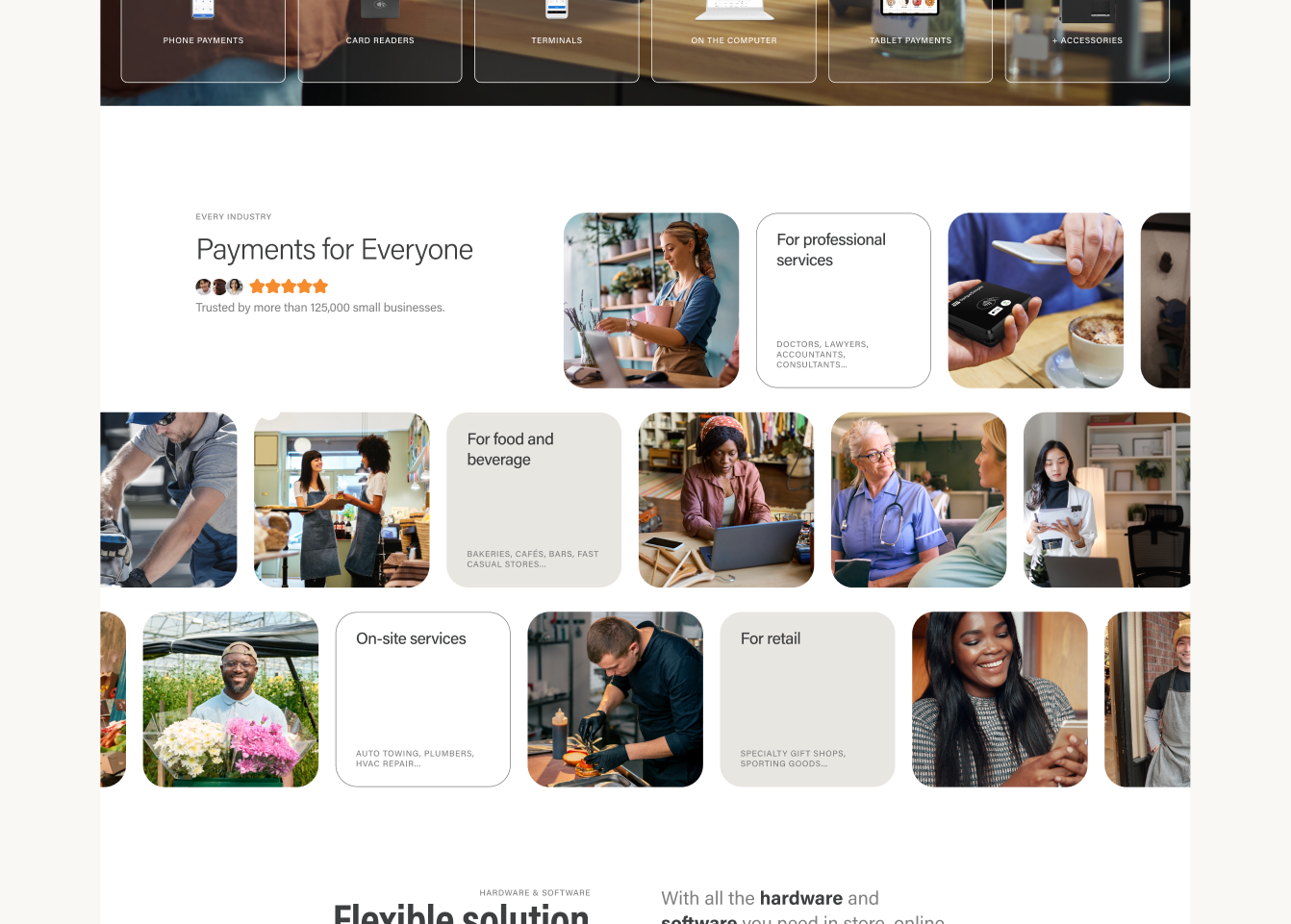
"Let's make this hero section have the kind of visual impact Square gets on its homepage." Or: "Let's list all of our business-type solutions with a special focus on on-site services."
Both are fair requests. Neither tells you what the module looks like. The work is turning that sentence into something that respects the brand guidelines, stays aligned with whatever the marketing direction is that quarter, and still gets to the point. That translation is the whole job, and it happens every week.
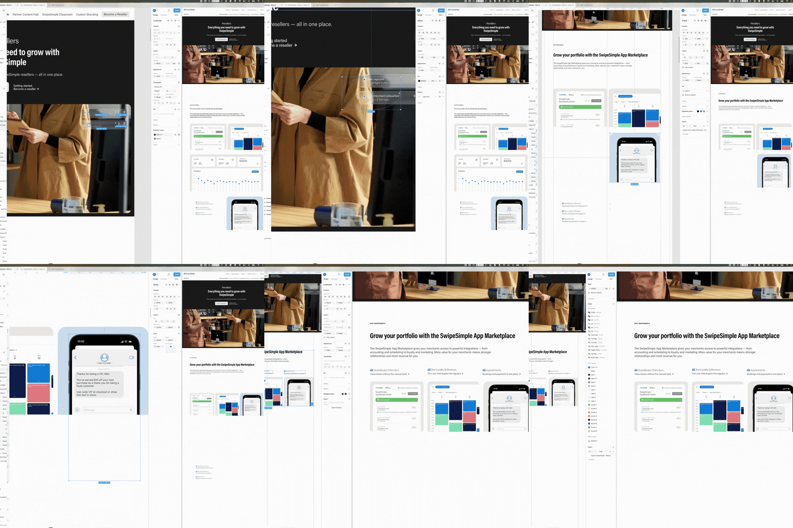
Every week we built dozens of artboards holding every pivot, micro-adjustment and discarded concept.
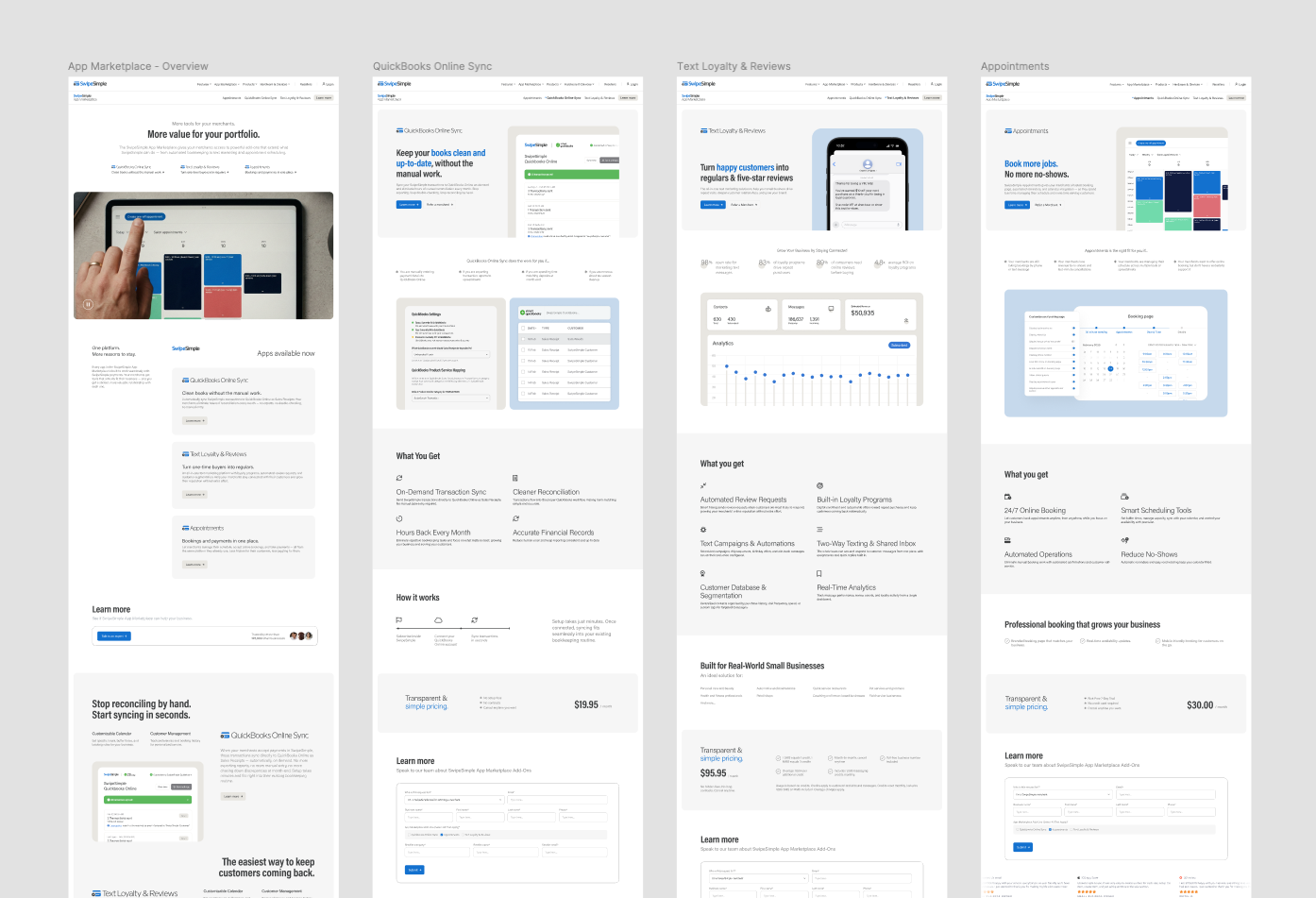
That is not indecision. Building three versions of a hero, four of a hardware display and a couple of pricing modules is the only reliable way to find out which order of information actually reads. You cannot argue a layout into working; you have to see it next to the alternative. The final page is the tip of it.
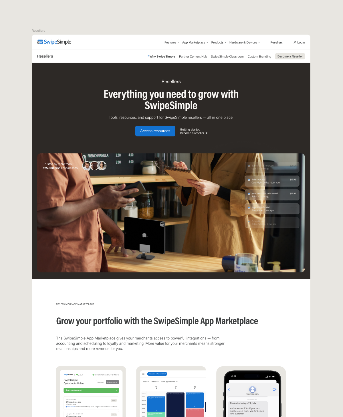
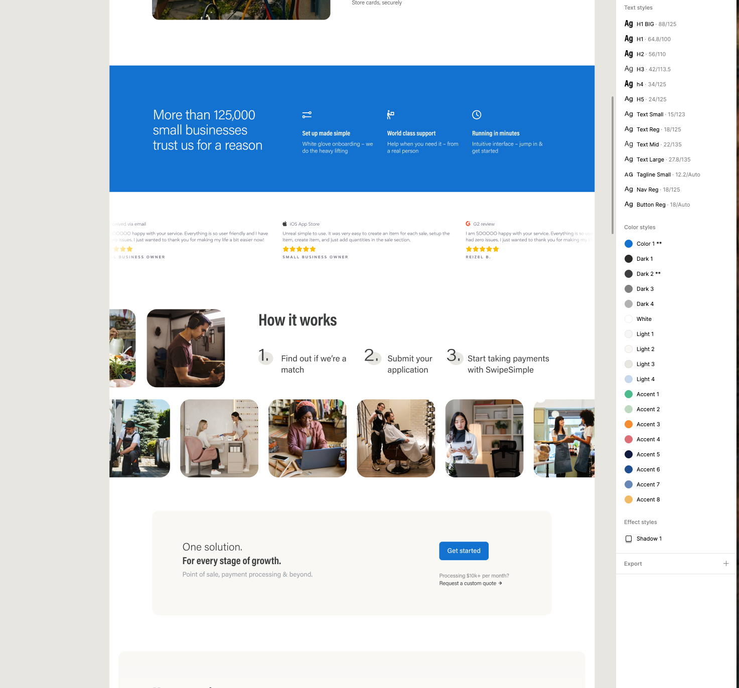
None of this holds together without a library. Text, colors and effects run on Figma synced styles, so a change lands everywhere at once and a module built in week nine still looks like it belongs beside one built in week two.
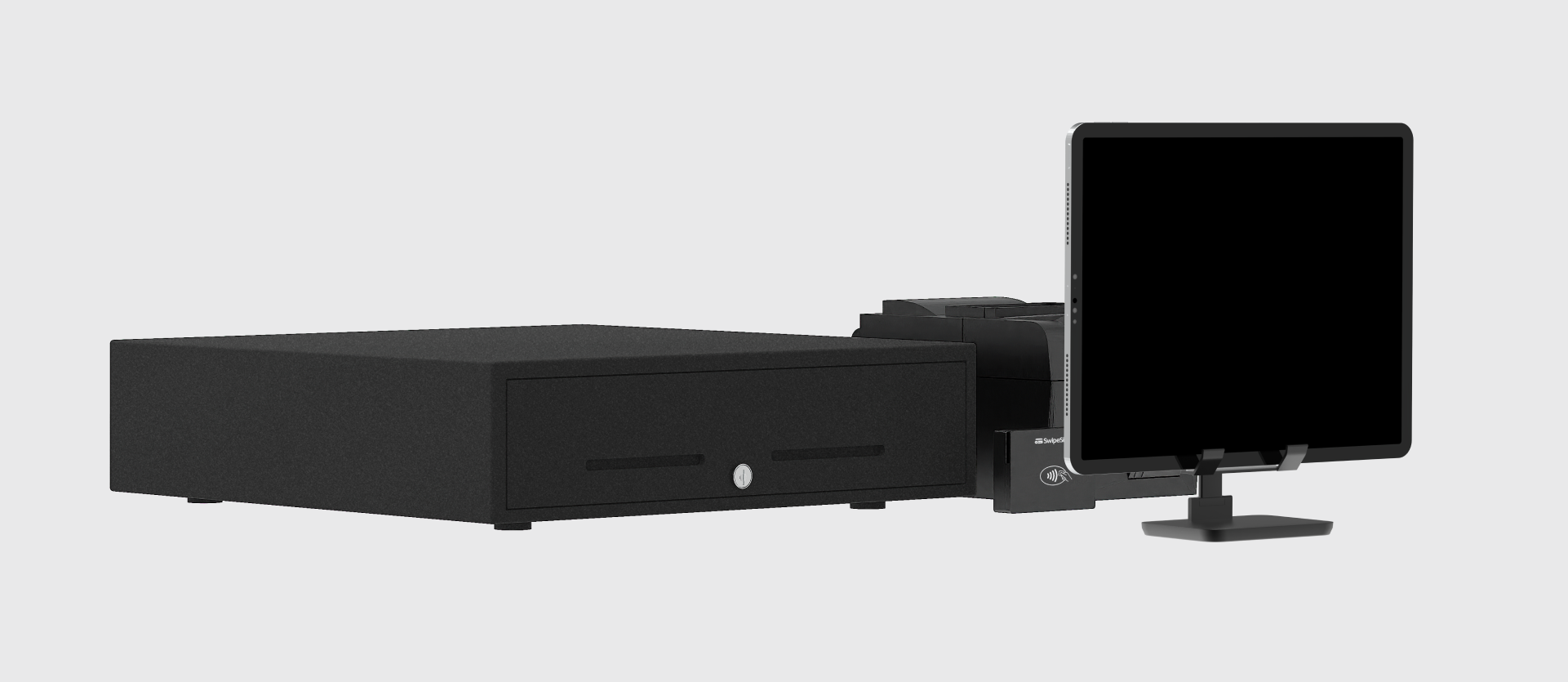
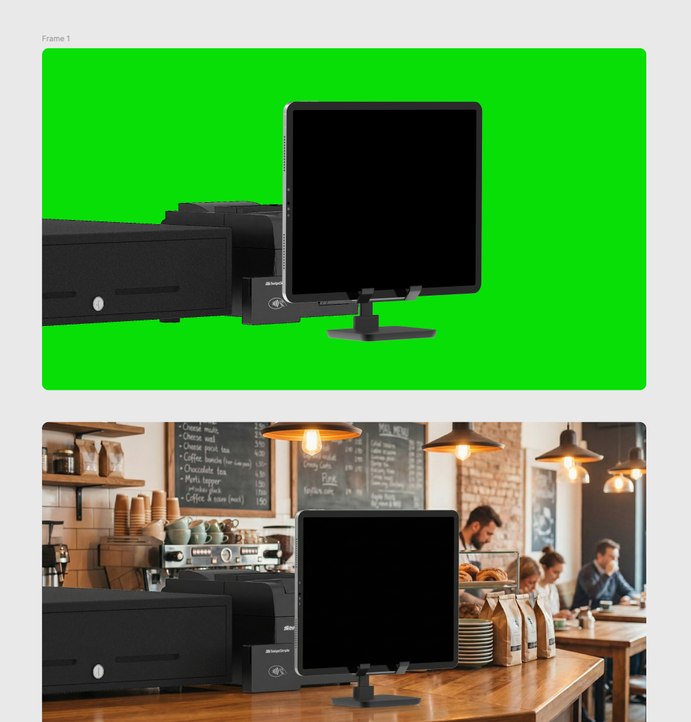
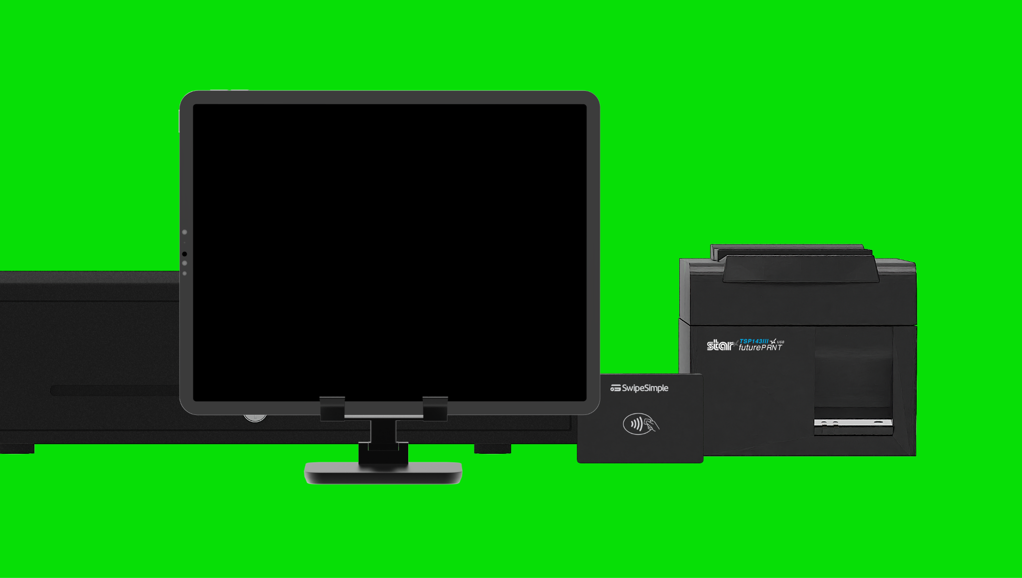
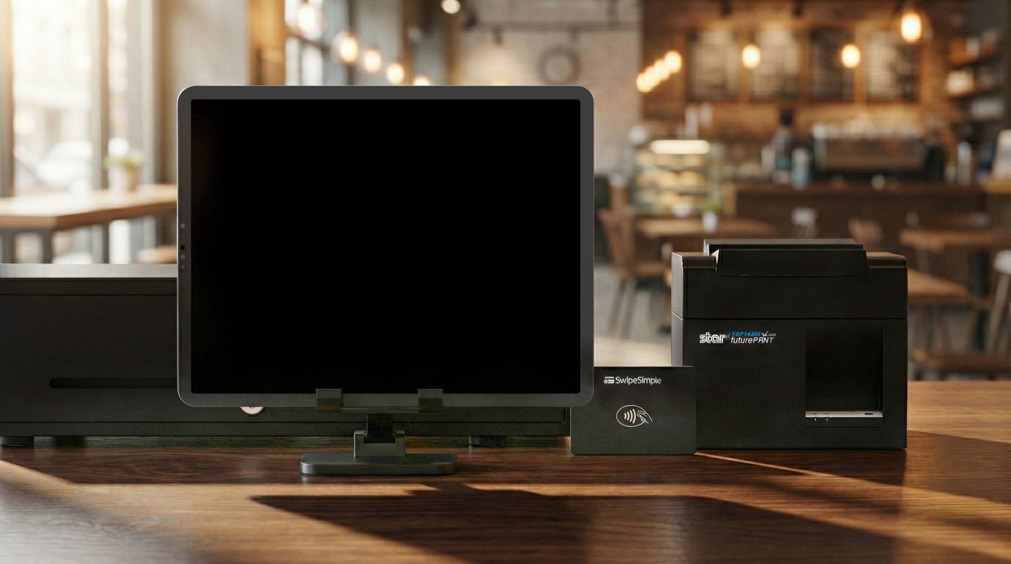
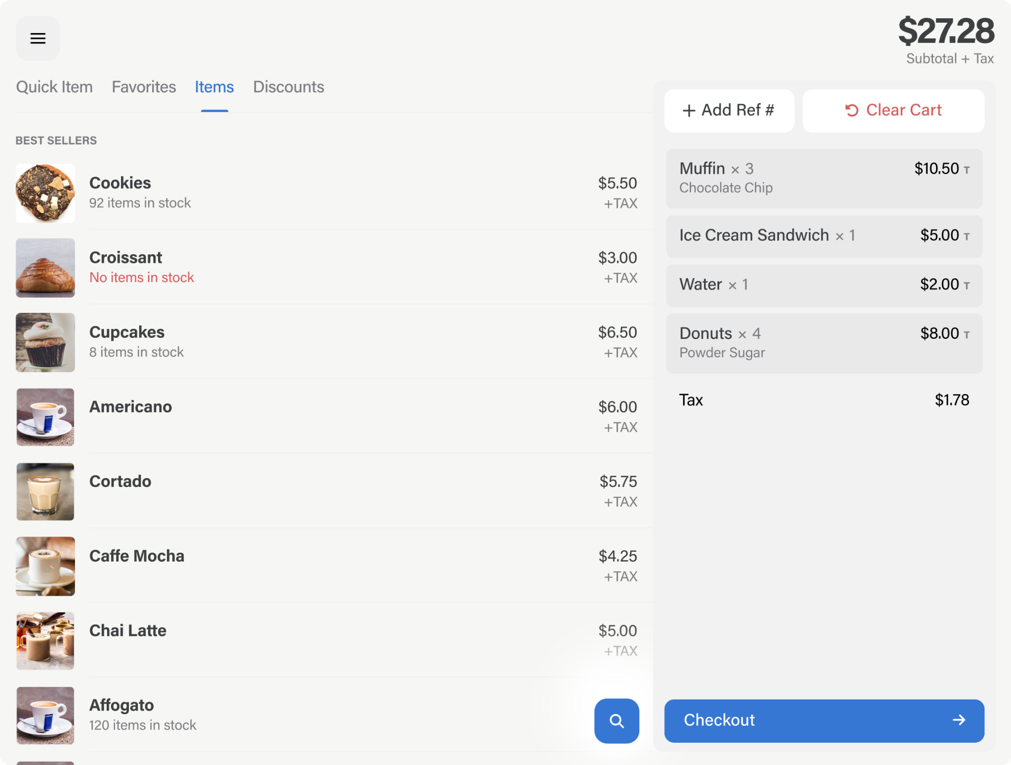
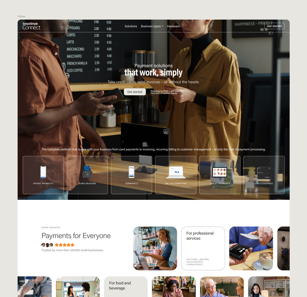
The imagery is where the pipeline gets specific. The UI on the screens is designed in Figma. The hardware is rendered in Blender, shot at a controlled camera angle over green screen. The scenery and lighting come from AI — Nano Banana, plus additional engines for the final polish.
The point of splitting it this way is control. Ask a model for a card reader on a café counter and you get something that resembles the product without being it: invented ports, a button that does not exist, an app screen that is not the app. Rendering the device and compositing the real UI means the AI only handles what it is good at, which is light and environment. No hallucinations on the parts that matter.
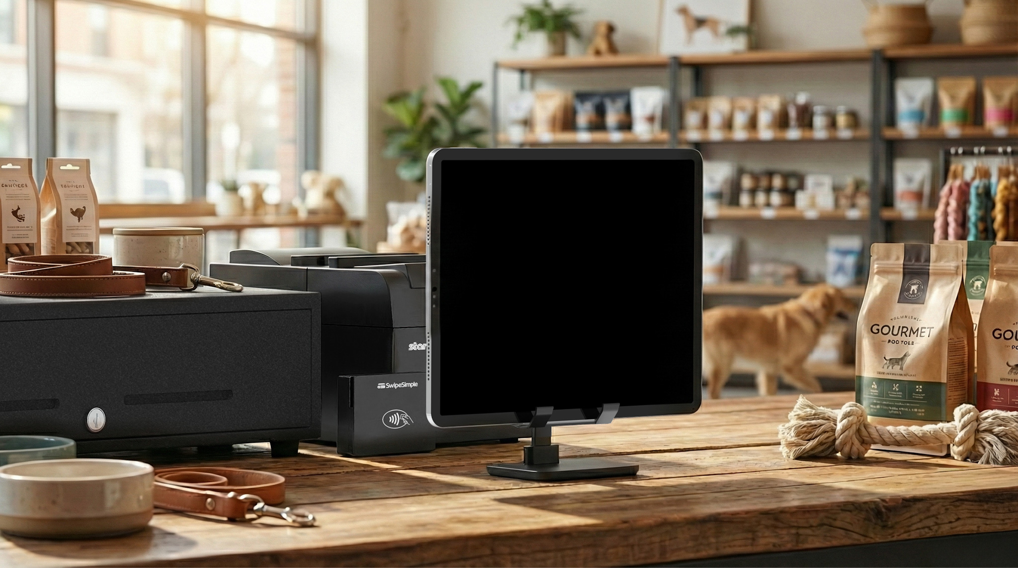
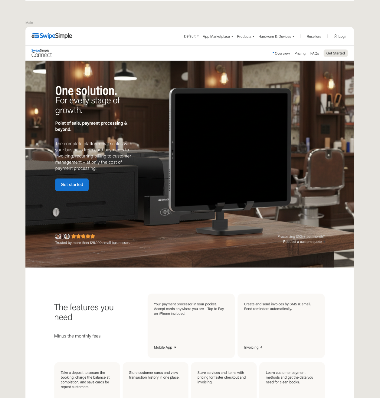
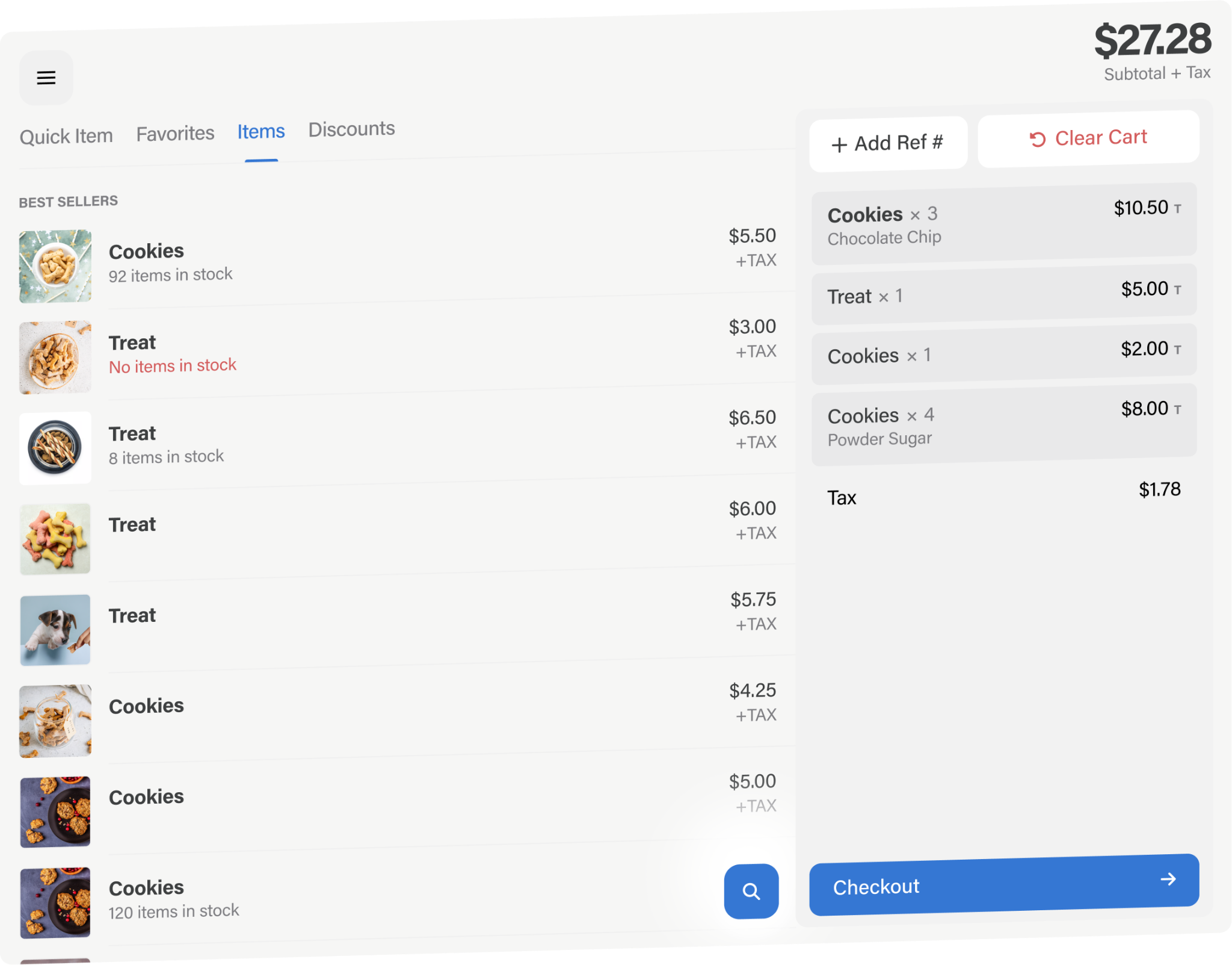
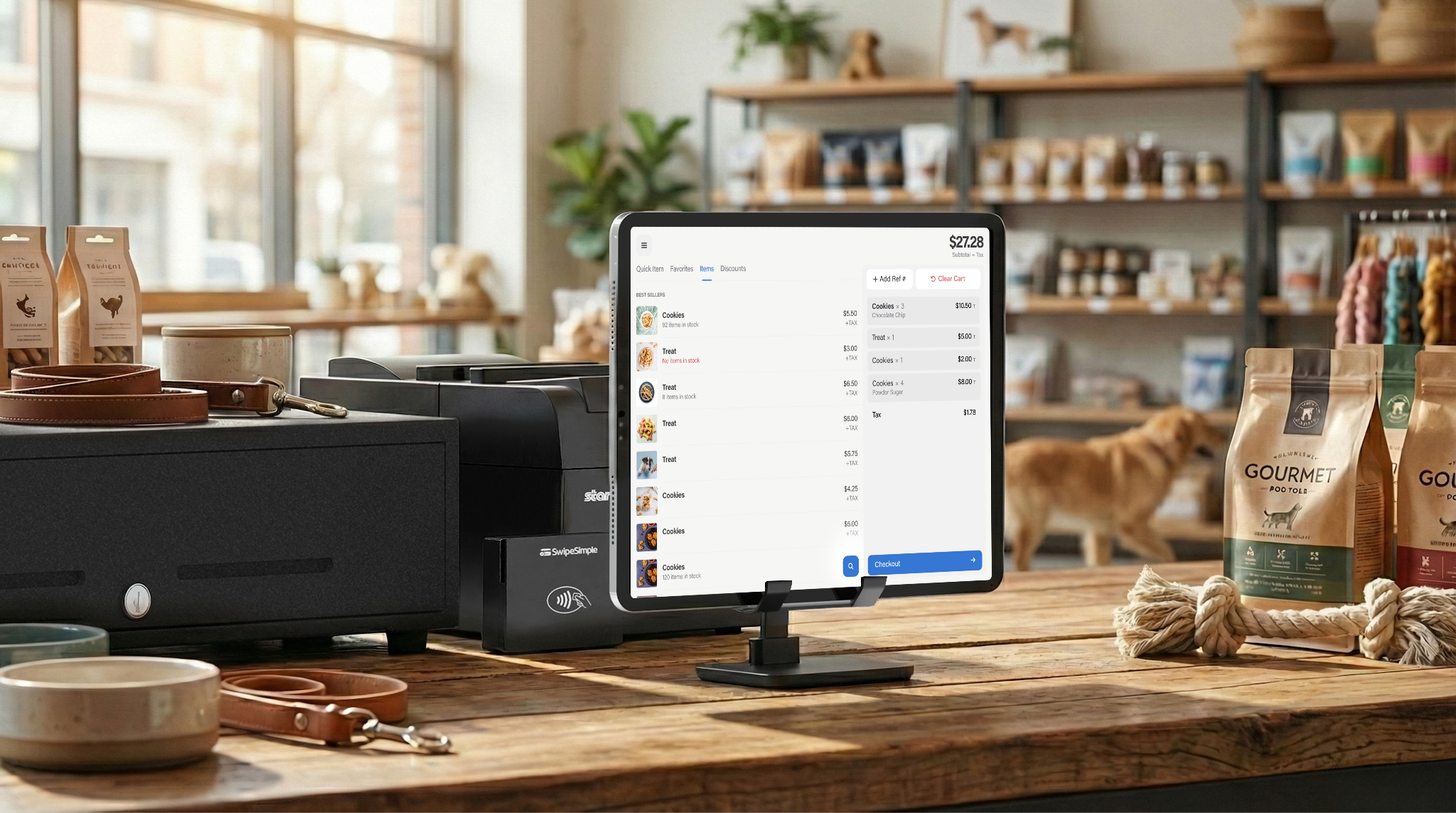
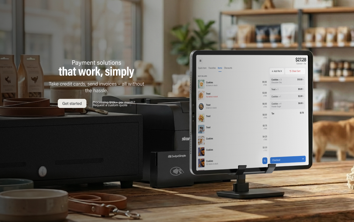
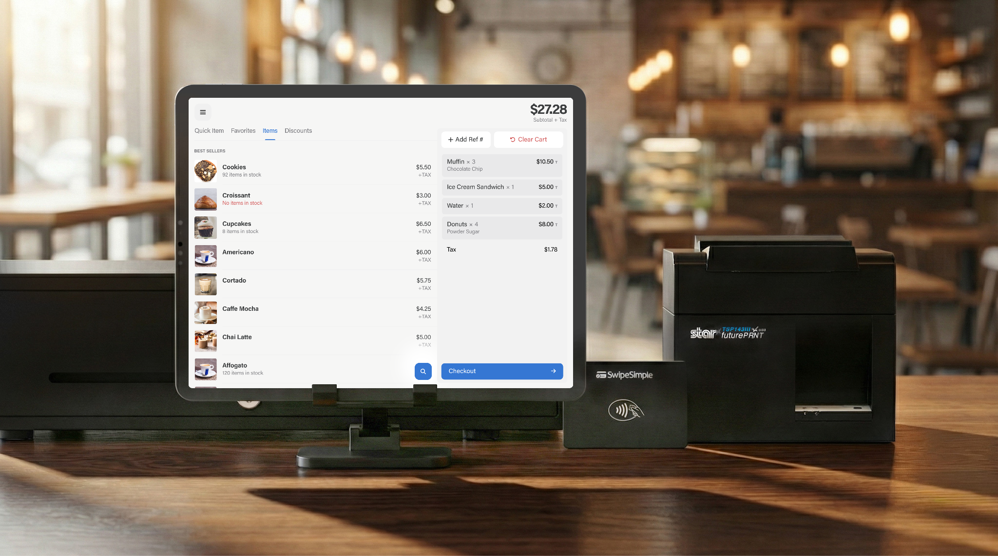
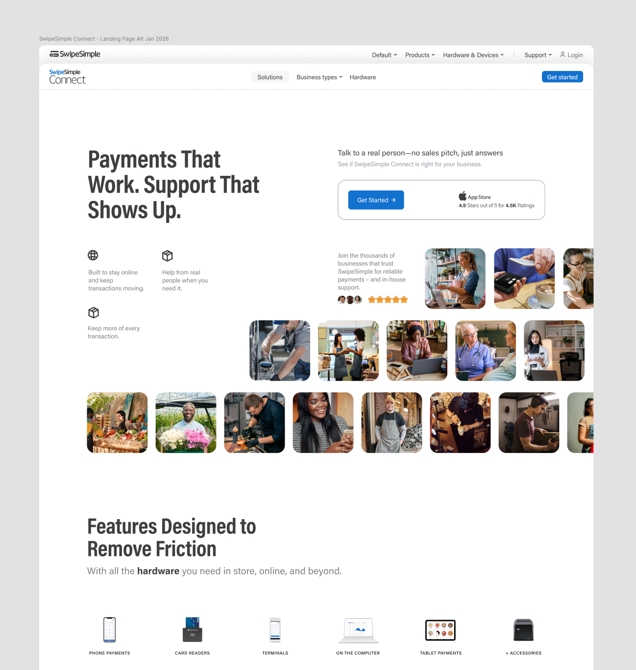
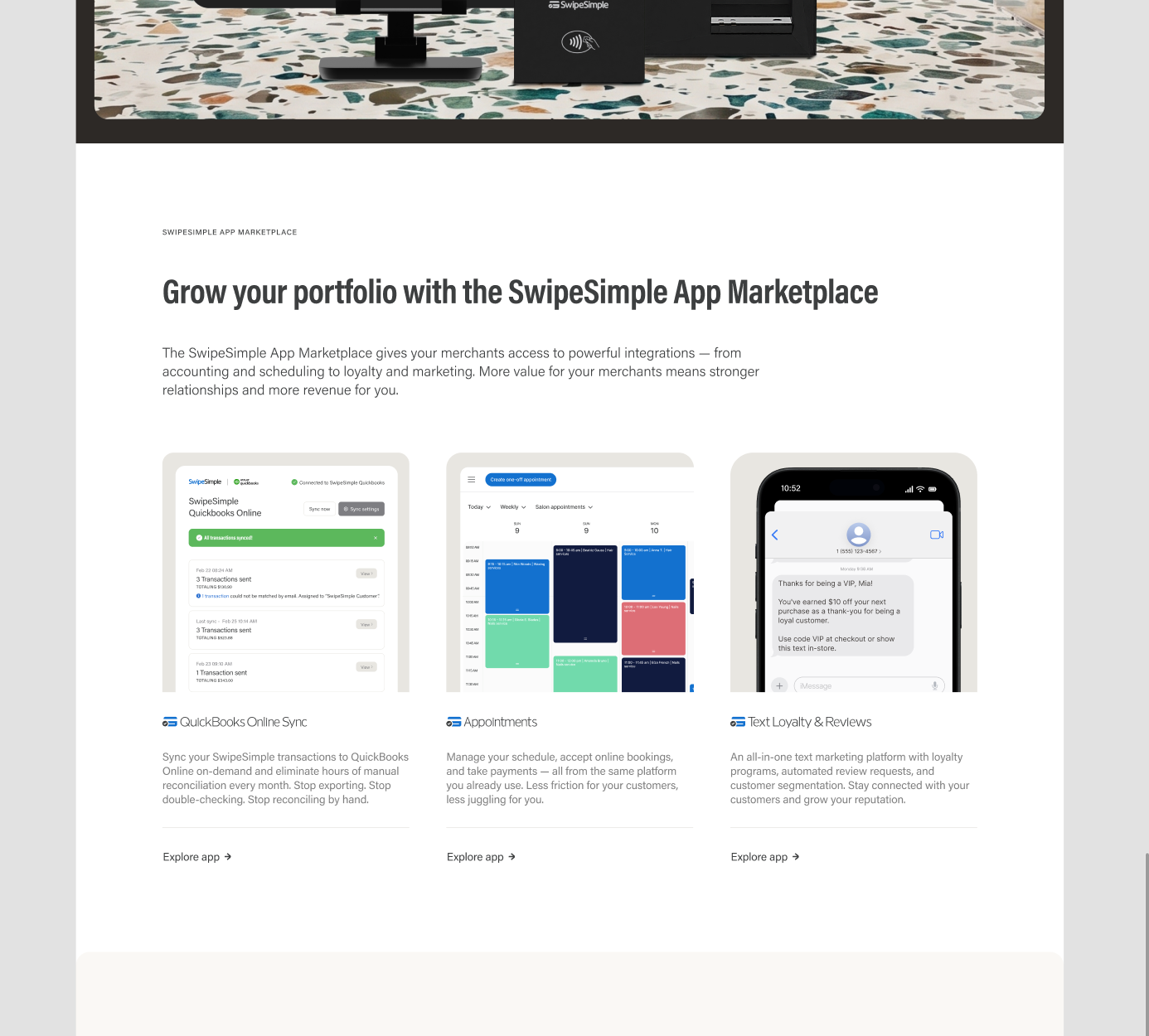
Most of the difficulty is density. A single module often has to hold testimonials, social proof, app store ratings, the four industries the service is built for, visual cues for each of them and a short description apiece — without turning into a wall.
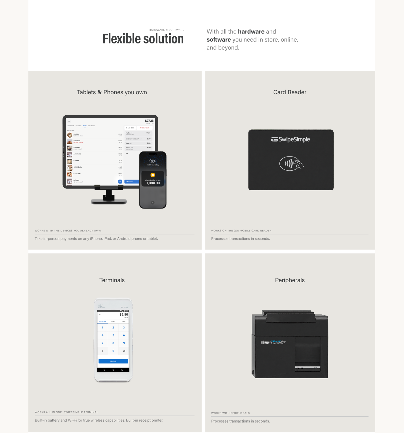
Other modules go the opposite way. The hardware section works better clean, so it borrows from Microsoft's restraint while staying inside SwipeSimple's identity.
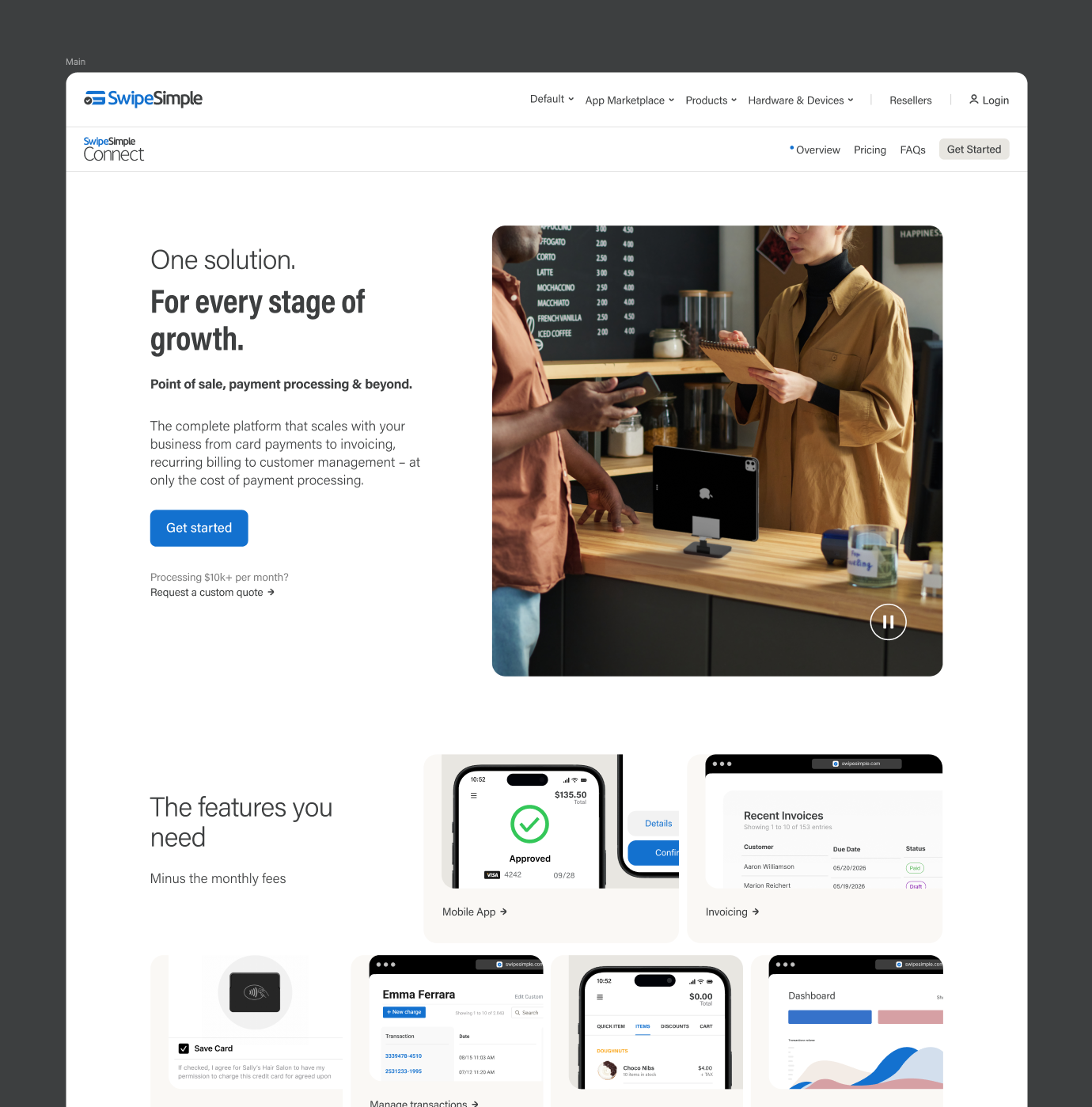
Two decisions worth naming. The CTA opens its form inside the same interface instead of sending anyone to a separate page, so nobody loses their place mid-consideration. And the immersive hero uses a top nav variant that lets the video background stay visible, with short hardware links at the bottom and the value proposition and main CTA at the center.
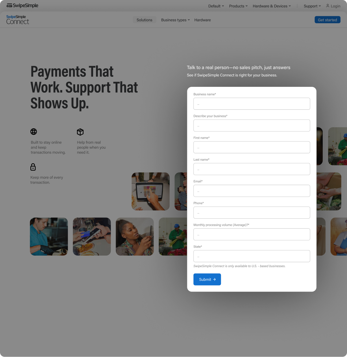
Ongoing UI work is less about single big ideas than about keeping quality steady while the volume stays high. Synced styles hold the system together, a hybrid Blender and AI pipeline keeps the imagery consistent and honest to the product, and a lot of discarded layouts make sure the one that ships was actually chosen rather than settled for. Square and Microsoft are the references; the brand is still SwipeSimple's.

Strategy, design, content and growth.