US & Global


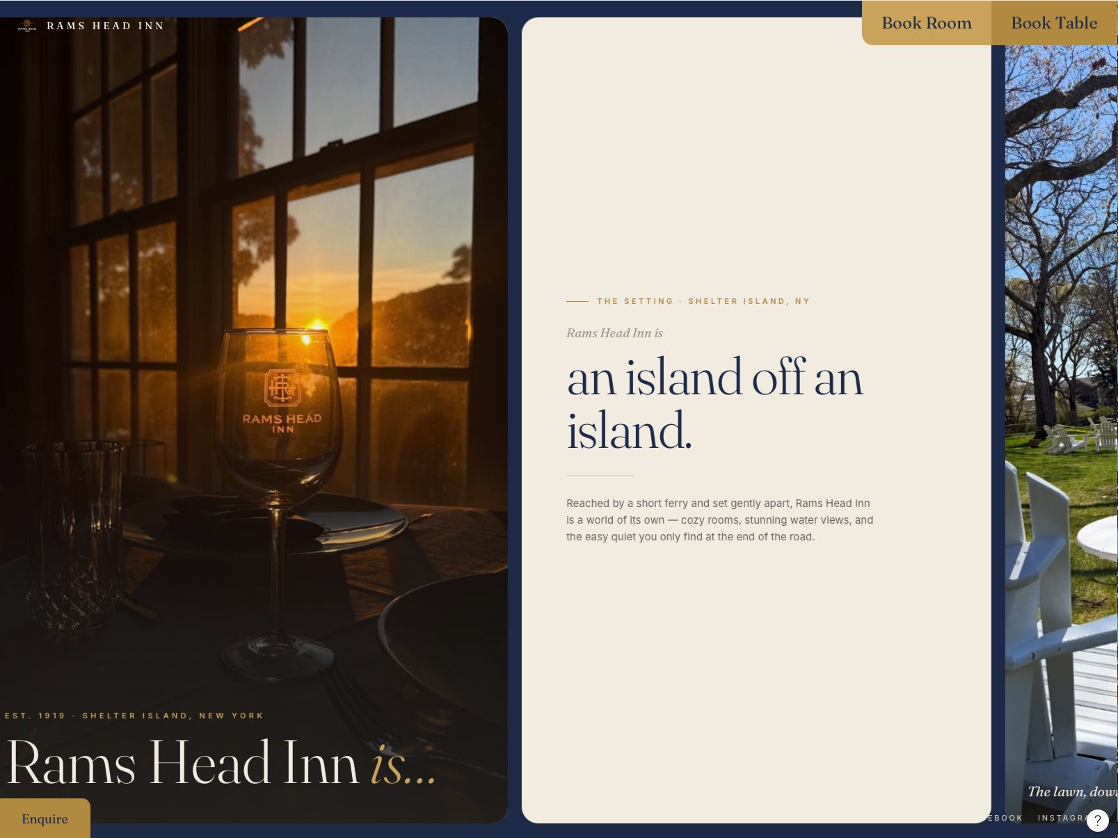
Now we are thinking about how this feels different, just to create an impact, but at the same time we want this not to be way too much – Different for a “Umm”, but not over complicated but rather somewhat classic. This implies we are not after something that would take some seconds to load, any initial animation the user got to wait for, or something that the user has to think about how to use.
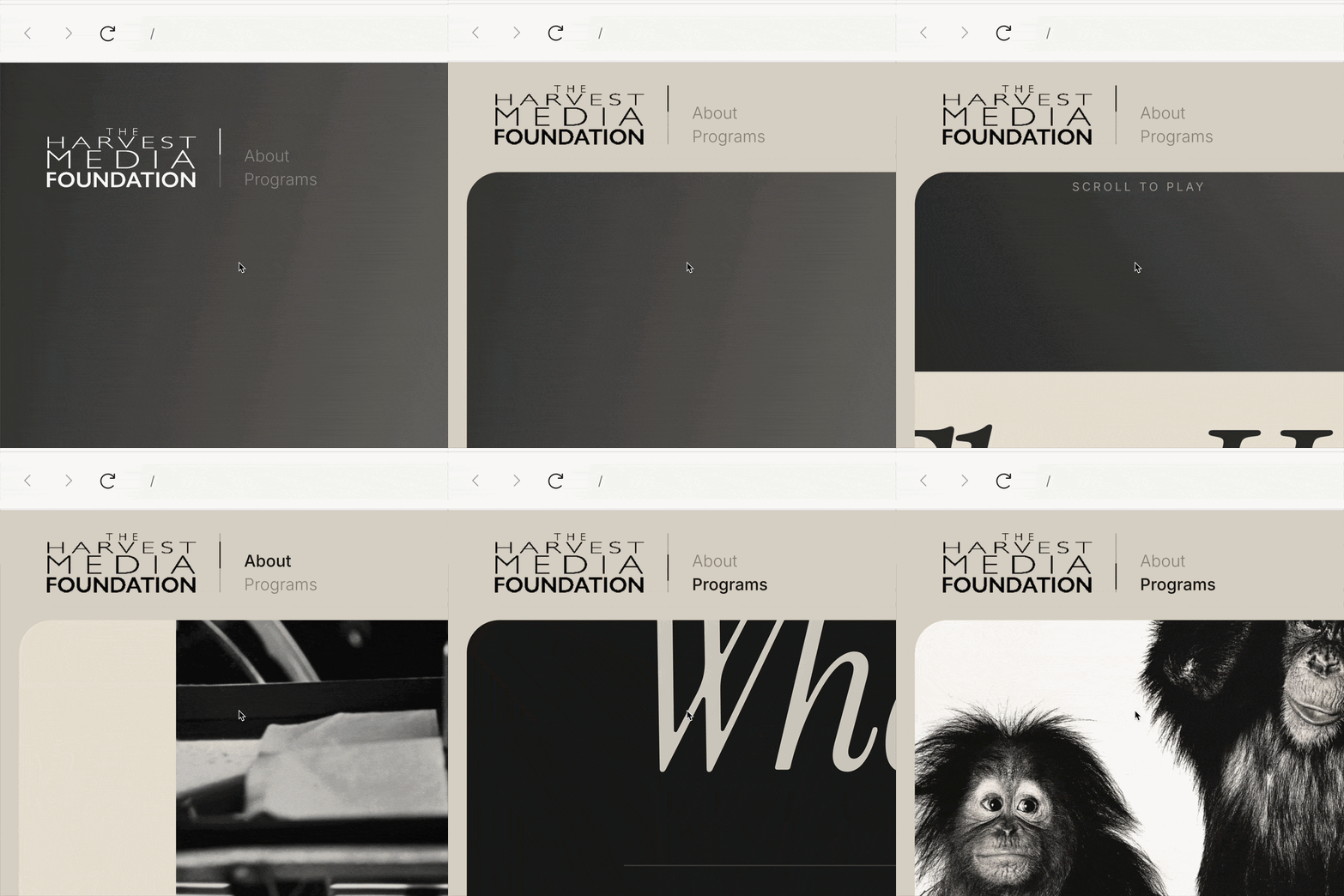
So we will use a lateral scroll as a starting point – Sort of: the users will use the scroll movement on their mouse or devices as per usual, only the direction of the content in the screen will follow from right to left.
We would like users to get what this is all about the same way a human would pitch it with words and pics: they would share the experiences themselves, pointing out pictures and videos, and through a single pitch. The latter means, in a conversation, the recipient would be guided through whatever the speaker tells them – On a traditional website, recipients have to browse through tabs to get to see it all. So they might miss things as they go through. This is not to say the website will not have a menu to get deeper into things, but rather that the homepage will serve as a single thread storytelling so that users don’t need to choose in a guess game what menu item to browse through next.
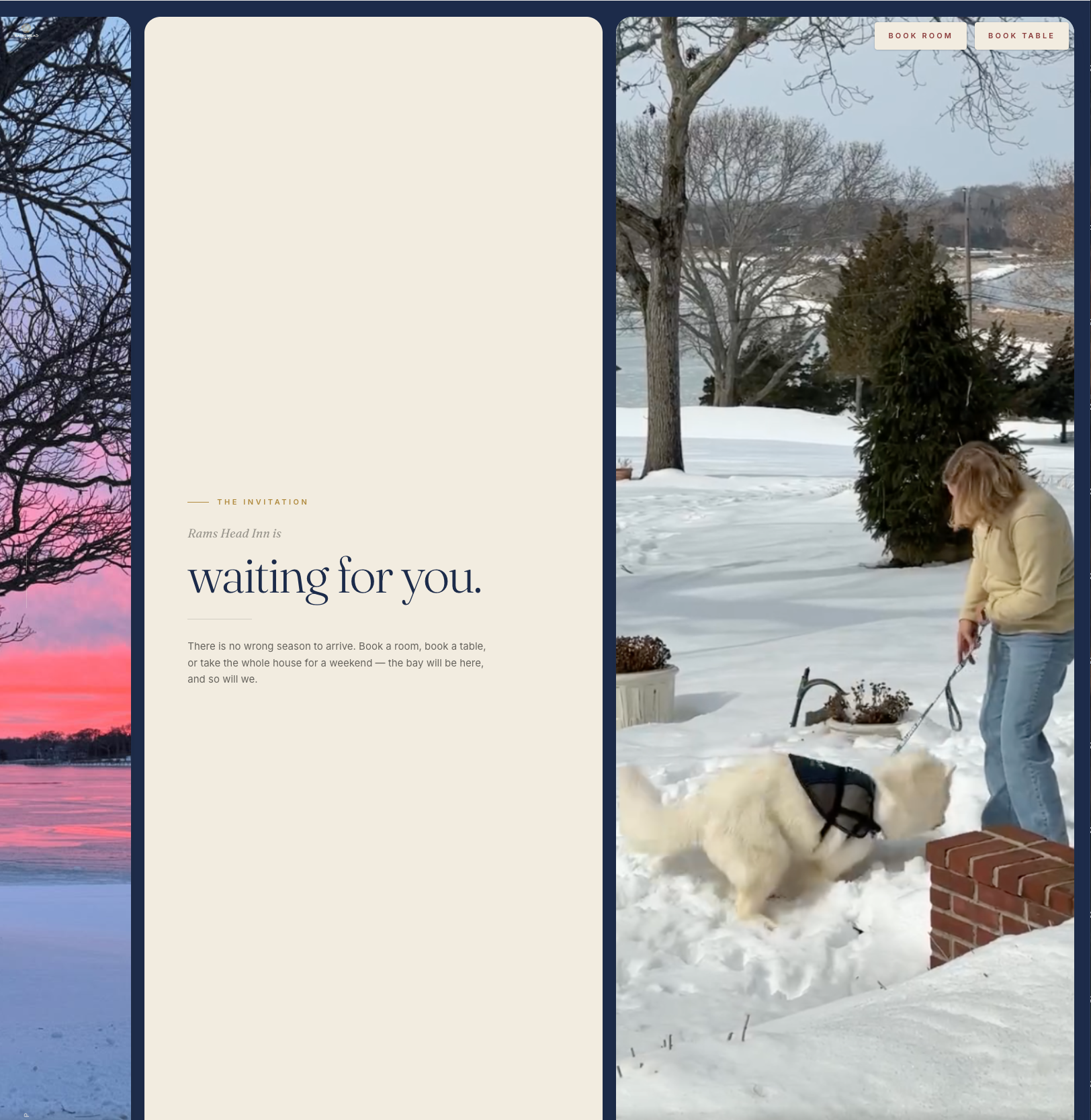
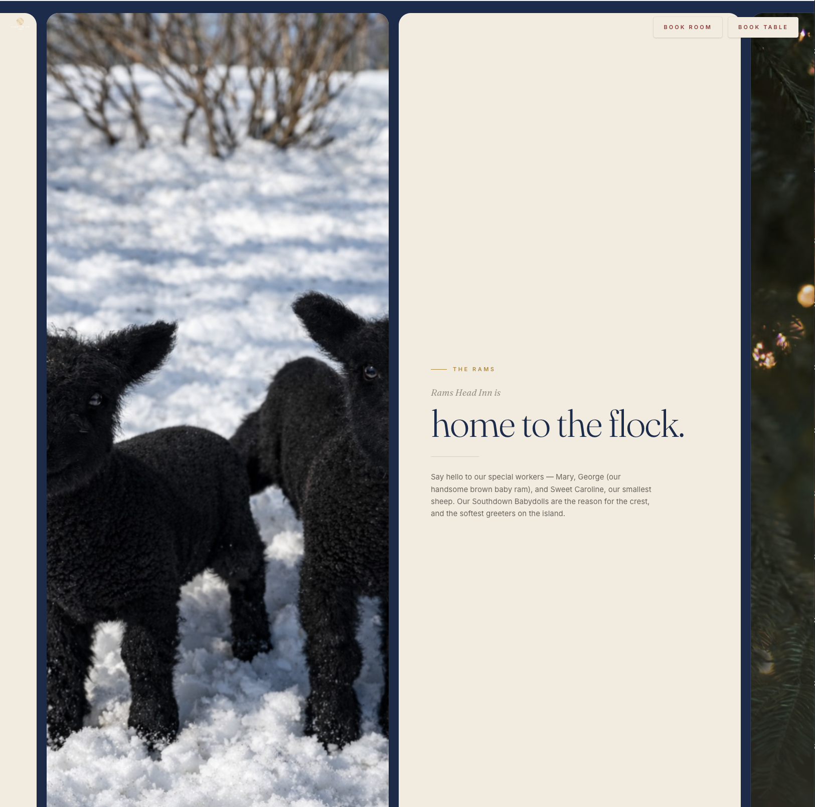
The scrollytelling experience will allow them to read it in the form of Rams Head Inn is: the island off an island, the chic yet historic seaside, the long weekends, the wellness retreats, the family gathers, the exceptional dining experience by Michael Gilleto, the kayaks, the paddleboards, the private events, the southdown babydoll sheep Mary and George, the winter escape (we will probably emphasize the current season activities at a certain moment of the year in parallel to mentioning that there are activities all year round), the Jaws outdoor movie with Rams Film Society, and so on and so forth. At this point, this is envisioned as:
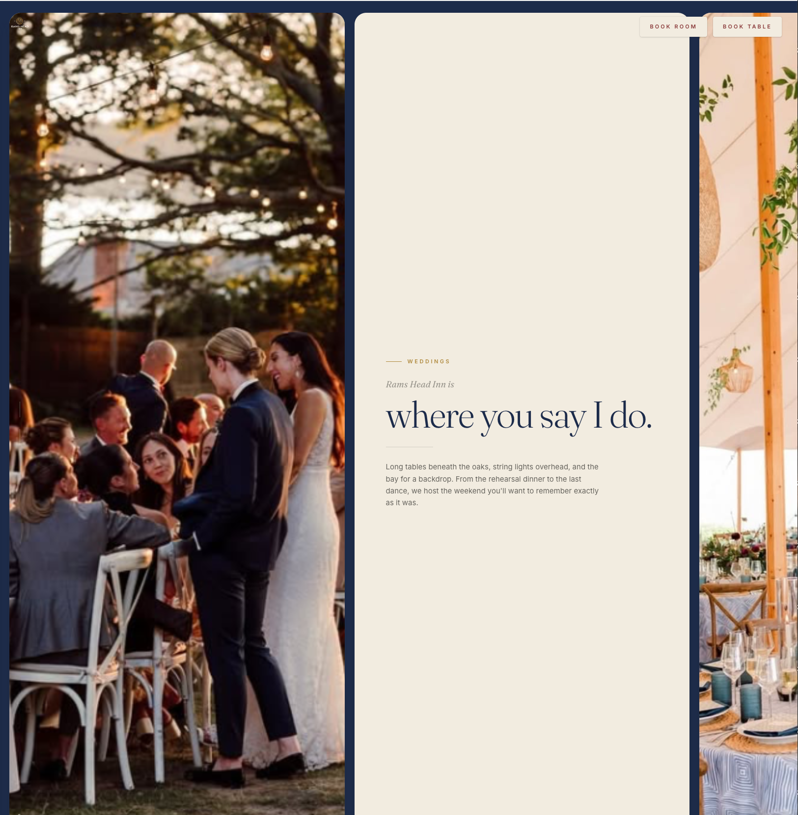
Now, the approach towards the user would not differ that much from the approach modern social media has got for posts: one can scroll through, there are units of content, and for some of them there is a carousel. Consider the typical Instagram carousel post for instance, it gets handy to share a group of media elements in one post instead of posting 10 pictures individually – Users who would like to stop for a moment and get to read more will be able to do so. A somewhat similar approach in terms of user psychology is available for us to use here – Specifically for content units such as events and live music. We could have a tile for “Rams Head Inn is… Events”, and then list a series of featured events in a carousel there. It could either look this way:
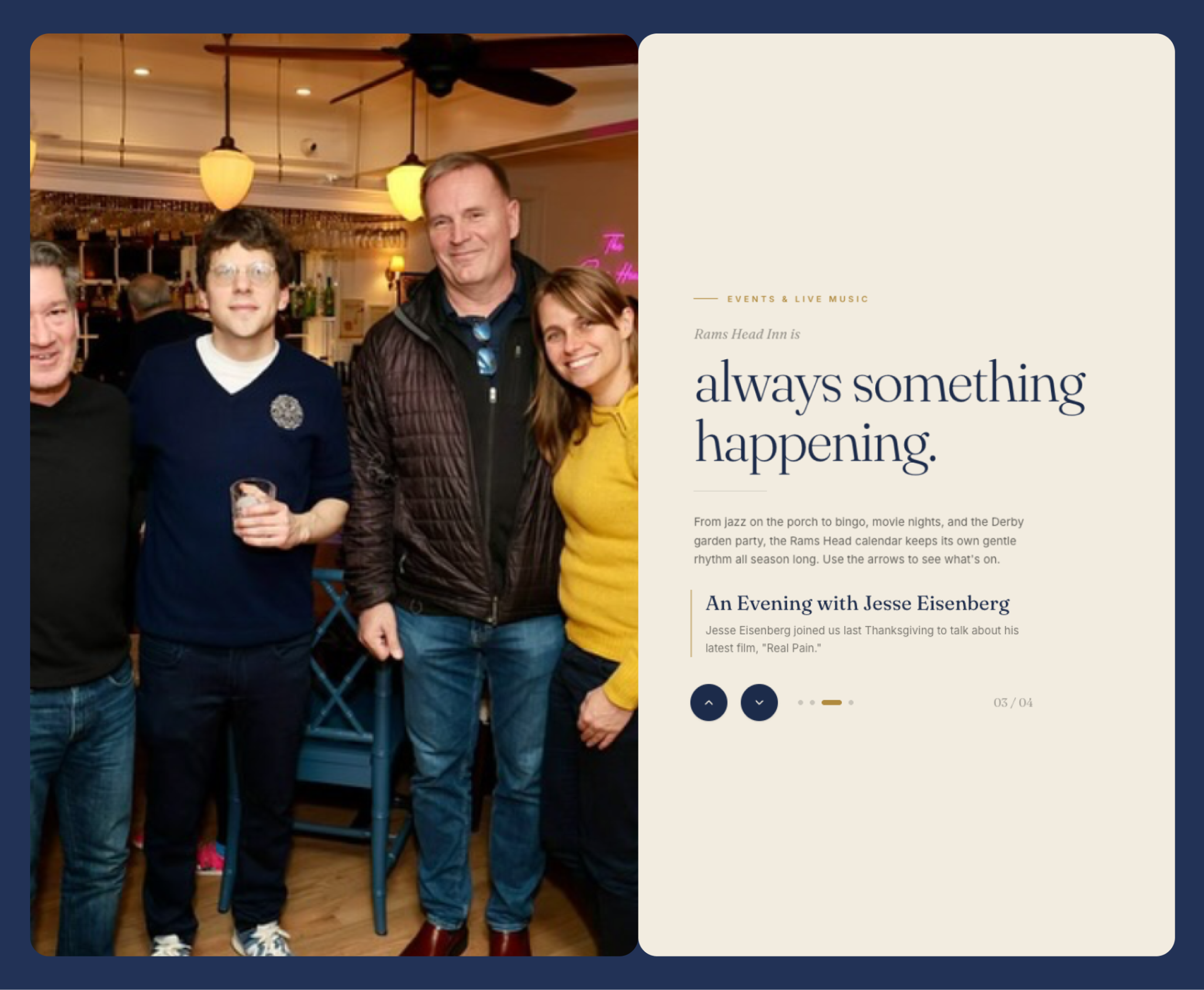
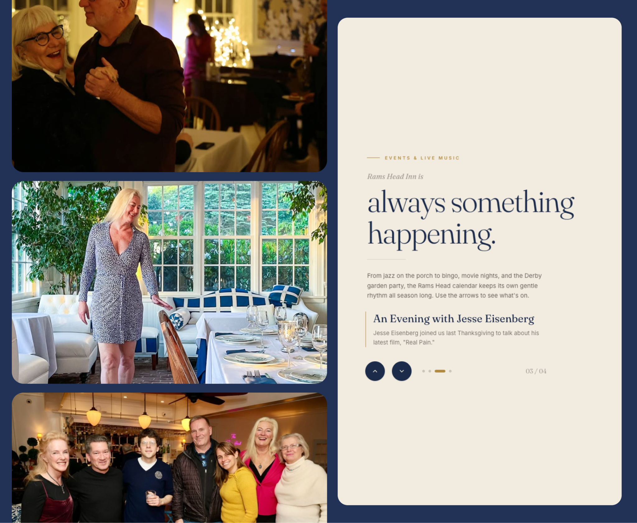
Or like this, letting readers visualize the items before and next to the current one:
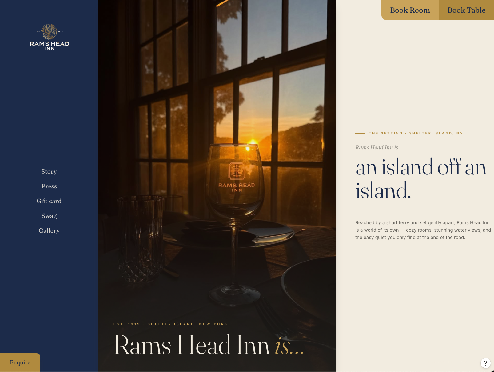
Let’s consider two stages, a default one on which to showcase the logo, a few links for diving deep into the pages:
Then as we start to scroll through, we will either get the intra site navigation links hidden and shrink the logo:
Or a skunk navigation overall, with the links to be displayed upon a click on a burger menu and the inquire presented vertically:
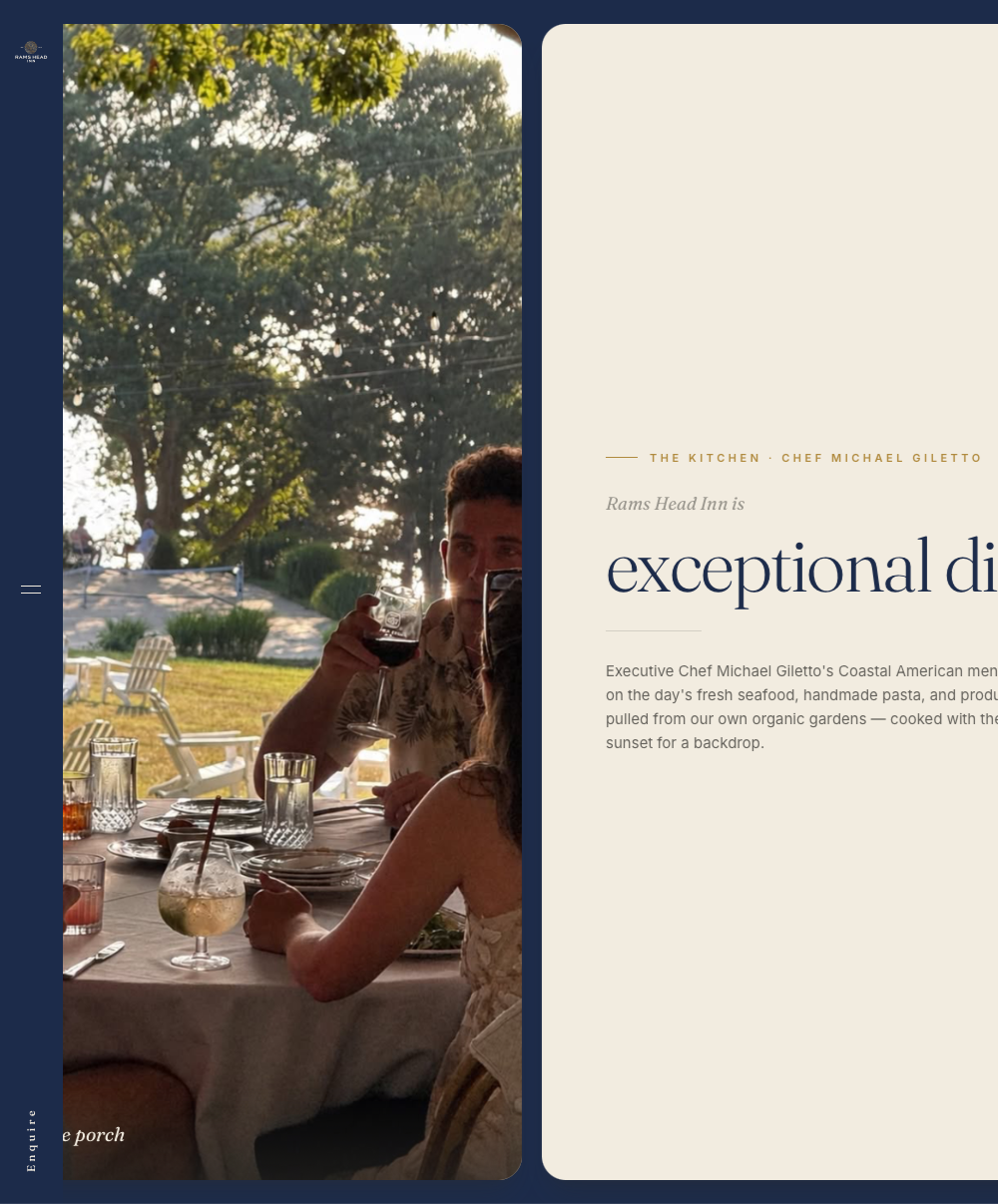
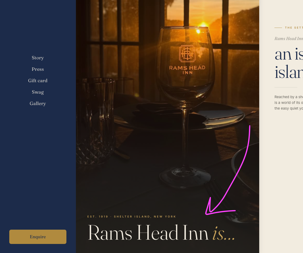
Users will land into a horizontal scrolling experience. At first, the left part of their view will offer them expanded navigation with the big logo and links for them to browse through the site's internal pages, should they want to. And as soon as they start scrolling through, the tiles that follow will tell what Rams Head Inn is –literally–.
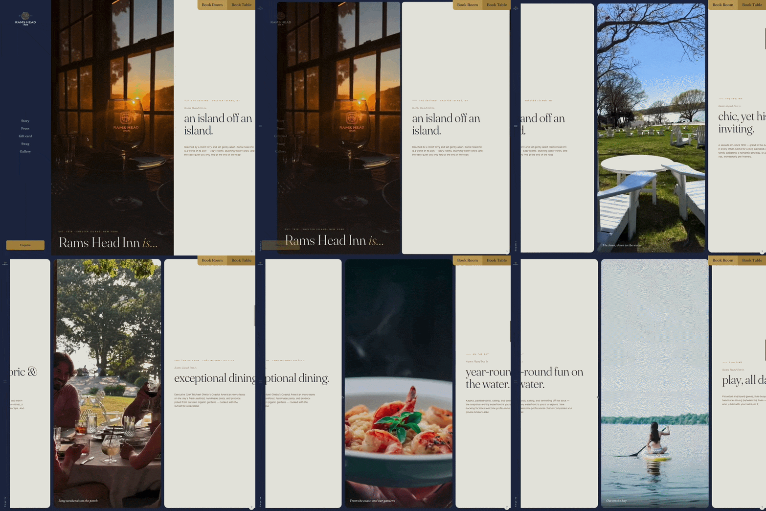
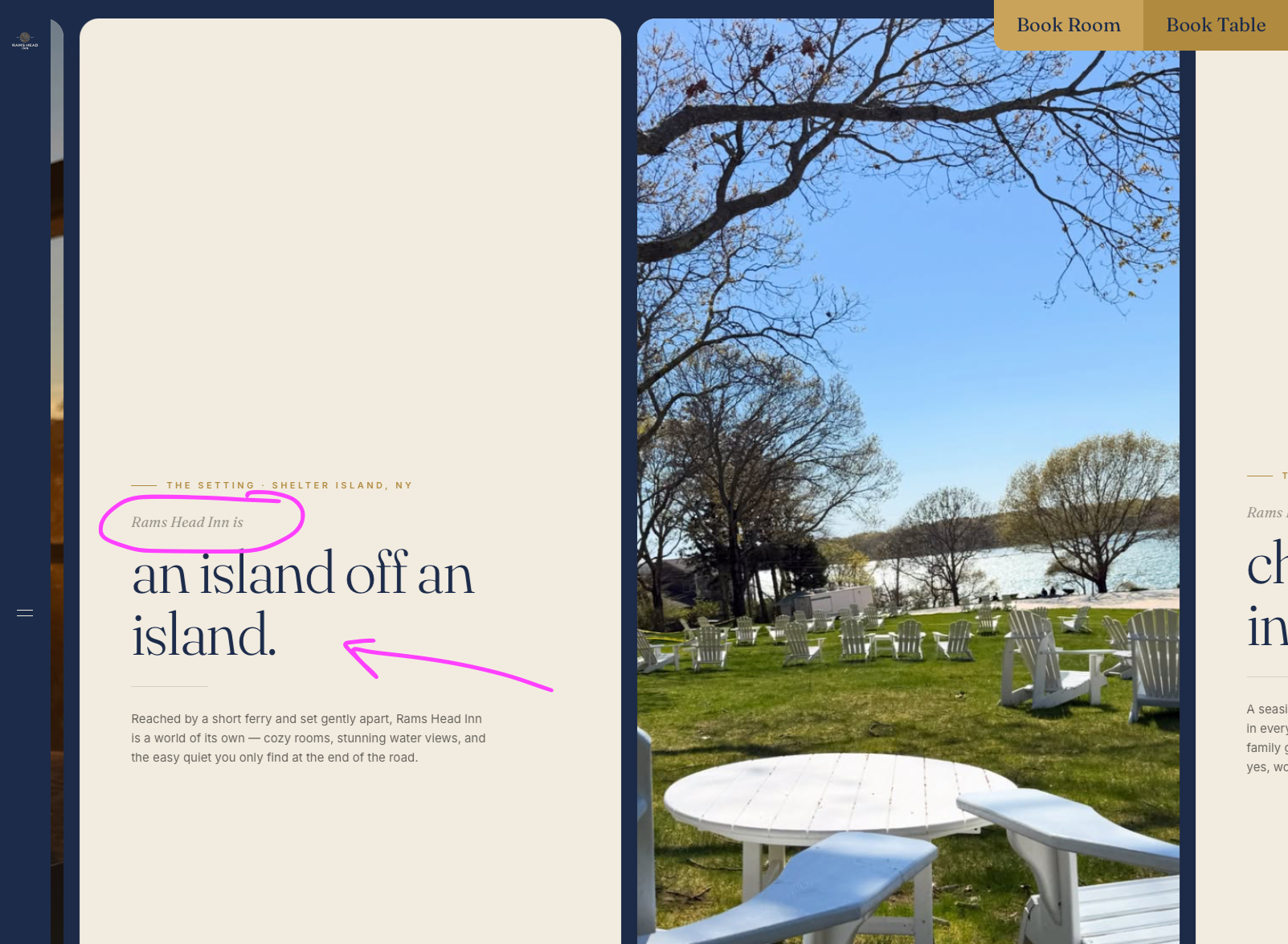
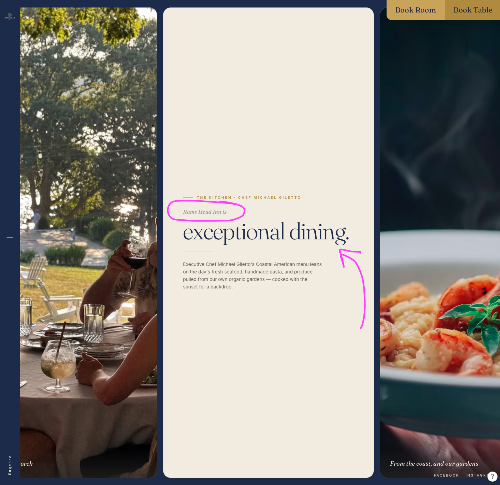
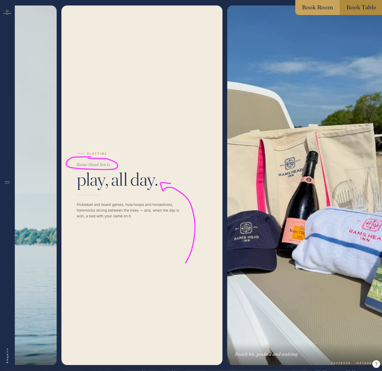
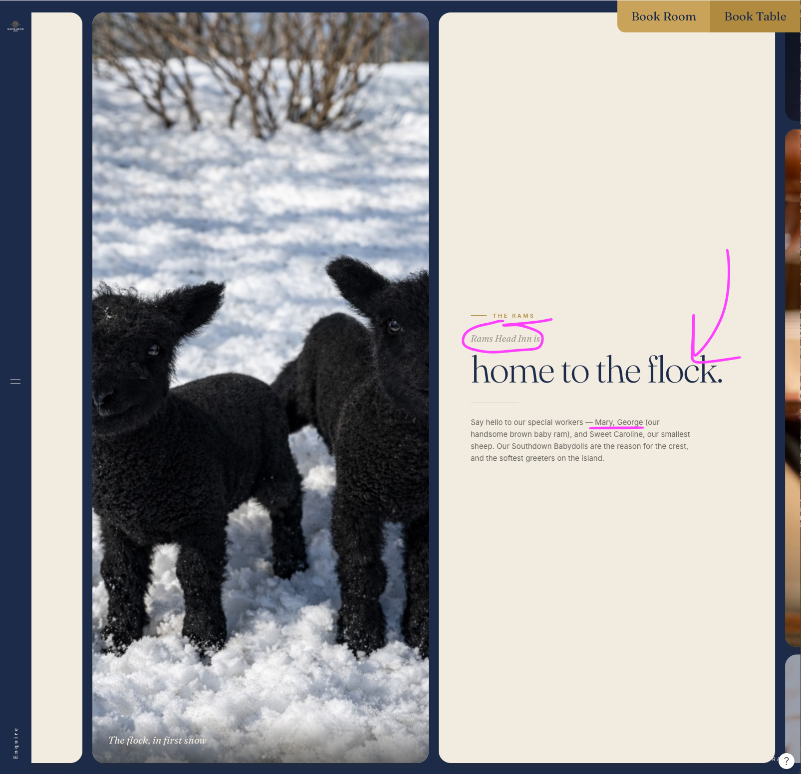
And the experience will go on like that with more on what Rams Head Inn is, going through experiences, fun on the water, weddings, corporate escapes, family reunions, and events. For the latter, since there are many events, we will group them like so –also applicable to live music evenings–:
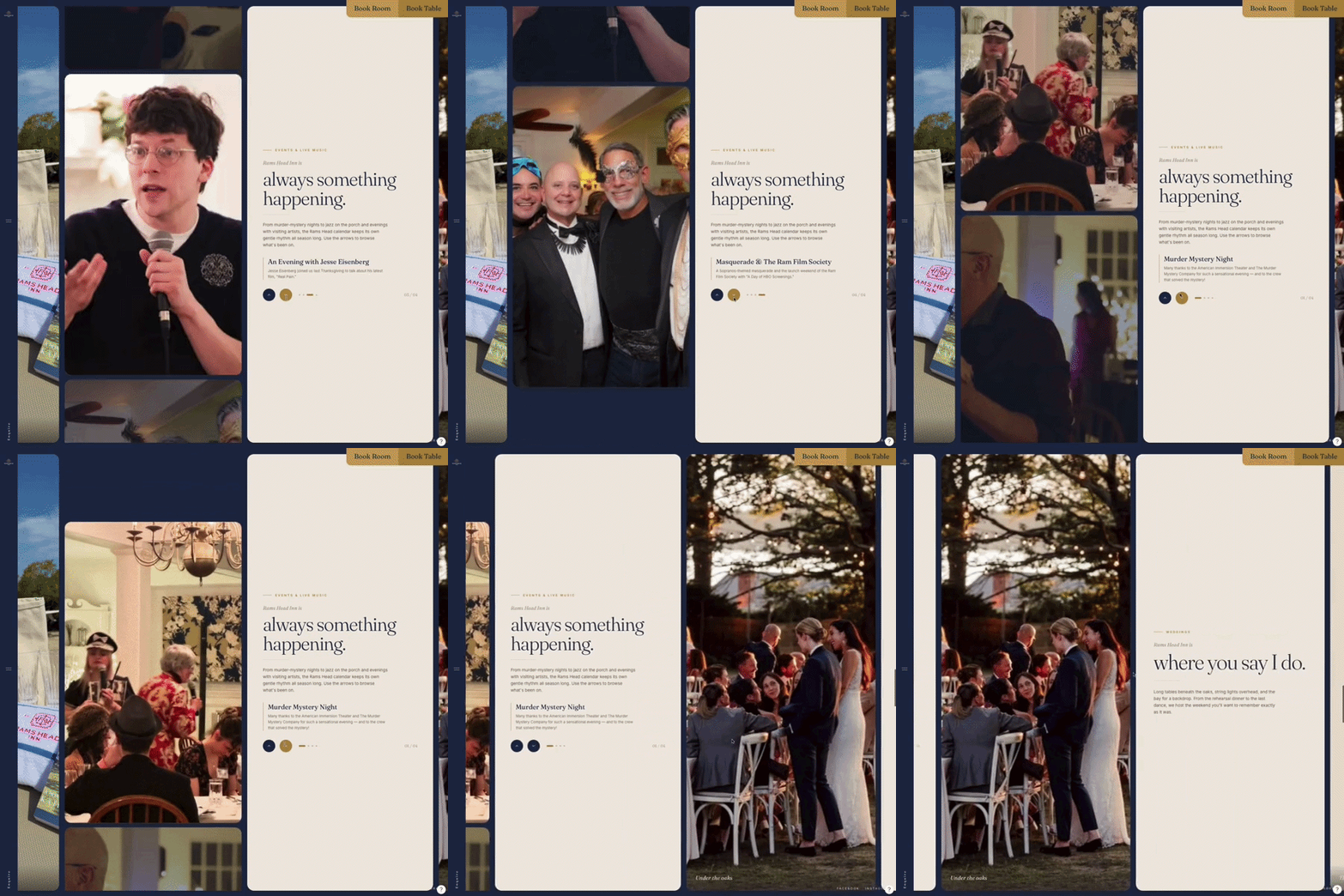
That is for the home most first and most important experience – There is more to be done although that will all circle around this concept. Homepage will be scrollytelling, and will take users to internal pages either via the story cards or the persistent call to action buttons (booking or enquiring).

Strategy, design, content and growth.