US & Global


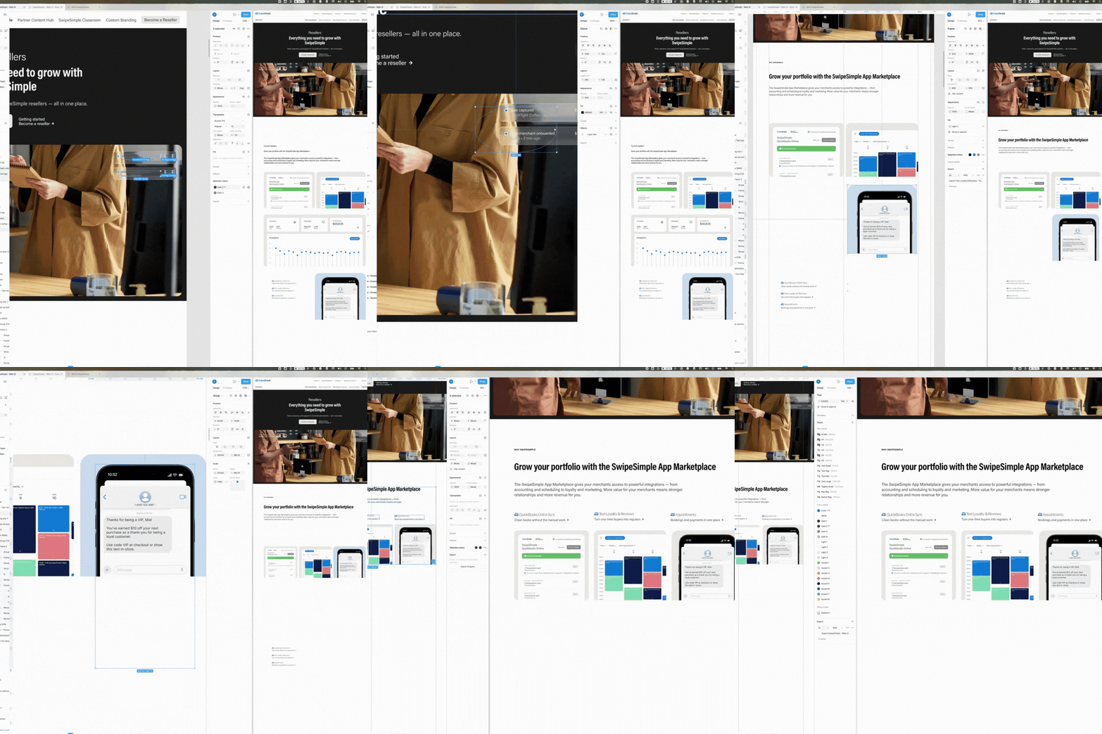
When looking at the sheer volume of exploration across the design canvas, it becomes evident that finding the right visual narrative requires rigorous iteration. The workspace acts as a sprawling map of thought processes, where dozens of artboards document every pivot, micro-adjustment, and discarded concept. This vast amount of visual data is not a sign of indecision, but rather a deliberate methodology to stress-test ideas before committing to a final structure.
The core of this ongoing project is a relentless engine of creation and iteration. It is a continuous cycle of designing, testing, and refining different interfaces, where each layout demands its own specific logic. By combining a diverse toolset, from traditional interface design to advanced artificial intelligence and 3d rendering, with a strong human pilot to orchestrate the results, the workflow ensures rapid production without sacrificing quality. Every new module is meticulously documented and aligned with the overarching brand system, proving that high-volume output can successfully maintain its structural and visual integrity.
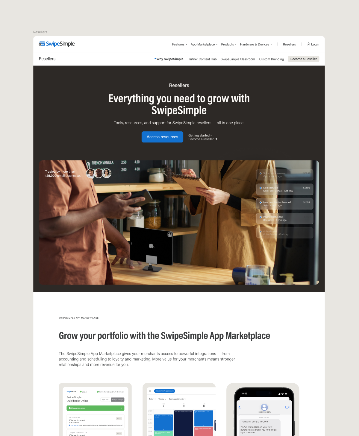
In the context of this ongoing project, this iterative expanse was the week-to-week moto to craft compelling stories. Every module for a landing page must guide the user seamlessly through value propositions, feature sets, and trust signals. Oh, and follow up a branding system, of course, so that everything a viewer look at feels part of the same big thing.
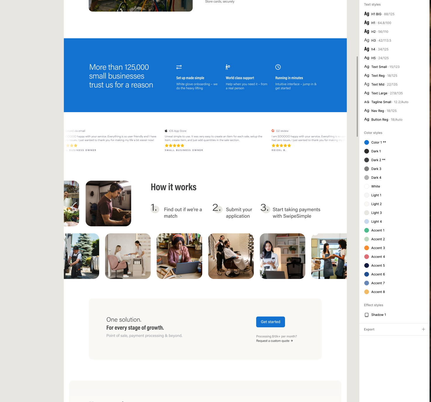
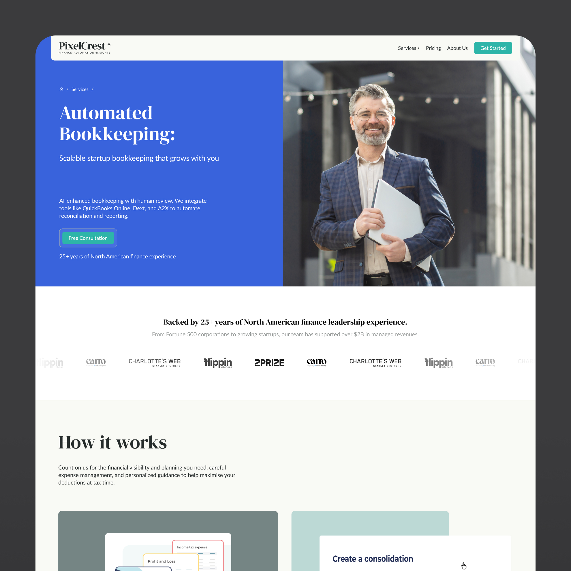
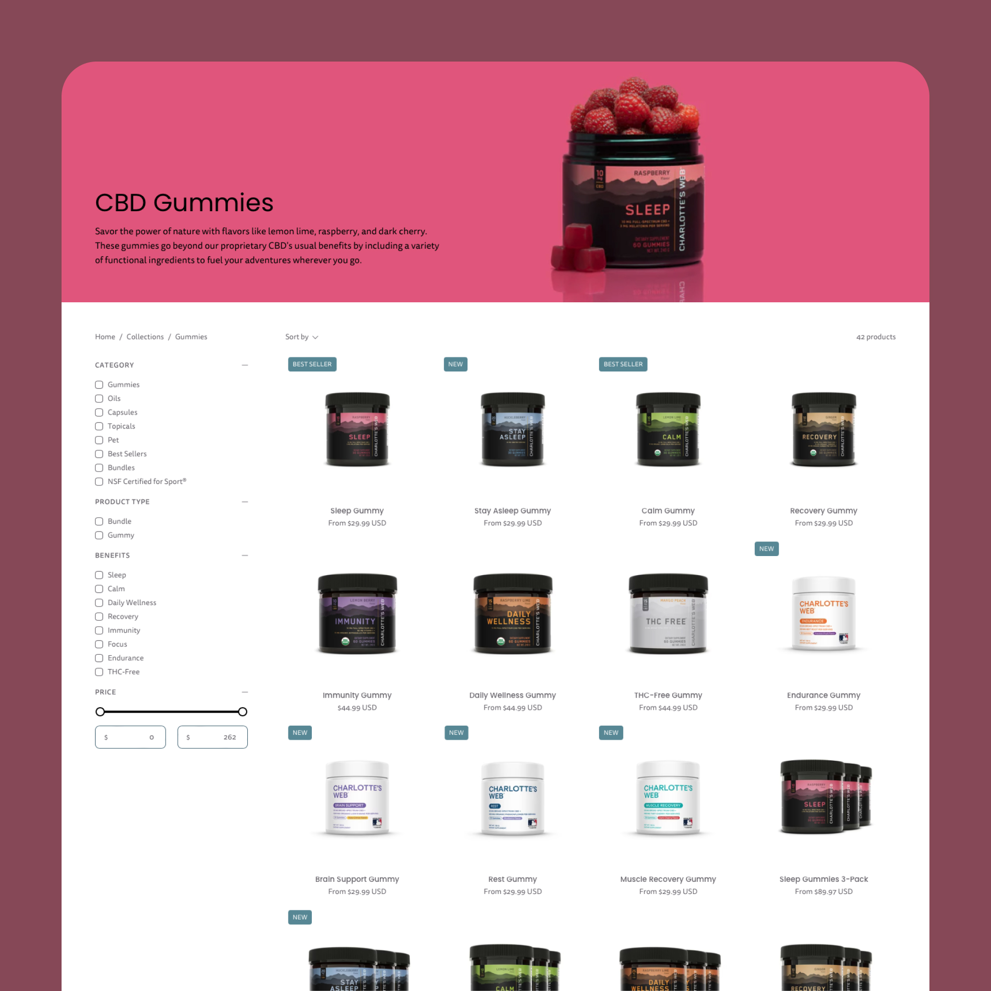
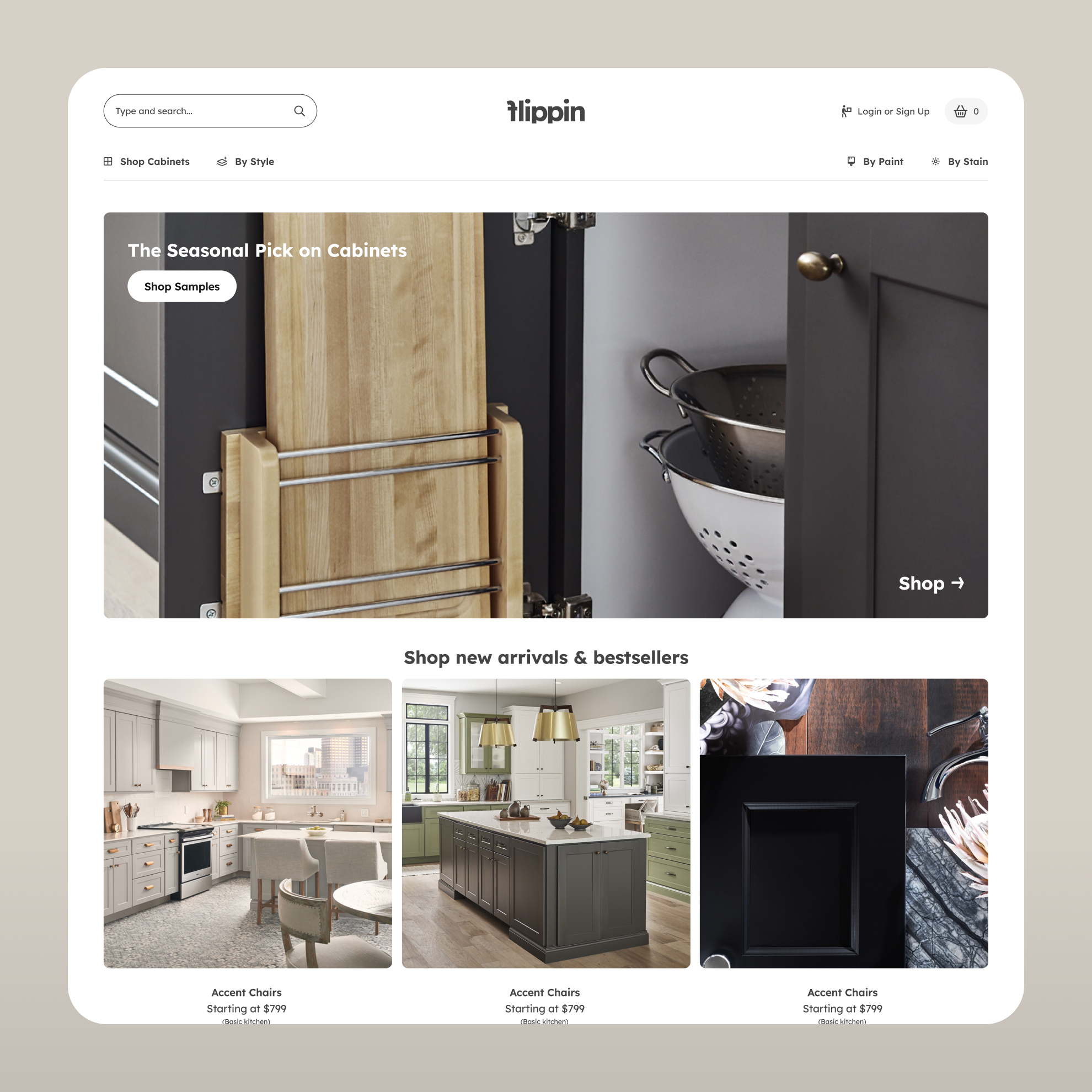
By creating multiple variations of hero sections, hardware displays, and pricing modules, it became possible to evaluate how different layouts impacted the overall flow of information. The canvas reveals a clear transition from fragmented ideas and broad explorations to a cohesive system that balances aesthetic appeal with functional clarity.
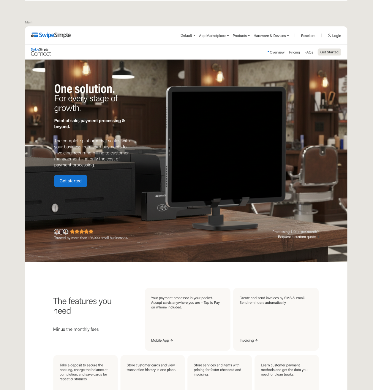
Final designs presented to the user are merely the tip of the iceberg. The countless screens and variations left behind on the canvas represent the necessary friction of creative problem-solving.
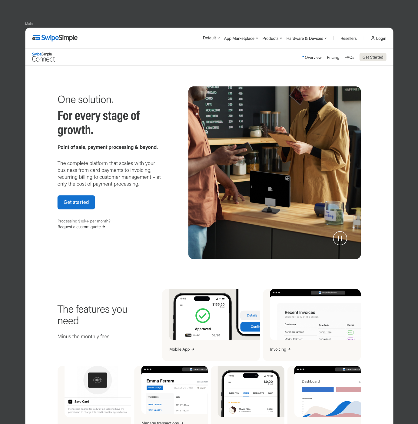
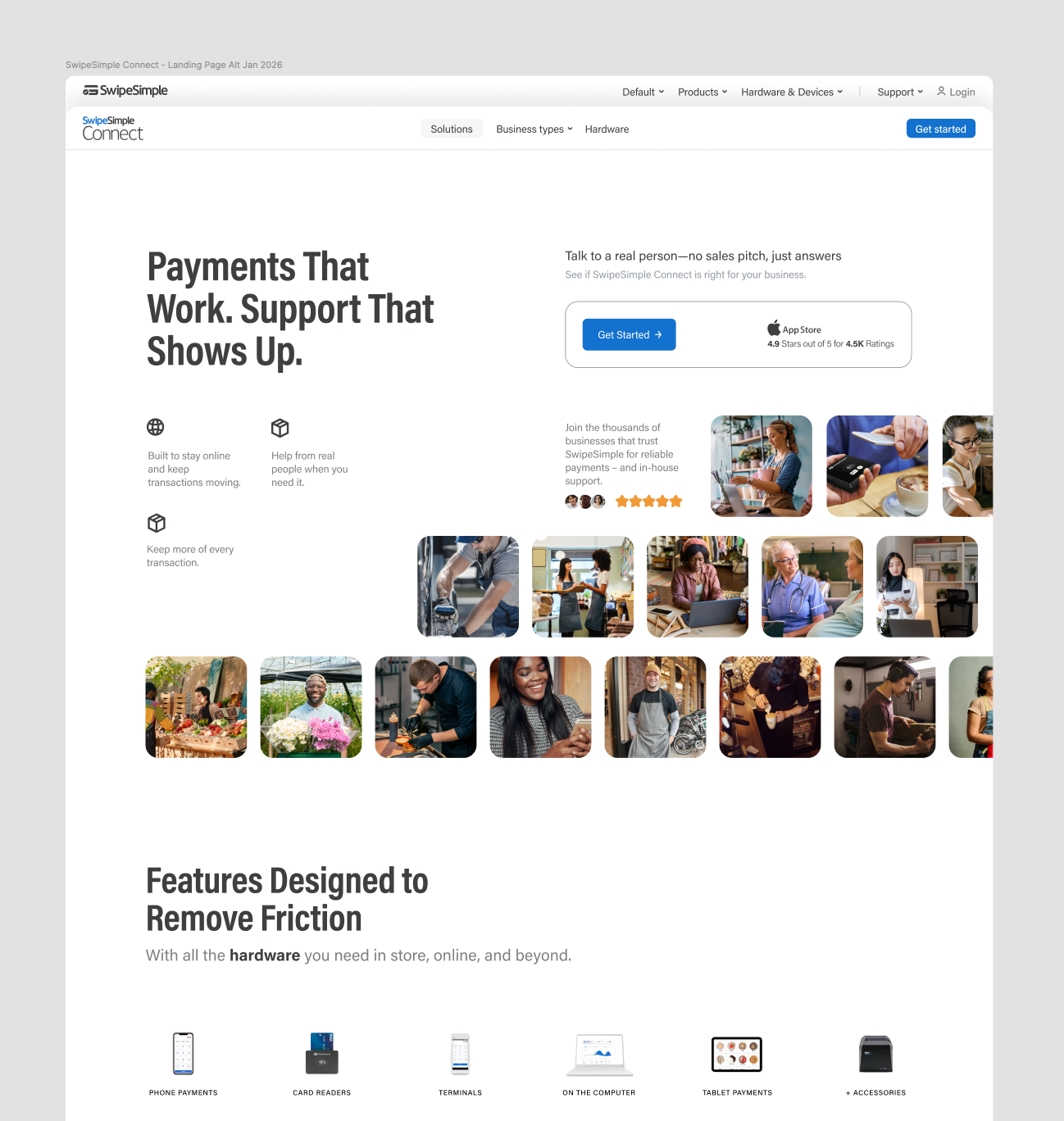
It is through this exhaustive exploration that the definitive storytelling of the project was forged, ensuring that every element on the final page serves a specific, tested purpose in the user journey.
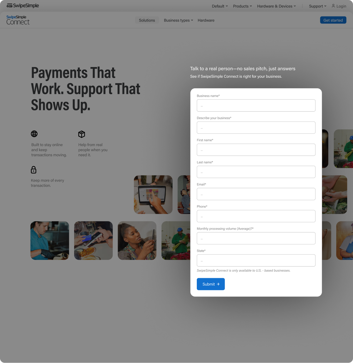
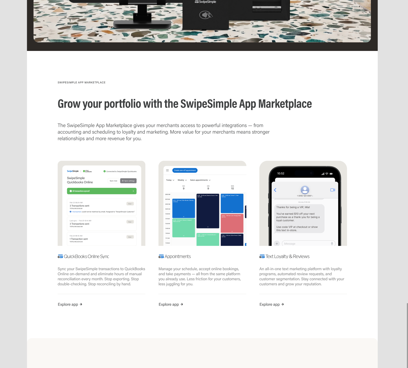
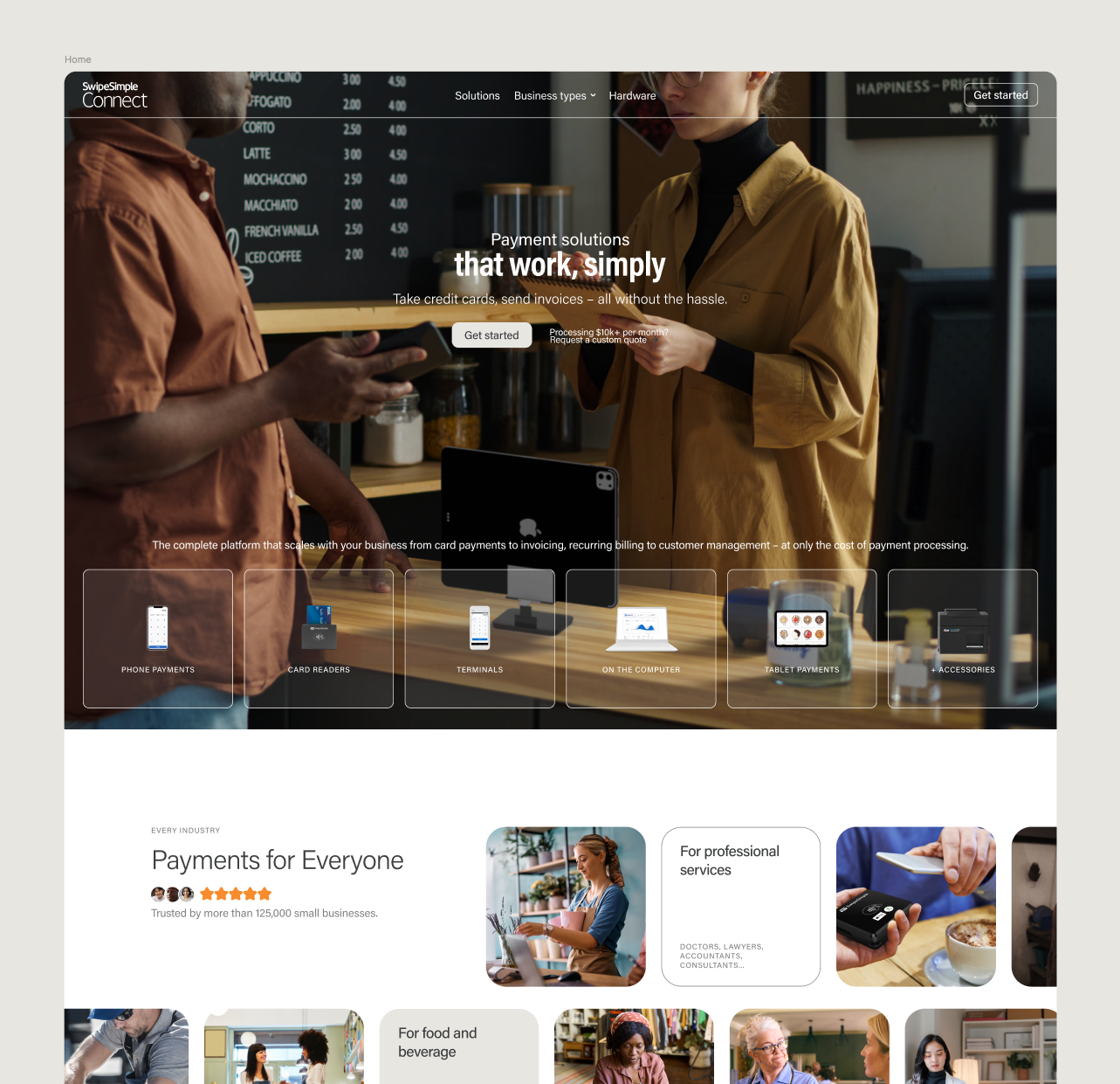
When keeping up with an ongoing agenda for creating new landing pages and UI modules, there are ongoing challenges in getting ideas through while respecting the brand guidelines, keeping alignment with the ongoing marketing vision, and getting to the point. From challenges such as, 'Let's make this hero section have the kind of visual impact Square gets on its homepage,' to, 'Let's list all of our business-type solutions with a special focus on on-site services.
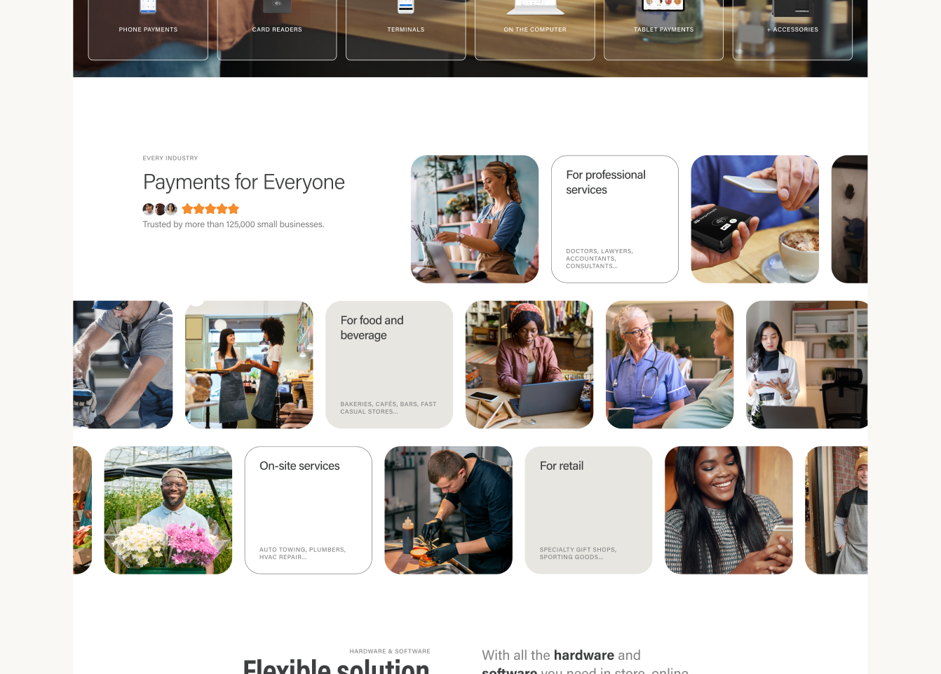
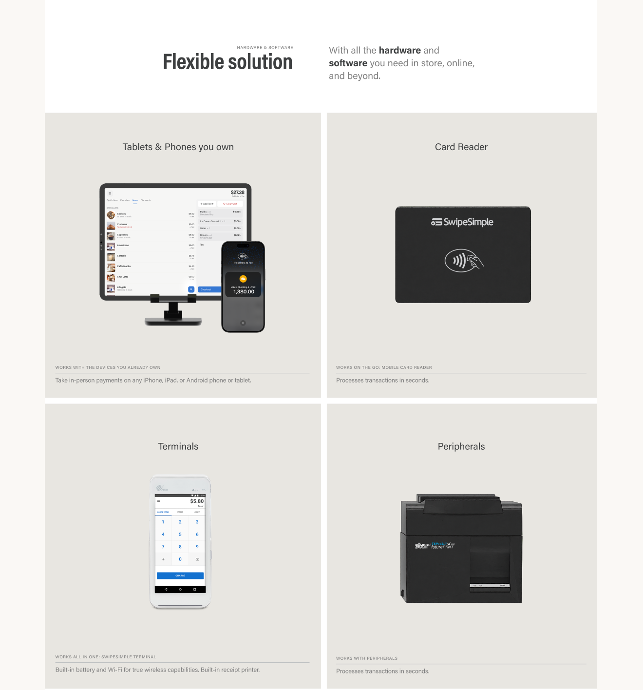
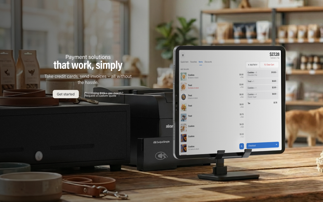
In summary: This ongoing project for extensive design iteration reflects a deliberate methodology to forge a compelling visual narrative that balances functional clarity with high-end aesthetic appeal. By leveraging Figma synced styles alongside a hybrid workflow of 3D Blender renders and artificial intelligence scenery generation, the team developed cohesive, impact-driven landing page modules that industry references like Square and Microsoft. The process involved stress-testing countless layouts to seamlessly integrate value propositions, complex feature sets, and trust signals into a unified brand experience.

Strategy, design, content and growth.